Showing posts with label adjustments. Show all posts

Monday, November 5, 2012

Update!

Greetings and welcome to Hohenfels Volks, THE place for our place! Well, after an incredibly busy October, it looks like things are settling down enough in Hohenfels to say, “I’m back.”

Firstly, I’d like to thank everyone for continuing to check us out!

I’ve been shooting large format 4x5 film almost exclusively as of late, as well as developing and printing the results. That’s made for some interesting photos and even more interesting discoveries.

Our weather here is typical of Hohenfels, rainy and cloudy. Let’s not forget cold, too! There are still enough leaves and signs of autumn to make for some great photos, so it’s time to get out there and make our visions spring to life. Let’s not forget the Christmas markets that begin at the end of the month, either. Just a trip to the market and you’re presented with more photo possibilities that you can imagine. I’m planning up a couple shots for some friends as I write this. Now’s the time to plan yours, the joyous sights, sounds, and smells will fill your thoughts and if you don’t have at least one planned shot, you’ll be overwhelmed.

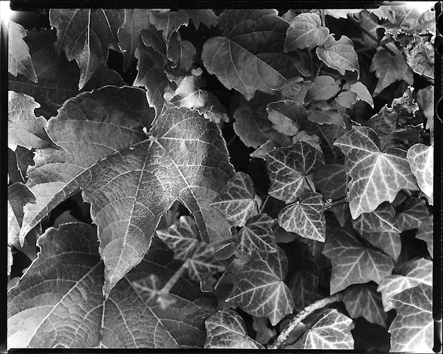
Well, I’m going to leave you with this large format photo. It was taken on Ilford’s FP4+ film, developed in Tetenal’s Ultrafin + 1+9, contact printed on Ilford’s MGIV paper, and finally developed in Tetenal’s Eukobrom 1+18 before scanning it as you see it. I adjusted the levels for contrast and mood.


Hohenfels Volks: I Subjugated
EI 125, f/22, 1/2. 4x5 film using a Calumet CC-401 view camera and Rodenstock Caltar II-e 210mm lens.
I, subjugated. This was shot with a green filter to bring the red leaves in line with the green leaves. By diminishing the levels of the red to match the green, we see everything based on contrast and sharpness, and these guide our eyes through the scene. The crop allows the whole negative to be viewed, although an enlargement would be cropped appropriately.

Here’s hoping you enjoy the rest of your week and capture the shots you’ve been wanting. Get out and make it happen, then show us, share what you felt through your images on our Hohenfels Volks Faceboook page.I'm looking forward to your comments!

Is there anything you’d like to see here? Do you have a question? Share your thoughts here or at the Hohenfels Volks Facebook page. Of course, commenting on both Facebook and here is always appreciated, too! Don't forget, we're on Google+, too!
Wednesday, August 22, 2012

Basic Calibration

Greetings and welcome to Hohenfels Volks, THE place for our place! Hohenfels was greeted this morning with the sky belching great flashes of light and a seemingly torrential downpour that lasted all of 15 minutes. Of course, our area spent the rest of the day under blue skies and wonderful cloudscapes.

Heading out to Regensburg to get some prints done, I was struck by the fact that we also place faith in others when we hand over our precious photos for processing. Of course, that faith was justified today when I saw the prints from this weekend.

Today, we’re going to touch a little on calibrating your monitor. We’re not using anything fancy, or doing too much involving more than the basic monitor settings in Windows.

For black and white work, I recommend heading over to Ilford and downloading their Monitor Set-Up Print chart. Get the chart printed at your favorite vendor; I use MPIX or Photohaus Zacharias in Regensburg.

When you get the print back, adjust your brightness and contrast settings with the image on display. Make the displayed image match the print, then save your profile. That’s it for Black and White. It should provide good brightness and contrast for general photographic use, as well.

For color, it’s a little more involved. Head over to Digital Dog and download their printer test file. Again, you’ll need to get it printed. With print in hand, make your adjustments in Windows, only this time you’ll want to adjust your color settings as well. Saturation and hue may need adjustment, and possibly your individual colors. Once everything matches, save this profile as something different.

When you’re working on color images, load your color profile before your edits. This will match your colors and levels between the display and the printer. The same applies for Black and White. Knowing your levels through calibration will make your prints match your vision far more closely than an uncalibrated monitor will. It also allows you to work more accurately.

I hope this helps; it works, and leads to great prints. Enjoy the rest of the week, as Hohenfels slides into the weekend. Create something stunning, and share with all of us!

Please feel free to share your photos on our Faceboook page. Everyone here would love the chance to see your work! Is there anything you’d like to see here? Do you have a question? Share your thoughts here or at the Hohenfels Volks Facebook page. Of course, commenting on both Facebook and here is always appreciated, too! Don't forget, we're on Google+, too!

Wednesday, August 15, 2012

Ride Along Rome

Greetings, volks. Welcome to Hohenfels Volks, THE place for our place! Another sunny day in Hohenfels, as we ride out the summer, brings us warmth and brightness.

Today we’re going out on a ride along shot. So, get ready to leave Hohenfels behind, and take a trip through time to ancient Rome.

First, here’s the shot from the camera.

Hohenfels Volks: Colosseum in Rome, Before
ISO 160, f/8, 1/100, Canon EOS 7D
This is washed out and appears to be a failure, but when you shoot for your final result, this is only half the image.

It’s not very pretty, but this goes to show you how you create an image with your vision. I shot it this way fully expecting to get to the final image with some editing in Canon’s DPP. I didn’t use Photoshop or any other program; everything was done in RAW conversion.

We were in Rome a couple weeks ago on a wonderful family vacation with some great friends. The whole family has always wanted to go there, so off we went.

Of course, the Colosseum was a mandatory stop, especially for me. This was shot during our tour, including the underground portion. I got quite a few shots inside, but wanted something that would leave the viewer wondering. I also wanted something that showed its incredible nature, without getting the usual fare.

I was shooting film and digital that day, so used my 7D to meter for both cameras. The film was Kodak Portra 160, which is a color film with a box speed of ISO 160. I metered for the lower wall. I wasn’t concerned about the sky blowing out, as the important details in the tunnel and brick were needed. By metering the lower mid values and exposing for M-1, shadow detail was preserved, as were the mids.

They hardly seem the same. I edited the image by setting my white balance to color temperature. This allows for some contrast control in the final image. The reason color temperature and white balance can be used to control contrast is that our color levels will be adjusted under the RGB tab. After setting the color balance, and setting the exposure to –2/3 stop and adjusting the contrast, I moved over to the RGB tab.

When converting this way, the image starts looking worse as you progress. It simulates color filters. The beauty of digital is that you can simulate different colors for different levels. By increasing the levels of red in the shadows, pretty much removing blue, and giving green a slight decrease, the image looked wonky. Of course, it starts to come together when you slide your saturation under the RGB tab to 0. A little dip of the luminance curve and it’s back to Raw.

By adjusting the color balance back toward blue, you can darken the image. You also increase contrast. Then, once you’re happy with those adjustments, under the RAW tab’s saturation you can further tweak your contrast. With the red bricks, green spots of grass, and blue sky the image was quite suited to this type of conversion. Another suitable type is when one color dominates several neutral or contrasting colors.

Here’s a screen shot of the 2 tabs and the final settings. Shooting RAW gives you so many options to capture shots that bring together your camera work and your vision.

Hohenfels Volks: Colosseum in Rome, RGB tab settings
Here is the RGB tab and the color adjustments.

Hohenfels Volks: Colosseum in Rome, RAW tab settings
And here we see the RAW tab in Canon DPP

Finally, here is the finished image.

Hohenfels Volks: Colosseum Section, Rome
ISO 160, f/8, 1/100
Colosseum Section, Rome, finished. The increased contrast from the color temperature brings detail into the bright stones topping the section. It also makes the entry dark and increases overall image interest.

The tunnel entrance, in dark mysterious shadows, referred to as the vomitorium, allowed for rapid exit during an emergency. The little arches below were entryways into another seating area. The site had a capacity of 50,000 spectators, and even though this small section doesn’t show the full capacity, it does give an impression of the scale and architectural marvel. I also shot a back up to be in color, which pops for the contrast between the sky and walls.

Here’s hoping you finish the week with some great shots. Hohenfels is full of opportunities for photography, and this weekend may be the perfect time to get something in your camera!

Please feel free to share your photos on our Faceboook page. Everyone here would love the chance to see your work! Is there anything you’d like to see here? Do you have a question? Share your thoughts here or at the Hohenfels Volks Facebook page. Of course, commenting on both Facebook and here is always appreciated, too! Don't forget, we're on Google+, too!

Tuesday, July 17, 2012

Converting Your Image

Greetings, volks. Welcome to Hohenfels Volks, THE place for our place! I hope everyone is faring well as press into the week.

Today we’re going to go over a simple, but interesting way to convert your photo to black and white.

As we all know, sometimes color can change the way an image feels. It can take a moody photo and make it seem wrong or out of place. It can distract from the subject and take away from the beauty of the light. There are many reasons for shooting, or converting to, black and white. For this post, we’re going to do something that takes our shot to a better place.

This is the image we’re working on. I’m using Corel’s Paintshop Pro Photo X4, but the concept is the same in Photoshop, Lightroom, or Gimp.

Hohenfels Volks: The Dom
ISO 6400, f/3.4, 1/15
Looking into the Cathedral. The scene was beautiful, yet the image lacks some pop. We'll fix that!

I shot this photo inside the Dom in Regensburg. The beautiful Gothic architecture and art inside this cathedral seem best suited for black and white, and seem quite garish in color. The color temperature also becomes an issue when shooting at high ISOs, although I photographed this with the intent of making it black and white.

Once we’ve converted our image and opened it in our application of choice, we’re going to separate the image into red, green, and blue layers. There we’ll lighten and darken the different layers to our desired levels using curves and levels, and remove the noise. For this image, I slightly decreased the red and blue layers, while only dodging the green along the pipes of the organ. Once you’re content with your adjustments, combine the layers into a new image. For this shot, I slightly darkened the red layer, darkened the blue layer quite a bit, and dodged the pipes of the organ to increase the levels to offset the overall decrease in brightness. The finished combination now looks rather odd, and has some tinting/toning in it.

Hohenfels Volks: The Dom
This is our image after splitting the color channels and recombining them. Notice the green tint on the pipes.

Our next step is to split the image again, this time to hue, saturation, and lightness layers. You can discard the hue and saturation layers, as we will now use the lightness layer for our final canvas. For this image, I adjusted the levels, performed a minor curves adjustment, and increased sharpness. I chose to over-sharpen, using a radius of 1.00, as I would be softening the noisy area under the arch, and applying an edge preserving smooth filter.

Hohenfels Volks: The Dom
Almost finished, a few tweaks and we're there.

The finished result, while no masterpiece, is rewarding. It leaves you with a sense of place and scale that the color version tends to minimize. The chiaroscuro also seems quite well suited to the Gothic cathedral.

Hohenfels Volks: The Dom
And here we go. I think this really brings out the mood and scale of the Dom. Its incredible Gothic architecture and art are magnificent.

Well, that’s one way you can do it. This is by no means the only way. You can also adjust color channels without splitting the image, and then desaturate the image. There are as many ways to convert your image as there are folks playing around to figure out what works best for their photo. One of the biggest keys, though, is color contrast and levels. Getting that where you want it can lead to some very nice results!

Enjoy the rest of your week.

Please feel free to share your photos on our Faceboook page. Everyone here would love the chance to see your work! Is there anything you’d like to see here? Do you have a question? Share your thoughts here or at the Hohenfels Volks Facebook page. Of course, commenting on both Facebook and here is always appreciated, too! Don't forget, we're on Google+, too!

Monday, May 14, 2012

Color Balance and Exposure

Greetings, volks. Welcome to Hohenfels Volks, THE place for our place! After a chilly weekend and a wonderful Mother’s Day with the family, it’s time to get back to the regularities of life, which includes plenty of time behind the lens. Let’s hope a nice week present Hohenfels with some great photo ops and we have our cameras ready!

Today we’ll discuss a little bit about color, color balance, and the impact they have on exposure. We most often see the impact when shooting B&W, but in today’s digital age, we see it more and more. So let’s get started.

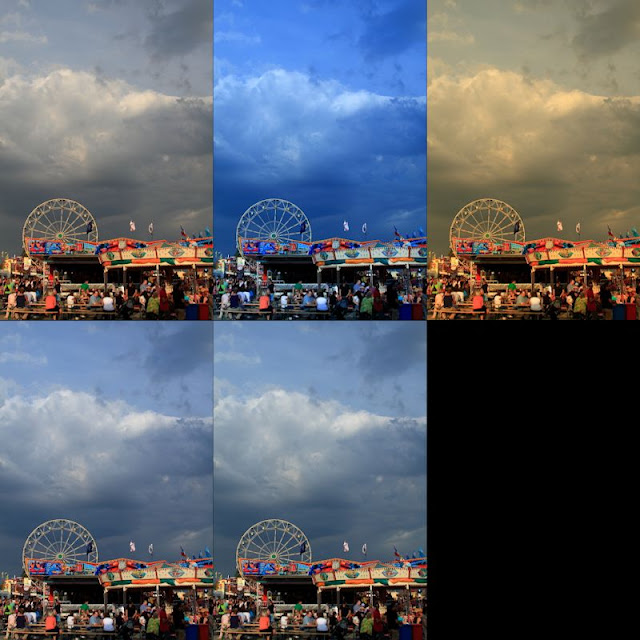
Most of today’s sensors seem biased toward the red. When you decrease the amount of red in the scene, you decrease your overall exposure. Over the course of editing photos and correcting color balance, you’ll start noting that decreasing the color temperature toward 4000K or lower a decrease in brightness generally occurs. This is especially true when using redder lights or in daylight shots. This can be clearly seen in the following series of images. All the settings are identical, except the color balance, which was set for to display this.

Hohenfels Volks: Color and Exposure
Top row L-R; no color balance, 3600K, 8700K Second row; click for the flag, click for the clouds. Notice the apparent changes in both exposure level and contrast.

Color balance also affects your exposure for black and white shots, even digital ones. You can see this in the shots below.

Hohenfels Volks: B&W Color exposure
Here we see the impact of color balance on black and white. The left is set for about 2700K and the right is 7000k.

By adjusting your color balance, you can correct your lighting to match what it was during your shooting. Doing this digitally without balancing your lighting through the proper application of color matching gels or matching your light sources can lead to issues that seem insurmountable, and may well be.

The best method to create proper color balance is to use a white target made for color balancing photographs and setting up a profile for that lighting situation. When you’re shooting a gathering for instance, set your custom white balance using the white target in the actual lighting conditions that you’ll be shooting in. This will enable you to have your white properly balanced, and enable batch white balancing. When shooting RAW this is the preferred method, as it can easily be changed should the results not be to your taste. Another method is to shoot a white balance shot as before, then only apply it where needed during RAW conversion. Of course, in situations like gatherings and events, I’ve found the best results to be obtained by shooting a white balance shot for each direction I’ll be photographing and applying them based on the shots. You usually get better results in mixed lighting this way.

When taking your white shots, make sure to frame the white card so that as much white is showing as possible. I find keeping some of the scene as reference helps when doing multiple white balance shots, so that I can remember which direction the shots were made. You can also use an 18% gray exposure target card, as long as there is no color in the card itself other than gray. Often times, the dyes used can lead to odd colorcasts. This is also true for white cards of lower quality. I used one once that showed up green on all the test shots I made. The actual shots would have been wasted if I had been shooting JPG and not RAW.

All this leads to this week’s exercise. Set your camera to monochrome and shoot a series of shots in different lighting. When you import the RAW files to your favorite converter, adjust your color temperature and see how it influences your exposure levels. Then try to apply several monochrome color filters and see the changes. Then set your picture style to one of the color modes and change your color temperature. You will see in all the cases, your exposure will change over different parts of the scene. Remember how you affect the scene, and when you’re out shooting apply that knowledge to your exposures. You’ll see things different and improve your work!

Time to get out and do some shooting, I hope you’ll be out today getting your shots in, too! Make some for us and share the wealth!

I’m looking forward to seeing your results and hearing from you. Let me know what you think and how you’re using your camera! Share your thoughts here or at the Hohenfels Volks Facebook page. Of course, commenting on both Facebook and here is always appreciated, too! Don't forget, we're on Google+, too!

Thursday, May 10, 2012

Luminance Values and Exposure

Greetings, volks. Welcome to Hohenfels Volks, THE place for our place! Spring, being upon us here in Hohenfels, is ripe with opportunities for our craft. Looking around, the trees are bright and clean, the flowers are bursting with color, and the Germany is waking up to a wonderful summer ahead.

Today’s post, delayed by unfortunate occurrences, is about luminance values, and how we can record, refer to, and use those values to improve our image. There will be some math here, but nothing major.

The first thing we need to discuss is the exposure formula. Ansel Adams described it as being the reciprocal of the luminance at a speeds key stop. The key stop for any speed is the square root of the speed. Here is a list of most speed/stop combinations.

Speed Key Stop
100 10
125 11
160 12
250 16
320 17
400 20
480/500 22
620 25
800 28
1000 32

I began the table at ISO 100 and ended at ISO 1000. ISO 100 is the lowest most consumer cameras go, and f/32 is about as high as most consumer lenses get today.

By setting your camera to any of the pairs in the table, you can read the luminance of your metered object, measured in candles/square foot, or c/ft2. For instance at ISO 125, f/11, metering 1/125, then the luminance value is 125 c/ft2. If your meter shows 30 seconds, then the luminance is 1/30 c/ft2. That will put you at 18%, or neutral gray reference values. This is what I refer to as M, or an M exposure.

When photographing normal scenes, we often encounter a scale of values that for any given exposure will run from approximately M-5 and lower to M+5 or higher. By learning to look at luminance values as described above, you learn to tame that range, creating an image that will make you justifiably proud.

An example of exposing for your luminance reading is when you meter the clear sky; you should read about f/11, ISO125, 1/300. This will put your sky into the range of 18% reflectance. We know that a clear Northern sky should fall about M+1, which means we should expose for the sky at f/11, ISO125, 1/150. Of course, this goes back to place and fall exposures. You must decide the key elements within your scene and where they should be placed. Once this exposure and placement is determined, all other values fall where their luminance levels impact your sensor. Knowing these values will help you determine where you wish to place elements and where your remaining elements will fall.

Even metering clouds, you will find a range of luminance values that may run from 200 c/ft2 to 1000 c/ft2. By meter the brightest part, 1000 c/ft2, then adding 3 stops, you bring your 200 c/ft2 up to nearly M+1 ½ in the exposure range, which is slightly brighter than the surrounding blue sky, and significantly darker than the brights in the clouds. Your brights will print out with slight tonal variations, and darker areas will have adequate or better textural ranges. You also bring areas metering at 50 c/ft2 up to the equivalent exposure of 400 c/ft2. These equivalent values are in relation to your original metering from the bright part of the clouds.

Recording your luminance values across the range of your scene will help you learn to recognize values, and expose with more confidence. It will also help in editing your images and preparing them for either printing or display. I would suggest metering across the range of M-4 to M+4 after determining your priorities, and noting the results. Even if you’re shooting at some combination not listed above, take the luminance readings using a combination. After reading the values, switch to your desired settings, compose, and make your image. Values for M+ and M- can be extrapolated by halving or doubling the values obtained with your meter. This is less accurate, but still of considerable value in perfecting your images.

Another great advantage of knowing your luminance and place values, is the ability to tell anyone about your exposure without giving the ISO, f/stop, EI, shutter speed, and so on. Tell them you metered this at 250 c/ft2, and gave M+1 to get the exposure where you wanted it. Regardless of your settings, they will know that to get that exposure from 250 c/ft2, then they give M+1 at whatever aperture and speed they desire, for instance ISO 125, f/8, 1/250 or ISO 400, f/5.6, 1/1600. Both will give the same results, and use the same values, 250 c/ft2 +1 stop, and make exposing a scene more consistent. It’s also useful when referring to edits performed. Taking the last example, you may have shot at M+1, and then edited it to M to decrease contrast. In this case, you can say this was shot at 250 c/ft2 +1 stop, then edited to M for the final effect. This will help others understand and help you remember your shots without having to know every little bit of detail.

There are other ways of expressing luminance, for instance EV or c/m2, or lumens, and as long as you find a consistent method of evaluating and expressing that exposure, your images will be consistent with your vision. Don’t get hung up on what I use, try it and if it doesn’t work, try something else. You’ll still have a working system, and you’ll still be enjoying what we love to do!

Time to get out and do some shooting, I hope you’ll be out today getting your shots in, too!

I’m looking forward to seeing your results and hearing from you. Let me know what you think and how you’re using your camera! Share your thoughts here or at the Hohenfels Volks Facebook page. Of course, commenting on both Facebook and here is always appreciated, too! Don't forget, we're on Google+, too!

Tuesday, March 13, 2012

Color Contrast in Monochrome

Greetings, volks. Welcome to Hohenfels Volks, THE place for our place!

Today we’re going to talk about using digital filters for black and white, and color contrast to bring our vision to our images. We’re going to walk through a few different colored filters in our RAW conversion software.

Referring to Canon’s Digital Photo Pro for our software portion, we see that the first thing is to set our picture style to monochrome. After doing that, you’ll notice that color tone and saturation sliders change to filter effects and toning effects.

Once we’re into monochrome picture style, set your white balance to color temperature and play with the slider a little. This will give you some idea of your sensor’s spectral response to color. For instance, raising your temperature from 5200 to 10000 may give a giant boost to your brightness, showing a larger response to red. Lowering it to 3000, seeing a boost would indicate a greater sensitivity to blue and green.

Now that you have some idea of its response to colors and temperature, we can understand how to work our monochrome images for maximum effect. Select the first filter choice as we drag our slider, yellow, and adjust your color temperature. Going either way with your temperature shows a slight shift in brightness throughout the range. As we get lower in temperature, we have less lightness, and more as we raise the temperature.

Selecting an orange filter shows a more pronounce version of the yellow filter’s response, due to an increased presence of red in the light being allowed through the filter, or in our case, allowed to impact the image by software. Moving on to red, we see great swings throughout the temperature range. At 2500, we see our greatest darkening and at 10000, we probably see something washed out and so high in contrast to be unusable.

Going to our last filter, green, we see almost no change as we shift through the temperature range. Since light is composed of all the colors, but most of the time less of the green, we see less impact. Green has a more pronounced effect in film photography than digital, though.

OK, now we’ve seen some pretty cool ways to improve on our vanilla black and white conversions. Let’s move to some interesting ways to use those filters. Select standard for your picture style. Selecting your RGB tab, you can choose between luminance, red, green, or blue. As we cycle through the colors and make adjustments, we end up with a pretty scary image. The color is ugly and unnatural. No that you’re someplace you think might work well with a colored filter, select saturation in the RGB tab and drag the slider to 0. Without saturation, there will be changes in lightness and brightness, but no real change.

Going back to your RAW tab, select monochrome, and choose your filter. Select color temperature. Once your color temperature is about where you want it, go back to the RGB tab and start playing with your color and lightness sliders. Notice how things change as you drag them around? Well, once you have your image about where you want it, you can either save it or finish it here. The reason for going into the color sliders goes back to our discussion on color theory. By adjusting our color curves, levels, and contrast, we can make some very nice black and white images with our initial RAW conversion.

Once you have your image about where you want it, you can save it and open in another editing program, like Paintshop Pro and split the image into CMYK or RGB layers and adjust it even further, or just play with your curves or layers creating a combination that suits your vision, message, and intent. Another nice option is to create a hand painted look or feel. We’ll talk about that in a future post.

I hope everyone is on the road to a great week and has plenty of opportunities to concretize your vision. Happy shooting and have a wonderful week, Hohenfels.

Don’t forget to post any of your images you’d like to see here at the Hohenfels Volks Facebook page. Of course, commenting on both Facebook and here is always appreciated, too! Don't forget, we're on Google+, too!

Friday, March 9, 2012

Ride Along: Golden Sky

Greetings, volks. Welcome to Hohenfels Volks, THE place for our place!

Today we’re going on another ride along. This one isn’t too far from home, so we’ll keep it short.

While exploring the backside of Hohenfels Sunday, I stumbled upon this scene and knew it was something I wanted to keep.

Hohenfels Volks: Golden Sky
ISO 400, f/22, 1/50, 35mm, Canon EOS 7D
The sun dipping slowly toward night's rest and renewal.

Going over the hill from Hohenfels proper toward Raitenbuch, you come across a small country lane meandering through the fields. Having been down this road before, I knew there were some nice scenics waiting to reward the one bringing them home. There is a tiny little chapel between 2 giant trees there, with some magnificent views of the hills around.

The shot was easy to visualize, I came up with several in fact. Composition was envisioned to include the colors all around as one the key elements. The sky was partly cloudy, with some nice golden glow from the sun hanging around the think veneer of sheeted clouds, and a nice blue in the areas without cloud cover.

I arrived moments before the color really started coming out. I took several shots, hoping to see something I could work with. I included the trees and the chapel in several, but liked this one for matching the closest to what I visualized.

I metered off the tree with the Gossen Sixtomat, at ISO 400. Giving the tree a –2-stop exposure from the meter would have washed out the sky and left the color flat and a bit comical. Metering the tree for –3 stops and the grass for about –2 stops from middle gray, meant I could shoot at f/22, which was part of getting the sun to streak in a nice little starburst. I was also able to shoot at 1/50, which limited the streaking to just a couple rays coming lightly over the hills in the distance through the clouds.

Getting it into Canon DPP, or the digital darkroom, added some magic. Canon has some “Picture Styles” for their application that come standard, allowing for the most common edits to color and contrast to be quickly applied. My first thought was Landscape, but that left the gold too vague and muddled. Having downloaded several other styles from Canon’s site, I settled on Autumn Hues for the picture style. This softened the contrast between the sun and the hills; it also made for some nice separation of the golds, oranges, and reds in the sky. I adjusted my levels, crushing them in some for clarity.

After that, I set the color temperature to about 6000K, which brought the color in line with the lighting hues. Increasing the contrast to +1 and the shadows to +2 added to the glow around the hills and tree, while allowing the levels to hold up throughout the image, including the separation in the distant hills. The last adjustment was to take saturation down –1 and sharpen.

The car coming up the road in the middle ground adds a nice little reference point for the viewer to pause. That was a lucky little bit of happenstance. I liked the lights as he was approaching and shot quickly to include his headlights. This photo captures what I visualized, and expresses the joy one gets when out looking for shots, especially when you find one that works for your vision. Shooting with a vision can make for some interesting stuff, knowing what tools you have at your disposal to make your vision a reality makes easier work of it!

Check out Canon’s site and download some of their picture styles. You’ll see some stuff that probably doesn’t appeal to you, at least I did, but you’ll also find something that does. I’m certain Nikon and other companies have something similar, if not, you can make your own in whatever app is your digital darkroom! Exposure and visualization start your image on its journey; your level controls and tools in software bring it home. Using them all together can make something that brings others to that same place with you!

Take care and enjoy your day!

Don’t forget to post any of your images you’d like to see here at the Hohenfels Volks Facebook page. Of course, commenting on both Facebook and here is always appreciated, too! Don't forget, we're on Google+, too!

Tuesday, February 21, 2012

Developing for Your Vision

Greetings, volks. Welcome to Hohenfels Volks, THE place for our place! Welcome to another delayed post.

Lots of things going on have delayed posting for several days, yet again! So here we go, continuing our last post about exposing for your vision.

We posted a photo that we referred to as N development, or normal. That going to be our starting point. Going back to our RAW conversion, we’re going to change that some. Since I use Canon’s Digital Photo Pro that came with my camera, I’ll refer to that.

Our first step is to adjust the slider for exposure. I took it down to -.33 stop. That added some depth to the sky and brighter areas, allowing for some slight texture and tonality. Then I set the white balance to color temperature, at 4200. You’ll see why I did that later.

After that, I crushed in the levels some, the method is shown below. That increases contrast and allows you to bring your levels at the extreme end in some. It gives deeper shadows and highlights. Some of this will be offset, while allowing the levels to be set in our next step.

Hohenfels Volks: Crushing levels
Looking at the arrows, you can see how the levels are crushed in using your sliding limits. This adds clarity, contrast, and depth to an image.

Bringing the contrast up to 2, and the highlights to –2, allowed for some slight increase in highlight detail along the snowy roof of the church and in the snow on the fields. Bringing the shadows up to +2, added depth to the forest and some detail to the church tower and tonality to the almost black barn. It also allowed the shadows to move higher along the exposure scale, increasing the open feeling of the spaces and the shadows from the buildings.

After setting my monochrome filter to red, which darkens greens and blues, the snow appeared brighter without fading or washing out, while adding some shadows back to the open parts of the further hill and forest. Adjusting the color temperature down to about 3900 cleared things up a little.

After rotating the image to a more suitable angle, due to my camera not being level while I shot, I was ready to sharpen, convert, and save. Below is the finished image.

Hohenfels Volks: N-.3 village outside Hohenfels
ISO 400, f/16, 1/500, 115mm
Our finished shot of this charming village.

Here is the photo in color with almost the same settings, with the biggest change coming from the color temperature. Outdoor shadows, and snow, usually have more blue light, so bumping up the color temperature allowed for white snow, blacker shadows, and still retained the color on the far hills.

Hohenfels Volks: N-.3 village outside Hohenfels
ISO 400, f/16, 1/500, 115mm
Our color shot of this charming village.

Some small edits in RAW can save tons of time fixing photos. They also allow us to create our vision, not just re-create what we saw. Using some dodging and burning tools and sharpening brushes, as well as the other tools, in editing applications can further that vision to a concrete expression of what our mind saw and wanted to show.

I hope to see some of your vision soon! Start sharing your work and showing us how you saw something, not what you saw. Making great photos is a great way to spend some time, and get in touch with the world around you! I hope you have a wonderful week and enjoy the weather we have right now!

Don’t forget to post any of your images you’d like to see here at the Hohenfels Volks Facebook page. Of course, commenting on both Facebook and here is always appreciated, too! Don't forget, we're on Google+, too!
Wednesday, February 8, 2012

Editing For Pre-Exposure?

Greetings, volks. Welcome to Hohenfels Volks, THE place for our place! I hope everyone is warm and well, and that you got the shot you wanted today!

Today we’re going to deal with an editing technique based on old film shooting. I know this was supposed to be another Around Hohenfels, but that didn’t quite pan out the way I had planned.

Back in the film days, you couldn’t change film speed mid roll. You also had some interesting things going on. Film often had a wider latitude for exposure errors, especially for overexposure, but even underexposing allowed film to still work out, if you knew how to make it. You could shoot with ISO 200 settings on ISO 100 film, and push the processing for ISO 200, and save the shots. There were several techniques for saving the shot, including push processing, pull processing, and pre-exposing. When shooting RAW format, most conversion applications, like Canon’s DPP, can be used to correct an exposure by up to 2 stops either direction. Using the exposure setting that way, though, you affect the entire image, not just certain areas. Using most image editing programs, you can dodge or burn areas to meet your needs, as well adjust your curves and levels. In fact, most applications have the common dark room tools, which is why they refer to them as a digital dark room.

Rather than discuss those choices at this time, we’ll address pre-exposure. I chose this topic, as most image applications don’t have a feature that allows that directly. Rather, you have to use a round about method to obtain similar results, and that’s what we’ll discuss today. Pre-exposing film allowed the photographer to bring out detail in deep shadows by adjusting them to higher levels or zones. By pre-exposing a hot, then shooting over that pre-exposed frame, light intensity could be raised. If you wish to bring out detail in zone 2 shadows, you could pre-expose for zone 1 or 2, then shoot for a correct overall exposure and get those elusive shadow features. You’d need to take a gray card or translucent plastic/glass, meter it exactly along your image axis, and set your exposure accordingly, then shoot the scene. You could push, pull, or otherwise develop according to your plans, and print the same. We’ll be simulating this technique. I’m going to use this image as an example.

Hohenfel Volks: Passau skyline, pre-exposure original
ISO 100, f/5.6, 1/500, 55mm
The Passau Skyline!

First, select your image, and open it in your editor of choice. Whether you use Photoshop, GIMP, or Paintshop Pro, the basic are the same, but your application needs to support layers. Once your image is open, make a new layer, and select your color selection tool. Click on the shadows you wish to open up and increase the details. Before closing, look at the settings or options for that color and increase the values by the desired amount. For this image, I chose the trees in front of the church, which came out to R-7, G-7, B-7, L-7, and doubled them all to 14. This was still in zone 1, digitally speaking, but when combined at the end, allowed for a slight bump in the shadow detail.

With that being done and applied, select your bucket too and flood fill the new layer with that color. You should have something solid, in your selected color or tone. Set you blend mode to screen, and watch the magic start. All your levels will increase except the brightest areas. You will notice a decrease in contrast as well.

Decrease the new layer’s opacity until you have a set of results that are satisfactory. Now, select levels adjustment, and crush in the curves ever so slightly. This will increase your contrast, without removing too much detail from your shadows. You can apply a curves adjustment and a clarify adjustment if you desire. Now you should see something that is pleasing to your eye, and has more detail in the shadows.

In the days of film, you shot for the shadows, to preserve detail. This often meant slightly overexposing your shot, and printing to retain the detail in the highlights. By pre-exposing your film, you had a way to create more detail without giving any up on the other end. Because exposure was cumulative on multiple shots at the same frame, you could add light as needed. The reason for dark areas benefiting most, was that you added light uniformly across the image at the same level, but your exposure of the image was not uniform. Using just quick numbers to demonstrate, at level 2, when you add 2 units you double the level. At your highlights with say 100 units, you add 2 units and the results are almost unnoticeable due to the ratios. This works in digital the same way, when you select screen mode, you only lighten values lower then your selected pre-exposure layer. Although there is some small effect at slightly higher levels, it is less drastic. By varying the opacity of the layer, you can control the effect even more. Adding masking to allow only certain areas to be painted in gives you complete control!

Here is my final image. Not a large change, but enough to bring out some of the detail within the trees. This works best with images without a large amount of bright spots or too much contrast, but this image was useful. This shows you what a little bit of old time darkroom work on today’s technology can accomplish.

Hohenfel Volks: Passau skyline, pre-exposure finished
Same as above, with pre-exposure.

Well, that’s it for today. Keep shooting, keep seeing the light, and keep your love of our art going with frequent sessions behind the lens! Don’t forget to vote and to get your works in for this week’s theme!

Don’t forget to post any of your images you’d like to see here at the Hohenfels Volks Facebook page. Of course, commenting on both Facebook and here is always appreciated, too! Don't forget, we're on Google+, too!