Showing posts with label editing. Show all posts

Tuesday, September 24, 2013

From the Soapbox

Greetings and welcome to Hohenfels Volks, THE place for our place!

Today’s discussion is a short one on a quote from one of the early greats in photography, Alfred Stieglitz.

Photographers must learn not to be ashamed to have their photographs look like photographs. Alfred Stieglitz

First, a little background on Stieglitz. He began photography in the 1880s, and campaigned hard for photography to be recognized as an art unto itself. In 1902 he held one of the first ever photo exhibitions to be judged solely by photographers. Prior to this point, exhibits were being judged by painters and the like, who’s influence led to a more painterly and less vigorous style holding sway in the art. Over the years he influenced many photographers, founded several asscoiations, clubs, organizations, and galleries. He was friends with many famous photographers, including Edward Weston and Ansel Adams. He worked with them to ascribe a new ideal to photographic artistry.

All this brings me around to the quote, and also to today’s message. As we all know, learning photography takes some effort, it’s a task that frustrates and rewards those who set themselves to it. We go through the various stages, and then we find ourselves making photos that can connect, communicate, and express on their own merits. Most of know the joy that somes from that achievement, we know the sense of accomplishment that we feel.

The issue we’re seeing is that too often, marketing tells us that our photos should look like paintings, or that we need to do things with software that we can’t do with our camera. We see plug-ins and products designed to sell us on the idea that our photos should be a little less like photos. My concern is that all too often, we’re being led into a path that doesn’t match what our vision or intent. Frequently, these products and techniques are either marketed or taught to folks to cover up or salvage bad shots, which undermines the learning process.

Hohenfels Volks: Abstract Clarity
ISO 125, f/4.5, 1/25
This was shot in Munich at BMW World during a daytrip. I wanted to share something of how our world may be changing, but some things will remain timeless. Exposing and planning for black and white allowed a more readily grasped sense of that thought. I knew that any other rendition would create an association with different art forms, which I did not want. This is the final intent, to show that abstract use of lines, tones, and texture can still look like a photograph and be artistic. I have a print of this I find very pleasing.

Be proud when your photos look like photos. Show off your photos, share your photos, and let the world know you made your photos! That feeling of pride that comes from the successful matching of our vision, intent, and final product can’t be replaced, and if your intent is canvas, than be proud of that canvas! Jump for joy and shout Hallelujah if it looks the way you want, because that’s what we’re trying to accomplish.

Enough of the old soapbox. I don’t want to discourage anyone from trying something new, but those new ideas can become a crutch all too easily. I relied on some of those crutches myself early on, and I know how easy it happens!

So now, it’s time to get out and get shooting! Plan your presentation while your planning your shot, and you’ll be way ahead. Then, make your shot and share it with us on our Hohenfels Volks Facebook page. We’d love to see your work.

Is there anything you’d like to see here? Do you have a question? Share your thoughts here or at the Hohenfels Volks Facebook page. Of course, commenting on both Facebook and here is always appreciated, too! Don't forget, we're on Google+, too!

Wednesday, August 15, 2012

Ride Along Rome

Greetings, volks. Welcome to Hohenfels Volks, THE place for our place! Another sunny day in Hohenfels, as we ride out the summer, brings us warmth and brightness.

Today we’re going out on a ride along shot. So, get ready to leave Hohenfels behind, and take a trip through time to ancient Rome.

First, here’s the shot from the camera.

Hohenfels Volks: Colosseum in Rome, Before
ISO 160, f/8, 1/100, Canon EOS 7D
This is washed out and appears to be a failure, but when you shoot for your final result, this is only half the image.

It’s not very pretty, but this goes to show you how you create an image with your vision. I shot it this way fully expecting to get to the final image with some editing in Canon’s DPP. I didn’t use Photoshop or any other program; everything was done in RAW conversion.

We were in Rome a couple weeks ago on a wonderful family vacation with some great friends. The whole family has always wanted to go there, so off we went.

Of course, the Colosseum was a mandatory stop, especially for me. This was shot during our tour, including the underground portion. I got quite a few shots inside, but wanted something that would leave the viewer wondering. I also wanted something that showed its incredible nature, without getting the usual fare.

I was shooting film and digital that day, so used my 7D to meter for both cameras. The film was Kodak Portra 160, which is a color film with a box speed of ISO 160. I metered for the lower wall. I wasn’t concerned about the sky blowing out, as the important details in the tunnel and brick were needed. By metering the lower mid values and exposing for M-1, shadow detail was preserved, as were the mids.

They hardly seem the same. I edited the image by setting my white balance to color temperature. This allows for some contrast control in the final image. The reason color temperature and white balance can be used to control contrast is that our color levels will be adjusted under the RGB tab. After setting the color balance, and setting the exposure to –2/3 stop and adjusting the contrast, I moved over to the RGB tab.

When converting this way, the image starts looking worse as you progress. It simulates color filters. The beauty of digital is that you can simulate different colors for different levels. By increasing the levels of red in the shadows, pretty much removing blue, and giving green a slight decrease, the image looked wonky. Of course, it starts to come together when you slide your saturation under the RGB tab to 0. A little dip of the luminance curve and it’s back to Raw.

By adjusting the color balance back toward blue, you can darken the image. You also increase contrast. Then, once you’re happy with those adjustments, under the RAW tab’s saturation you can further tweak your contrast. With the red bricks, green spots of grass, and blue sky the image was quite suited to this type of conversion. Another suitable type is when one color dominates several neutral or contrasting colors.

Here’s a screen shot of the 2 tabs and the final settings. Shooting RAW gives you so many options to capture shots that bring together your camera work and your vision.

Hohenfels Volks: Colosseum in Rome, RGB tab settings
Here is the RGB tab and the color adjustments.

Hohenfels Volks: Colosseum in Rome, RAW tab settings
And here we see the RAW tab in Canon DPP

Finally, here is the finished image.

Hohenfels Volks: Colosseum Section, Rome
ISO 160, f/8, 1/100
Colosseum Section, Rome, finished. The increased contrast from the color temperature brings detail into the bright stones topping the section. It also makes the entry dark and increases overall image interest.

The tunnel entrance, in dark mysterious shadows, referred to as the vomitorium, allowed for rapid exit during an emergency. The little arches below were entryways into another seating area. The site had a capacity of 50,000 spectators, and even though this small section doesn’t show the full capacity, it does give an impression of the scale and architectural marvel. I also shot a back up to be in color, which pops for the contrast between the sky and walls.

Here’s hoping you finish the week with some great shots. Hohenfels is full of opportunities for photography, and this weekend may be the perfect time to get something in your camera!

Please feel free to share your photos on our Faceboook page. Everyone here would love the chance to see your work! Is there anything you’d like to see here? Do you have a question? Share your thoughts here or at the Hohenfels Volks Facebook page. Of course, commenting on both Facebook and here is always appreciated, too! Don't forget, we're on Google+, too!

Tuesday, July 17, 2012

Converting Your Image

Greetings, volks. Welcome to Hohenfels Volks, THE place for our place! I hope everyone is faring well as press into the week.

Today we’re going to go over a simple, but interesting way to convert your photo to black and white.

As we all know, sometimes color can change the way an image feels. It can take a moody photo and make it seem wrong or out of place. It can distract from the subject and take away from the beauty of the light. There are many reasons for shooting, or converting to, black and white. For this post, we’re going to do something that takes our shot to a better place.

This is the image we’re working on. I’m using Corel’s Paintshop Pro Photo X4, but the concept is the same in Photoshop, Lightroom, or Gimp.

Hohenfels Volks: The Dom
ISO 6400, f/3.4, 1/15
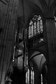
Looking into the Cathedral. The scene was beautiful, yet the image lacks some pop. We'll fix that!

I shot this photo inside the Dom in Regensburg. The beautiful Gothic architecture and art inside this cathedral seem best suited for black and white, and seem quite garish in color. The color temperature also becomes an issue when shooting at high ISOs, although I photographed this with the intent of making it black and white.

Once we’ve converted our image and opened it in our application of choice, we’re going to separate the image into red, green, and blue layers. There we’ll lighten and darken the different layers to our desired levels using curves and levels, and remove the noise. For this image, I slightly decreased the red and blue layers, while only dodging the green along the pipes of the organ. Once you’re content with your adjustments, combine the layers into a new image. For this shot, I slightly darkened the red layer, darkened the blue layer quite a bit, and dodged the pipes of the organ to increase the levels to offset the overall decrease in brightness. The finished combination now looks rather odd, and has some tinting/toning in it.

Hohenfels Volks: The Dom
This is our image after splitting the color channels and recombining them. Notice the green tint on the pipes.

Our next step is to split the image again, this time to hue, saturation, and lightness layers. You can discard the hue and saturation layers, as we will now use the lightness layer for our final canvas. For this image, I adjusted the levels, performed a minor curves adjustment, and increased sharpness. I chose to over-sharpen, using a radius of 1.00, as I would be softening the noisy area under the arch, and applying an edge preserving smooth filter.

Hohenfels Volks: The Dom
Almost finished, a few tweaks and we're there.

The finished result, while no masterpiece, is rewarding. It leaves you with a sense of place and scale that the color version tends to minimize. The chiaroscuro also seems quite well suited to the Gothic cathedral.

Hohenfels Volks: The Dom
And here we go. I think this really brings out the mood and scale of the Dom. Its incredible Gothic architecture and art are magnificent.

Well, that’s one way you can do it. This is by no means the only way. You can also adjust color channels without splitting the image, and then desaturate the image. There are as many ways to convert your image as there are folks playing around to figure out what works best for their photo. One of the biggest keys, though, is color contrast and levels. Getting that where you want it can lead to some very nice results!

Enjoy the rest of your week.

Please feel free to share your photos on our Faceboook page. Everyone here would love the chance to see your work! Is there anything you’d like to see here? Do you have a question? Share your thoughts here or at the Hohenfels Volks Facebook page. Of course, commenting on both Facebook and here is always appreciated, too! Don't forget, we're on Google+, too!

Monday, July 16, 2012

Shooting the Spires

Greetings, volks. Welcome to Hohenfels Volks, THE place for our place! Welcome to another Monday. I hope your week is off to a great start.

Yesterday I posted the following photo, along with a message that I would post more about it tonight.

Hohenfels Volks: Shooting the Spires
ISO 125, f/16, 1/125, 85mm.
This shot is straight from the camera. I applied some sharpening to retain detail during the resize, but no other edits were made. By placing the spires to the right, and using the clouds to create interest in otherwise negative space, mood is created and enhanced.

This photo was made in Regensburg on Saturday. Dachauplatz has a nice garage, located to be within a few minutes walk to just about anywhere in the old part of town. Parking on the roof and scanning the other roofs, this scene just begged to be photographed. The sky was stormy looking, and clouds appeared ominously ready to ruin our afternoon. I metered for the bright clouds and added about 2/3-stop exposure. This left the dark clouds about 1 and 1/3 stop below the meter reading on my 7D.

Composing to minimize intrusion of the garage and several other out of place structures, I made 2 shots about 1/3 stop apart. The mood of the image captured the light, sky, and feeling of that dreadful appearing scene.

After getting the image onto the computer, I decreased the exposure 1/2 stop, brought in the shadow levels to just right of the edge, the highlight levels a slight amount, set contrast to 3, and shadows to 2. I set the color temperature to 3500K, and adjusted the curves for maximum impact. Under the RGB tab, I reduced saturation to 0 and tweaked the curves again to create a balanced scene, resulting in the following B&W image. I applied maximum sharpening on both tabs, and felt pretty good about this image.

The rest of that afternoon was incredibly nice, the weather was on our side, we enjoyed some nice family time, and of course, some ice cream at Eis am Dom, in the Domplatz. Of course, no visit to Regensburg can be complete without a visit to Fotohaus Zacharias. I got to see their latest offerings in the old camera department and pick up some 120 film. They always have so much to choose from. I get lost dreaming about the cameras! I saw a couple old time large format cameras that were incredible. It’s definitely a place to spend a couple hours just looking!

Hohenfels Volks: Shooting the Spires, Monochrome
Here's the finished version. It looks old fashioned in monochrome, and the mood is enhanced without color to distract. Converting images can often be a very simple process when you shoot for a mood.

Well, that about wraps it up for today, but I’ll be back with some more photos from the trip and techniques to get that B&W image you visualized!

Did you get any exciting images this weekend? If so, feel free to share them on our Faceboook page. Is there anything you’d like to see here? Do you have a question? Share your thoughts here or at the Hohenfels Volks Facebook page. Of course, commenting on both Facebook and here is always appreciated, too! Don't forget, we're on Google+, too!

Thursday, June 21, 2012

On the Range...

Greetings, volks. Welcome to Hohenfels Volks, THE place for our place! Today’s weather turned out to be quite nice. There is a wide variety of things and places to shoot in our little part of Germany. Clouds and fields are just coming around to being incredibly photogenic.

Today we’re going to take a quick look at contrast and exposure. When we refer to contrast, we’re generally speaking about the range of values within an image or scene. From the brightest areas to the darkest is our range, and the contrast ratios can be quite high for a full range scene to rather low for a lower contrast image, such as a portrait.

As a general rule, higher contrast images tend to be more dramatic, while lower contrast images run toward the softer side. That’s the reason we call lower contrast “softer.” An image’s sharpness is also dependant upon contrast. When you decrease contrast, you can quickly decrease sharpness if your not careful.

Contrast can be varied by exposure. When an image runs toward high key, it loses contrast due the lower values being absent. The inverse is true in low-key images, though to a lesser extent. By adding shadow and decreasing brightness or overall exposure, contrast can apparently be increased. Decreasing exposure by 1/3 stop can be just the trick. The same can be said for color contrast, which is the range of tones in a single color within your image.

Drama can be added through darkening, and tranquility, or stillness, through lightening. Local contrast can be adjusted within a narrow range of tones, improving appearance, detail, and bringing interest to an area within the image. By using levels for general contrast adjustments, and curves for local effects, an interesting image can be created.

Combined with visualizing the desired outcome, or range of outcomes, limitless possibilities exist within each image. By exposing your brightest areas for M+2 and your darkest for M-3, a visual feast can be created from one shot, if done right. Visualize the effect of several adjustments and contrast ranges, and then set the shot so that each one can be accomplished using limited adjustments.

I hope this gives you something to think about and play with. Throw in some work with this week’s exercise, and you’ll be sure to get something that fills with that pride of accomplishment that comes from a shot well made.

Take care and enjoy the rest of the week!

Is there anything you’d like to see here? Do you have a question? Share your thoughts here or at the Hohenfels Volks Facebook page. Of course, commenting on both Facebook and here is always appreciated, too! Don't forget, we're on Google+, too!

Monday, May 14, 2012

Color Balance and Exposure

Greetings, volks. Welcome to Hohenfels Volks, THE place for our place! After a chilly weekend and a wonderful Mother’s Day with the family, it’s time to get back to the regularities of life, which includes plenty of time behind the lens. Let’s hope a nice week present Hohenfels with some great photo ops and we have our cameras ready!

Today we’ll discuss a little bit about color, color balance, and the impact they have on exposure. We most often see the impact when shooting B&W, but in today’s digital age, we see it more and more. So let’s get started.

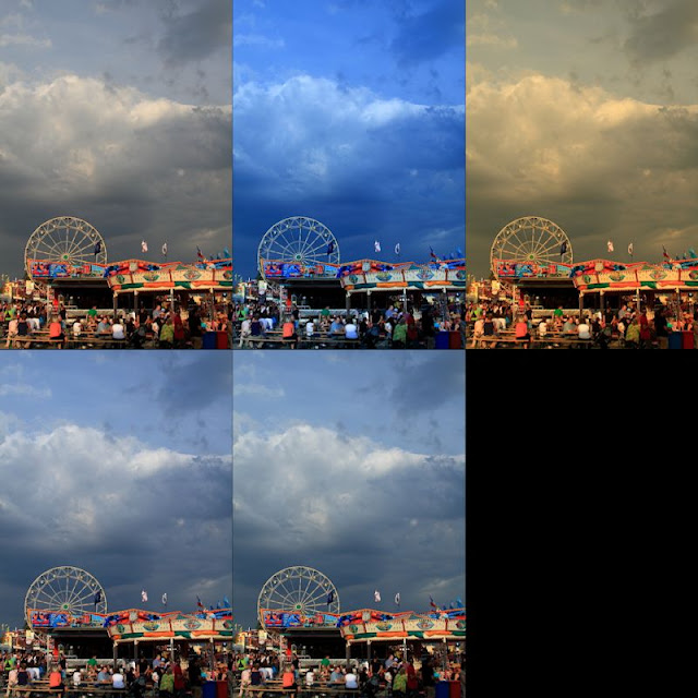
Most of today’s sensors seem biased toward the red. When you decrease the amount of red in the scene, you decrease your overall exposure. Over the course of editing photos and correcting color balance, you’ll start noting that decreasing the color temperature toward 4000K or lower a decrease in brightness generally occurs. This is especially true when using redder lights or in daylight shots. This can be clearly seen in the following series of images. All the settings are identical, except the color balance, which was set for to display this.

Hohenfels Volks: Color and Exposure
Top row L-R; no color balance, 3600K, 8700K Second row; click for the flag, click for the clouds. Notice the apparent changes in both exposure level and contrast.

Color balance also affects your exposure for black and white shots, even digital ones. You can see this in the shots below.

Hohenfels Volks: B&W Color exposure
Here we see the impact of color balance on black and white. The left is set for about 2700K and the right is 7000k.

By adjusting your color balance, you can correct your lighting to match what it was during your shooting. Doing this digitally without balancing your lighting through the proper application of color matching gels or matching your light sources can lead to issues that seem insurmountable, and may well be.

The best method to create proper color balance is to use a white target made for color balancing photographs and setting up a profile for that lighting situation. When you’re shooting a gathering for instance, set your custom white balance using the white target in the actual lighting conditions that you’ll be shooting in. This will enable you to have your white properly balanced, and enable batch white balancing. When shooting RAW this is the preferred method, as it can easily be changed should the results not be to your taste. Another method is to shoot a white balance shot as before, then only apply it where needed during RAW conversion. Of course, in situations like gatherings and events, I’ve found the best results to be obtained by shooting a white balance shot for each direction I’ll be photographing and applying them based on the shots. You usually get better results in mixed lighting this way.

When taking your white shots, make sure to frame the white card so that as much white is showing as possible. I find keeping some of the scene as reference helps when doing multiple white balance shots, so that I can remember which direction the shots were made. You can also use an 18% gray exposure target card, as long as there is no color in the card itself other than gray. Often times, the dyes used can lead to odd colorcasts. This is also true for white cards of lower quality. I used one once that showed up green on all the test shots I made. The actual shots would have been wasted if I had been shooting JPG and not RAW.

All this leads to this week’s exercise. Set your camera to monochrome and shoot a series of shots in different lighting. When you import the RAW files to your favorite converter, adjust your color temperature and see how it influences your exposure levels. Then try to apply several monochrome color filters and see the changes. Then set your picture style to one of the color modes and change your color temperature. You will see in all the cases, your exposure will change over different parts of the scene. Remember how you affect the scene, and when you’re out shooting apply that knowledge to your exposures. You’ll see things different and improve your work!

Time to get out and do some shooting, I hope you’ll be out today getting your shots in, too! Make some for us and share the wealth!

I’m looking forward to seeing your results and hearing from you. Let me know what you think and how you’re using your camera! Share your thoughts here or at the Hohenfels Volks Facebook page. Of course, commenting on both Facebook and here is always appreciated, too! Don't forget, we're on Google+, too!

Tuesday, March 13, 2012

Color Contrast in Monochrome

Greetings, volks. Welcome to Hohenfels Volks, THE place for our place!

Today we’re going to talk about using digital filters for black and white, and color contrast to bring our vision to our images. We’re going to walk through a few different colored filters in our RAW conversion software.

Referring to Canon’s Digital Photo Pro for our software portion, we see that the first thing is to set our picture style to monochrome. After doing that, you’ll notice that color tone and saturation sliders change to filter effects and toning effects.

Once we’re into monochrome picture style, set your white balance to color temperature and play with the slider a little. This will give you some idea of your sensor’s spectral response to color. For instance, raising your temperature from 5200 to 10000 may give a giant boost to your brightness, showing a larger response to red. Lowering it to 3000, seeing a boost would indicate a greater sensitivity to blue and green.

Now that you have some idea of its response to colors and temperature, we can understand how to work our monochrome images for maximum effect. Select the first filter choice as we drag our slider, yellow, and adjust your color temperature. Going either way with your temperature shows a slight shift in brightness throughout the range. As we get lower in temperature, we have less lightness, and more as we raise the temperature.

Selecting an orange filter shows a more pronounce version of the yellow filter’s response, due to an increased presence of red in the light being allowed through the filter, or in our case, allowed to impact the image by software. Moving on to red, we see great swings throughout the temperature range. At 2500, we see our greatest darkening and at 10000, we probably see something washed out and so high in contrast to be unusable.

Going to our last filter, green, we see almost no change as we shift through the temperature range. Since light is composed of all the colors, but most of the time less of the green, we see less impact. Green has a more pronounced effect in film photography than digital, though.

OK, now we’ve seen some pretty cool ways to improve on our vanilla black and white conversions. Let’s move to some interesting ways to use those filters. Select standard for your picture style. Selecting your RGB tab, you can choose between luminance, red, green, or blue. As we cycle through the colors and make adjustments, we end up with a pretty scary image. The color is ugly and unnatural. No that you’re someplace you think might work well with a colored filter, select saturation in the RGB tab and drag the slider to 0. Without saturation, there will be changes in lightness and brightness, but no real change.

Going back to your RAW tab, select monochrome, and choose your filter. Select color temperature. Once your color temperature is about where you want it, go back to the RGB tab and start playing with your color and lightness sliders. Notice how things change as you drag them around? Well, once you have your image about where you want it, you can either save it or finish it here. The reason for going into the color sliders goes back to our discussion on color theory. By adjusting our color curves, levels, and contrast, we can make some very nice black and white images with our initial RAW conversion.

Once you have your image about where you want it, you can save it and open in another editing program, like Paintshop Pro and split the image into CMYK or RGB layers and adjust it even further, or just play with your curves or layers creating a combination that suits your vision, message, and intent. Another nice option is to create a hand painted look or feel. We’ll talk about that in a future post.

I hope everyone is on the road to a great week and has plenty of opportunities to concretize your vision. Happy shooting and have a wonderful week, Hohenfels.

Don’t forget to post any of your images you’d like to see here at the Hohenfels Volks Facebook page. Of course, commenting on both Facebook and here is always appreciated, too! Don't forget, we're on Google+, too!
Friday, March 9, 2012

Ride Along: Golden Sky

Greetings, volks. Welcome to Hohenfels Volks, THE place for our place!

Today we’re going on another ride along. This one isn’t too far from home, so we’ll keep it short.

While exploring the backside of Hohenfels Sunday, I stumbled upon this scene and knew it was something I wanted to keep.

Hohenfels Volks: Golden Sky
ISO 400, f/22, 1/50, 35mm, Canon EOS 7D
The sun dipping slowly toward night's rest and renewal.

Going over the hill from Hohenfels proper toward Raitenbuch, you come across a small country lane meandering through the fields. Having been down this road before, I knew there were some nice scenics waiting to reward the one bringing them home. There is a tiny little chapel between 2 giant trees there, with some magnificent views of the hills around.

The shot was easy to visualize, I came up with several in fact. Composition was envisioned to include the colors all around as one the key elements. The sky was partly cloudy, with some nice golden glow from the sun hanging around the think veneer of sheeted clouds, and a nice blue in the areas without cloud cover.

I arrived moments before the color really started coming out. I took several shots, hoping to see something I could work with. I included the trees and the chapel in several, but liked this one for matching the closest to what I visualized.

I metered off the tree with the Gossen Sixtomat, at ISO 400. Giving the tree a –2-stop exposure from the meter would have washed out the sky and left the color flat and a bit comical. Metering the tree for –3 stops and the grass for about –2 stops from middle gray, meant I could shoot at f/22, which was part of getting the sun to streak in a nice little starburst. I was also able to shoot at 1/50, which limited the streaking to just a couple rays coming lightly over the hills in the distance through the clouds.

Getting it into Canon DPP, or the digital darkroom, added some magic. Canon has some “Picture Styles” for their application that come standard, allowing for the most common edits to color and contrast to be quickly applied. My first thought was Landscape, but that left the gold too vague and muddled. Having downloaded several other styles from Canon’s site, I settled on Autumn Hues for the picture style. This softened the contrast between the sun and the hills; it also made for some nice separation of the golds, oranges, and reds in the sky. I adjusted my levels, crushing them in some for clarity.

After that, I set the color temperature to about 6000K, which brought the color in line with the lighting hues. Increasing the contrast to +1 and the shadows to +2 added to the glow around the hills and tree, while allowing the levels to hold up throughout the image, including the separation in the distant hills. The last adjustment was to take saturation down –1 and sharpen.

The car coming up the road in the middle ground adds a nice little reference point for the viewer to pause. That was a lucky little bit of happenstance. I liked the lights as he was approaching and shot quickly to include his headlights. This photo captures what I visualized, and expresses the joy one gets when out looking for shots, especially when you find one that works for your vision. Shooting with a vision can make for some interesting stuff, knowing what tools you have at your disposal to make your vision a reality makes easier work of it!

Check out Canon’s site and download some of their picture styles. You’ll see some stuff that probably doesn’t appeal to you, at least I did, but you’ll also find something that does. I’m certain Nikon and other companies have something similar, if not, you can make your own in whatever app is your digital darkroom! Exposure and visualization start your image on its journey; your level controls and tools in software bring it home. Using them all together can make something that brings others to that same place with you!

Take care and enjoy your day!

Don’t forget to post any of your images you’d like to see here at the Hohenfels Volks Facebook page. Of course, commenting on both Facebook and here is always appreciated, too! Don't forget, we're on Google+, too!

Wednesday, February 29, 2012

Character...istic

Greetings, volks. Welcome to Hohenfels Volks, THE place for our place! I hope Hohenfels and our friends throughout the area are staying comfortable and warm.

Today we’re going to talk a little bit about the histogram and the characteristic curve portion. We’re going to see how every camera, film, and sensor has a different characteristic curve and how adjustments we make can change that. We’re also going to see those changes on the histogram.

First, we need to define what a histogram is. Simply stated, your histogram is a graphic representation of the range of levels within your image. The higher the graph, the more of that exposure level is present within your image. If you notice, with Canon’s DPP, it’s scaled from about –10 to +4. The starting and ending points vary between different models. The curve you see highlighted is what is generally referred to the characteristic curve, and is dependant on the camera model and sensor. This is analogous with a film’s characteristic curves, and once we see how our adjustments impact it, we can learn to judge our images and exposures.


The characteristic curve for my 7D in an unedited image


Here is the same image, after crushing levels some. Note the minor differences in the curves. Everything past the threshold of the toe will be pure black.

Next, we’re going to learn the basic terms when referring to the curve. At the bottom left, you can see the curve has tapered and become elongated. It loses its vertical travel and starts fading into a horizontal line at about –6. That area is referred to as the “toe,” and runs from –6 to about –2.5. At the upper right, something similar has happened, that area is referred to as the “shoulder,” and runs from about +1.5 to +4. The area in between is the straight-line portion. –6 on the curve is the “threshold” and at about +3 we hit “maximum density.”

The toe area represents the “density” in the negative shadow areas. The greater the density, the more detail can be brought out in your shadows. At maximum density, no further increase can be visually detected in the brightness at those levels. When we are at the threshold and maximum density, our shadows and highlights are clipped or blocked, and there is absolutely no detail in these areas. These equate to about zone 0 for your shadows and zone 10 for your highlights. These zones are slightly off some with digital due to restraints of monitors and printers. We look to get our images from blackest at zone 1 to 2 and whitest at about 8 to 9. This gives us our limitations within which our exposures must be made.

Using the example of my curve, we can see that zone 2 to zone 8, or –3 to +3 are capable of being exposed and retaining detail. Below 2 and above 8 we start to see clipping and blocking creep into the image. This equates to 3 stops under and 3 over middle gray, or what our meter is telling us to set our exposure for.

Understanding these things gives us the tools to adjust our images in a manner consistent with our vision and measurements. When we crush in our curves, as discussed in a prior post, we change our characteristic curve. As you can see from the image showing the levels we adjusted to, our toe and shoulder have gotten shorter. This changes our minimum maximum densities. In effect, it darkens our darks, and whitens our whites. A sort of photographic laundry soap! You’ll also notice that the straight-line portion becomes progressively more vertical. The more vertical this section is, the more contrast in your image.

Combining all these things, we see how easy it is to change our characteristic curve for our camera and sensor, which will change our image quality and exposure. We can easily use these tools in conjunction with our metering and proper exposure to bring our images into our range of visualization.

Film and even our sensors use these curves to determine the ISO or exposure value. That’s how true film speed was determined before the advent of digital. Sensitometry
was used in conjunction with testing different exposures to get the correct speed for setting cameras up. The densities were measured and settings read that allowed a film's ISO to be determined, and therefore exposed properly. Density today doesn’t need to be measured, but knowing how film density relates to your histogram and exposure can increase your ability to visualize and expose accurately.

The next time you’re working on your RAW images, watch what happens as you adjust your exposure and crush in your curves. When you see the characteristic curve change, you’ll know why and how better to read your original and your edits. Have fun playing with it, discovering what you can do, and making your vision concrete.

Enjoy the rest of your week.

Don’t forget to post any of your images you’d like to see here at the Hohenfels Volks Facebook page. Of course, commenting on both Facebook and here is always appreciated, too! Don't forget, we're on Google+, too!

Friday, February 24, 2012

Digital Density

Greetings, volks. Welcome to Hohenfels Volks, THE place for our place! Let’s start by welcoming a little sanity and quiet, as peace returns to Hohenfels and our surrounds!

The last couple weeks have been trying for everyone, I’m sure, but things are getting back on track.

I went out and shot some film today, and developed 2 rolls this evening. That got me thinking about something that we’ll discuss here today. Before we begin, I should explain that many of our recent references to Ansel Adams are because he was probably the most prolific educational writer on photography. He’s not the only great, but his vast amount of work and writings are the most widely read, studied, and approachable.

Today we’re talking about “Digital Density.” This has nothing to do with being behind the curve on technologies. I’m referring to something that hit me today while developing my film.

When old photographers spoke of their negatives, they spoke in the arcane language of photographers. A negative that was thin was dark in printing and so on. Too dense often leads to blocked, or clipped, highlights. Contrast was a product of your negative’s density. So was tonal range. The density was determined by the thickness of remaining silver, or emulsion, after development. Adams developed for a zone 8 density of 1.25-1.35 for his preferred diffusion enlargers. Density is a logarithmic number, and we’re not going into it here. Generally, zone 8 is where the brightest details can be discerned and identified. Zone 9 results only in very slight variations in tone and 10 is pure white. By exposing to keep the darkest shadow details in zone 3-4 and developing to keep highlight details in zone 8, he was able to make magnificent images.

Most of that is overly simplified, but it gives us a basis for the next part of this post.

First, let’s look at a basic representation of the zone system.
Hohenfels Volks: Zone System
The basic Zones chart

Now, we’re going to convert that to a negative.
Hohenfels Volks: Zone System in Negative
When converted to a negative, this is an approximation of the basic zone chart

You can see how things changed. Assuming a pure white light behind the negative strip, you can see that zone 1 is pure white, and so on up the scale. Below are the negative versions of a couple photos, one black and white, and the other color. Looking at them, you can see that the darker parts are actually the lighter areas when the image is returned to original.

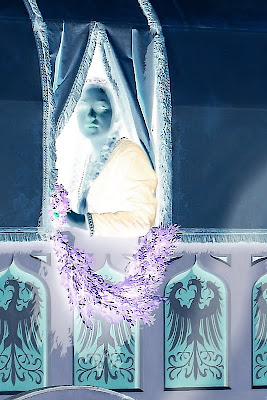
Areas with no density, other than film base+fog, will have absolutely no detail, and tone. Areas that are pure black will have no detail and will be pure white. Knowing how the density affects photos, you can do a bit of editing on your image after converting it to negative. In Photoshop, this is done by inverting the image, or CTRL-I. In Lightroom, it’s the same. In Paintshop Pro, it’s under the Image Menu- negative image.

Here are 2 conversions of digital photos, taken with a Canon digital SLR, one in color and one black and white.
Hohenfels Volks: A Lady in Waiting
This is a color photo converted to negative. Look for the original in my works.

Hohenfels Volks: Developing for your vision
The photo we used in our last post about developing for your vision

Once you’ve done your conversion, you can clone out dust, with greater accuracy if you’re messy with the mouse. Another great thing about this feature is the ability to bring out detail in your highlights. Digital doesn’t deal too awfully well with blown highlights, but you can recover small amounts of detail by converting to a negative of your image. This is great for working with skies and snowy areas. It’s possible to recover some in the shadows, also.

The caveat is that there must be information there, or it will be less effective.

You can also increase your control over your tonal range by performing level and curve adjustments on a negative layer, then inverting it. When working on a color image, be aware, that subtle changes to exposure can be localized to perhaps a small portion by extraction that selection as a layer and converting it a negative. It allows you to expand the tonal range of any color, or the whole image, in ways that can be very impressive. You can also diminish some colorcasts! Colors are inverted in a negative, so keep that in mind, or you’ll end up all abstract and disappointed, unless that’s your vision! It’s almost like working with a large negative.

Using the tools taught to us by those who were taking photos when our folks were kids, we can learn to improve our digital art. Using your vision, seeing both the negative and the print, you can begin to get some awesome stuff going on. Give it a try and see how it works with your vision and your exposures. If it's something you're happy with, post the results, we'd all like to see!

Don’t forget to post any of your images you’d like to see here at the Hohenfels Volks Facebook page. Of course, commenting on both Facebook and here is always appreciated, too! Don't forget, we're on Google+, too!

Tuesday, February 21, 2012

Developing for Your Vision

Greetings, volks. Welcome to Hohenfels Volks, THE place for our place! Welcome to another delayed post.

Lots of things going on have delayed posting for several days, yet again! So here we go, continuing our last post about exposing for your vision.

We posted a photo that we referred to as N development, or normal. That going to be our starting point. Going back to our RAW conversion, we’re going to change that some. Since I use Canon’s Digital Photo Pro that came with my camera, I’ll refer to that.

Our first step is to adjust the slider for exposure. I took it down to -.33 stop. That added some depth to the sky and brighter areas, allowing for some slight texture and tonality. Then I set the white balance to color temperature, at 4200. You’ll see why I did that later.

After that, I crushed in the levels some, the method is shown below. That increases contrast and allows you to bring your levels at the extreme end in some. It gives deeper shadows and highlights. Some of this will be offset, while allowing the levels to be set in our next step.

Hohenfels Volks: Crushing levels
Looking at the arrows, you can see how the levels are crushed in using your sliding limits. This adds clarity, contrast, and depth to an image.

Bringing the contrast up to 2, and the highlights to –2, allowed for some slight increase in highlight detail along the snowy roof of the church and in the snow on the fields. Bringing the shadows up to +2, added depth to the forest and some detail to the church tower and tonality to the almost black barn. It also allowed the shadows to move higher along the exposure scale, increasing the open feeling of the spaces and the shadows from the buildings.

After setting my monochrome filter to red, which darkens greens and blues, the snow appeared brighter without fading or washing out, while adding some shadows back to the open parts of the further hill and forest. Adjusting the color temperature down to about 3900 cleared things up a little.

After rotating the image to a more suitable angle, due to my camera not being level while I shot, I was ready to sharpen, convert, and save. Below is the finished image.

Hohenfels Volks: N-.3 village outside Hohenfels
ISO 400, f/16, 1/500, 115mm
Our finished shot of this charming village.

Here is the photo in color with almost the same settings, with the biggest change coming from the color temperature. Outdoor shadows, and snow, usually have more blue light, so bumping up the color temperature allowed for white snow, blacker shadows, and still retained the color on the far hills.

Hohenfels Volks: N-.3 village outside Hohenfels
ISO 400, f/16, 1/500, 115mm
Our color shot of this charming village.

Some small edits in RAW can save tons of time fixing photos. They also allow us to create our vision, not just re-create what we saw. Using some dodging and burning tools and sharpening brushes, as well as the other tools, in editing applications can further that vision to a concrete expression of what our mind saw and wanted to show.

I hope to see some of your vision soon! Start sharing your work and showing us how you saw something, not what you saw. Making great photos is a great way to spend some time, and get in touch with the world around you! I hope you have a wonderful week and enjoy the weather we have right now!

Don’t forget to post any of your images you’d like to see here at the Hohenfels Volks Facebook page. Of course, commenting on both Facebook and here is always appreciated, too! Don't forget, we're on Google+, too!
Wednesday, February 8, 2012

Editing For Pre-Exposure?

Greetings, volks. Welcome to Hohenfels Volks, THE place for our place! I hope everyone is warm and well, and that you got the shot you wanted today!

Today we’re going to deal with an editing technique based on old film shooting. I know this was supposed to be another Around Hohenfels, but that didn’t quite pan out the way I had planned.

Back in the film days, you couldn’t change film speed mid roll. You also had some interesting things going on. Film often had a wider latitude for exposure errors, especially for overexposure, but even underexposing allowed film to still work out, if you knew how to make it. You could shoot with ISO 200 settings on ISO 100 film, and push the processing for ISO 200, and save the shots. There were several techniques for saving the shot, including push processing, pull processing, and pre-exposing. When shooting RAW format, most conversion applications, like Canon’s DPP, can be used to correct an exposure by up to 2 stops either direction. Using the exposure setting that way, though, you affect the entire image, not just certain areas. Using most image editing programs, you can dodge or burn areas to meet your needs, as well adjust your curves and levels. In fact, most applications have the common dark room tools, which is why they refer to them as a digital dark room.

Rather than discuss those choices at this time, we’ll address pre-exposure. I chose this topic, as most image applications don’t have a feature that allows that directly. Rather, you have to use a round about method to obtain similar results, and that’s what we’ll discuss today. Pre-exposing film allowed the photographer to bring out detail in deep shadows by adjusting them to higher levels or zones. By pre-exposing a hot, then shooting over that pre-exposed frame, light intensity could be raised. If you wish to bring out detail in zone 2 shadows, you could pre-expose for zone 1 or 2, then shoot for a correct overall exposure and get those elusive shadow features. You’d need to take a gray card or translucent plastic/glass, meter it exactly along your image axis, and set your exposure accordingly, then shoot the scene. You could push, pull, or otherwise develop according to your plans, and print the same. We’ll be simulating this technique. I’m going to use this image as an example.

Hohenfel Volks: Passau skyline, pre-exposure original
ISO 100, f/5.6, 1/500, 55mm
The Passau Skyline!

First, select your image, and open it in your editor of choice. Whether you use Photoshop, GIMP, or Paintshop Pro, the basic are the same, but your application needs to support layers. Once your image is open, make a new layer, and select your color selection tool. Click on the shadows you wish to open up and increase the details. Before closing, look at the settings or options for that color and increase the values by the desired amount. For this image, I chose the trees in front of the church, which came out to R-7, G-7, B-7, L-7, and doubled them all to 14. This was still in zone 1, digitally speaking, but when combined at the end, allowed for a slight bump in the shadow detail.

With that being done and applied, select your bucket too and flood fill the new layer with that color. You should have something solid, in your selected color or tone. Set you blend mode to screen, and watch the magic start. All your levels will increase except the brightest areas. You will notice a decrease in contrast as well.

Decrease the new layer’s opacity until you have a set of results that are satisfactory. Now, select levels adjustment, and crush in the curves ever so slightly. This will increase your contrast, without removing too much detail from your shadows. You can apply a curves adjustment and a clarify adjustment if you desire. Now you should see something that is pleasing to your eye, and has more detail in the shadows.

In the days of film, you shot for the shadows, to preserve detail. This often meant slightly overexposing your shot, and printing to retain the detail in the highlights. By pre-exposing your film, you had a way to create more detail without giving any up on the other end. Because exposure was cumulative on multiple shots at the same frame, you could add light as needed. The reason for dark areas benefiting most, was that you added light uniformly across the image at the same level, but your exposure of the image was not uniform. Using just quick numbers to demonstrate, at level 2, when you add 2 units you double the level. At your highlights with say 100 units, you add 2 units and the results are almost unnoticeable due to the ratios. This works in digital the same way, when you select screen mode, you only lighten values lower then your selected pre-exposure layer. Although there is some small effect at slightly higher levels, it is less drastic. By varying the opacity of the layer, you can control the effect even more. Adding masking to allow only certain areas to be painted in gives you complete control!

Here is my final image. Not a large change, but enough to bring out some of the detail within the trees. This works best with images without a large amount of bright spots or too much contrast, but this image was useful. This shows you what a little bit of old time darkroom work on today’s technology can accomplish.

Hohenfel Volks: Passau skyline, pre-exposure finished
Same as above, with pre-exposure.

Well, that’s it for today. Keep shooting, keep seeing the light, and keep your love of our art going with frequent sessions behind the lens! Don’t forget to vote and to get your works in for this week’s theme!

Don’t forget to post any of your images you’d like to see here at the Hohenfels Volks Facebook page. Of course, commenting on both Facebook and here is always appreciated, too! Don't forget, we're on Google+, too!

Friday, January 27, 2012

Rice? Sand? Nope, It's Film!

Greetings, volks. Welcome to Hohenfels Volks, THE place for our place! Well, so much for no snow here in Hohenfels.

As promised last night, here’s our post on editing your digital images for the film look. We’re going to be using GIMP with some script-fu plug-ins. Even though we’re assuming you use and have GIMP there are 2 things before we begin; 1- these concepts apply to Photoshop and Paint Shop as well, but may be called something else, and 2- choose an image you think would look good as a film shot, and let’s get ready.

hohenfels Volks: Starting out, in B&W
ISO 125, f/4.5, 1/60, 53mm
We're going to start with this image. You can see the settings above. It was shot monochrome on the Canon EOS 7D, with a red filter applied and some very minor crushing of levels.

First, open GIMP. When it’s finished loading, select Open from the File menu. Navigate to your image and click Open. Once your image loads, right click on the layers palette and select Duplicate Layer. This is the layer we will be using as our background, which allows us to perform our edits without actually touching the pixels on the original image. Right click on your background and select Delete, leaving only the duplicate layer.

Right click on the duplicate layer and select New Layer. In the dialog box, Name your layer grain and select Transparency, then click OK. Make sure brush color is set for 50% gray, although darker shades will increase contrast and lighter shades will decrease it. I generally choose a darker shade to get an older style feel to the image, but the choice is up to your style and taste. Choose your Flood Fill tool, AKA Bucket Tool, and click inside the image area with your grain layer selected. You should see nothing but your selected color now. In the Mode drop down select Overlay. You can see your image now, although it will have some contrast changes.

Click on your filters menu. Select Noise, and then select Hurl. In the dialog box that appears, click the New Seed button, Then adjust your Randomization slide for about 10-15% and your repeat for 1-5. Then click OK. Your image now looks slightly contrasty and noisy, and quite unappealing. From the menu bar select Colors, then Hue-Saturation and decrease your lightness slightly and your saturation all the way down. Things are looking better, but it still needs some work. Go back to your filters menu and select Blur. From there, click Gaussian Blur. Set your radius to about 1-1.5 and click OK. The noise now looks like the grain on film, but we’re not done yet.

Next, select your background. Click on Script Fu in your menu and go to Sharpness. Select Sharper and finally click on High Pass Sharpen. Select your desired level of sharpening and click OK. You now have a new layer that is the sharpening level and looks like the lines from your original. Click the Eye Button to turn off your background.

Go back to the Colors menu and select Brightness-Contrast. I usually bring the brightness down, around 30 for most B&W photos, and increase the contrast to about 25, then click OK. Click the eye on your background layer again, turning it back on. You should be about right. The grain, contrast, and sharpness should be about what you’d expect from a general use film like ISO 200-400. If it’s too grainy, blur your noise layer in .25 pixel steps until it looks good. If your contrast is too high or low, adjust the brightness or transparency of your grain and sharpened layers.

And here's the final product. Although at this size, the grain isn't quite as prominent as it would be zoomed in, you can see the difference and the impact adding grain can have.

hohenfels Volks: finished grain in BW
This is more film like, although not quite as contrasty as pushing a little more could make it. Higher contrast can make for some nice old time photos that bring people back in time.

It isn’t perfect, but with some practice, patience, and trial and error, you can get something that looks like real film. Photoshop has plug-ins to do, as does GIMP, but the results are more natural when done manually. One important thing to remember is to make sure you remove all saturation from your grain layer. If you don’t, you’ll end up with colored noise that has no resemblance to film grain.

I hope you're working on your shots for the theme! Have a great weekend and shoot that trophy photo you've always wanted!

Don’t forget to post any of your images you’d like to see here at the Hohenfels Volks Facebook page. Of course, commenting on both Facebook and here is always appreciated, too!

Friday, January 13, 2012

Quick Touch Ups

Greetings, volks. Welcome to Hohenfels Volks, THE place for our place! Time for a quick post.

With the announcement and release of Lightroom 4 Beta, I thought we’d have a quick hit on image editing. We’ll be short; there won’t be anything in depth here.

Let’s start out by saying shooting RAW is the best way to go. It gives you more control and latitude in your exposure and color. The best way to edit is in head, then in camera. What does that mean? It means get it right before your expose your image. Make sure your settings are correct for your exposure and focus. It means less time fixing and more time shooting. I know we all love shooting more than we love fixing our images.

Once the image is on the computer, you have to convert from RAW to JPEG. I use Canon’s DPP. It was bundled with my camera, and I’ve updated it whenever a new version is available. Once your Raw is in your converter, make any exposure corrections you feel are needed. Then adjust your contrast, followed by minor levels adjustments.

To adjust levels, drag in the top, bottom, and sides of your histogram to get the contrast and levels right. I usually do a little crushing of the highlights and shadows, nothing more. This pops your contrast without affecting the entire image as much as the contrast adjustment. By clipping your shadows to black a little and your highlights slightly less, you create some pop to a properly exposed photo.

A touch (+1) to saturation, then finish with sharpening to make the image crisp, and that’s it. For most images, this is all you need! Convert your image and save it, and you’re done. Remember to make your resolution match your intention.

That’s all I’m going to cover for editing today. Everyone has there own vision and style. I just wanted to get the idea of getting it right in camera across, and to get folks thinking about their own editing styles.

Editing is a lot more than this, though. The amount of tools available in applications ranging from Corel’s Paintshop Pro and Adobe’s Lightroom is enough to create magic with your images. Maybe we’ll touch on that editing in another post, how we can fix minor issues and make our work that much better!

Vote now for the next theme, get your pics going, and submit them to our Facebook page. Let’s try to get more Volks participating, the more we have going on, the more opportunities we’ll have to make our photos better, and to share that love we all have of photography with others like us! Have a great weekend and enjoy the shooting!

Don’t forget to post any of your images you’d like to see here at the Hohenfels Volks Facebook page. Of course, commenting on both Facebook and here is always appreciated, too!