Showing posts with label color. Show all posts

Saturday, October 5, 2013

Autumn Leaves

Greetings and welcome to Hohenfels Volks, THE place for our place!

“Autumn...the year's last, loveliest smile.”
William Cullen Bryant

"Autumn is a second spring when every leaf is a flower."
Albert Camus

“On this autumn mountain,
Tumbling yellowed leaves,
For just a moment
Cease your scattering
For I would see my beloved's home.”
Kakinomoto No Hitomaro

William Cullen Bryant was a famous 19th century American poet. Albert Camus was a French philosopher and member of the resistance during the war. Hitomaro was a famous poet and court noble in the 7th and early 8th centuries, and is revered as one of the “36 Poetry Immortals” of Japan.

All 3 quotes are reminders of how autumn can be a wonderful season. The Season of color and clarity is upon us, preparing us for the dark and cold days ahead. The joys we experience in autumn can last a lifetime! Childhood memories are always rekindled with the tasted of fresh cider or just picked apples. Pumpkin pie and Halloween, not to be outdone compete with colored leaves and apple pie!

For the moment, though, we’re leaving the memories for later, when we’re each on our path. We’re going to give a few short pointers for dealing with autumn colors and shooting.

The easiest thing one can do when dealing with autumn’s majestic colors is to simply underexpose by 1/3 to 1 stop. Meter the area you’d like to see an increase in saturation, then set your exposure 1/3 to 1 stop less. To do this successfully, you have to make sure the rest of the scene is within the range of your cameras sensor. When you desire to increase saturation, underexposing will always help. This is because saturation, in simple terms, is generally inversely proportional to the reflected light. A lower luminance value will usually appear more saturated than a higher luminance.

Hohenfels Volks: Lanu Mimita
ISO 100, f/16, 1/15
Lanu Mimita, Samoan for The colors are bold. This was shot in Dietldorf, a couple years ago. By underexpsoing slightly, and lowering the levels using the levels adjustment tool, saturation is increased. With some slight tweaking of color temperature the scene can be rendered to replicate the feeling of that wonderful day, time spent with family, and the big, hot, cocoa that followed the making of this image!

Another important thing to try is changing up your compositions. Since you’re likely to be shooting color, you’ll want to use composition to enhance the brilliance of your image. This can be used to either increase your subject’s importance or bring a saturated subject in line with an element having a lower saturation, while maintaining the distinction. Composition needs to be strong with higher levels of saturation to prevent the color from creating distractions or becoming a crutch.

If you wish to shoot black and white, autumn is a wonderful time to try it. If possible, use real filters on your lenses, as they will give you better renditions of the contrast inherent in your image than software alone. Editing your image should be done on multiple layers, especially if you desire to simulate different filters. A red filter will leave your reds, oranges, and yellows bright and your greens and blues very dark. An orange filter will have less impact but the results are similar. It's all about how you visualize it! Filter pack plug-ins for Photoshop are available, and Tiffen makes one for stand-alone use.

While these suggestions are a good place to start, I highly recommend getting out and making some shots. Try these suggestions, and any others you come across and feel comfortable with. Also remember, you’re the determining factor in your image’s value. If you like it, than show it off, definitely share it here, and be proud of your work.

We want you to share your photos with us on our Hohenfels Volks Facebook page. You can also e-mail questions, photos, or comments to HohenfelsVolks(at)tks-net.com, and we’ll get them posted!

Is there anything you’d like to see here? Do you have a question? Share your thoughts here or at the Hohenfels Volks Facebook page. Of course, commenting on both Facebook and here is always appreciated, too! Don't forget, we're on Google+, too!

Monday, September 23, 2013

Improve Our Seeing

Greetings and welcome to Hohenfels Volks, THE place for our place! Hohenfels is getting ripe for photographic opportunities. Within the next couple weeks, the “autumnal fireworks” will really be in swing. Time to explore our areas and get your images made!

Today we’re going to provide a couple exercises to get you thinking about your photography and small ways to improve.

First up, we’re going to look at the use of tone and tonal variations to improve our shots. The exercise is simple enough. You’re going to need a couple lightly textured items to photograph. A couple differently colored towels or pillowcases will suffice. The object is to learn how our exposure impacts our tonal ranges, and how tones translate into an important element of our final image.

It’s best to use red, green, and blue items, but whatever you have at hand will work. Set up your item and meter it. In manual mode, set your exposure to give you –3 stops exposure and make a photo. Repeat for every full stop between –3 and +3 stops. You’ll have 7 photos. Do that for the other colors. Compare them in your image editing application, and see how the saturation, texture, and feel of each color changes with the different exposures and colors. Then take the same series of photos, but put your different items in the same frame. Finally, convert the last series to monochrome, and review one last time. After reviewing them all, you can see the difference in tones and moods. This is a big part of visualization, knowing how your camera’s rendition of color and light will present itself in the final image. It’s a simple exercise that does more than give you that knowledge; it also shows you what your camera can do. By knowing that there should be texture through all the shots, you can identify where your camera begins to lose that texture. Hey, since it’s autumn, you can combine the shots with more than all you colors into making something to hang on your wall by shooting something of the autumn around you.

Hohenfels Volks: Technicolor Pathways
ISO 100, f/15, 1/25
One of my older photos, taken just outside Hormansdorf. The track to the field was dappled and the tonal range of the colors brought to mind something from childhood, a reminder that God's beauty is everywhere. Notice how dark and light tones of the same color come into play here, creating contrast and enhancing the feeling of magic.

The next exercise is patterns. Learning to recognize patterns is something we all naturally do from an early age. But, patterns can be subtle or glaring. Stucco has a nice texture, and can have something of a pattern to it if you observe it long enough. Decorative tiles, clothing, and even bark will present something to create the feeling of a pattern if you open yourself to it.

The exercise is shooting 5-10 photos of patterns around you. This can be the tracks from a tractor in a just harvested field, the still tall rows of corn, your hounds-tooth pants, anything presenting a pattern. Corn on the cob present a nice pattern that can be presented and intensified by including the green of the husk and the golden caramel brown of the outer silk. They’re everywhere once you open up to them! It’s a great way to add interest to your photography, and bring you into a closer relationship with the scenes we take for granted every day. There is so much in God’s green Earth to see and feel, that an entire lifetime isn’t enough to experience it all!

I hope everyone will get out and make some photos, both for the exercises and to celebrate autumn’s beauty. There’s no time like now to get shooting! Figure out where and when, the rest will follow. Then, make your shot and share it with us on our Hohenfels Volks Facebook page. We’d love to see your work.

Is there anything you’d like to see here? Do you have a question? Share your thoughts here or at the Hohenfels Volks Facebook page. Of course, commenting on both Facebook and here is always appreciated, too! Don't forget, we're on Google+, too!
Sunday, September 8, 2013

Jaunty in Hohenfels

Greetings and welcome to Hohenfels Volks, THE place for our place! Several days of beautiful weather have made life comfortable here in Hohenfels and our surrounding areas. Bayreuth last weekend was especially beautiful, as the clouds and lighting made for some magnificent wooded shots. Yesterday’s clear skies made the Nuremberg flea market, scattered throughout the old parts of town, a place full of photographic treasures.

Today’s post is short and simple. We’re going to talk about day jaunts to local areas. We’re not going to expound too much on places, it’s more about finding and making photos we like. Expressive images make the creative process a reward in itself, and being prepared can make a big difference.

I’m planning a mid-Autumn trip to Bayreuth to make some photos. The intent is to make some beautiful photographs of the autumn state at a couple places there. The first one is the Hermitage. I fell in love with this place on my first visit. The lighting, textures, and wooded areas make for something magical. The second one is at the New Residenz, which is similar, but has a completely different feel. I also hope to make a portrait or 2, and shoot some slide film.

The reason I mention that, is our main reason for the topic today. When we make our jaunts and trips, it’s always a good idea to know what to expect. By making a trip or 2 in advance, and maybe some shots of our ideas, we can be prepared for the situations we’re likely to encounter. For instance, at the Hermitage a reflector is a good idea. On a sunny day, it can be used to fill in the shaded areas with light streaming through the trees. Because of the large volume of trees, autumn will increase the warmth of the light, and a clear day will help keep it from going to warm. In Regensburg, I might rely on a golden reflector or gelled flash, as the light in the park by the bahnhof feels quite different. In either place, flash and gels are vital to getting a portrait to be more in line with our vision and intent.

Around our area, going place to place is simply a matter of taking the train. A train to Bamberg doesn’t take too long, and can lead to some quiet contemplation of what our intentions may be. We can also relax on the way back and reflect on our efforts. Trains also provide an easy way to scout a location. They run close to our own schedules in most cases, and we can leave when we see fit, or stay as long as we want. Avoiding the traffic allows for more insightful planning and reflection.

Hohenfels Volks: Rebirth In Bayreuth
ISO 1600, f/8, 1/30
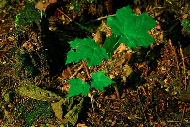
Rebirth in Bayreuth. Green against orange. Leaves intensified by shooting with a yellow filter. Yes, black and white filters can be used on digital cameras. By bringing out the green slightly, the leaves are made to stand out. Just a small fraction of the beauty in Bayreuth. The leaves growing from amidst the decay of an older tree brought a sense of rebirth, and second chances, the shallow DOF allows a more meaningful contemplation. I plan to re-do this shot when the leaves are changing for a different mood.

On another note, I’m hoping we can get some volks to contribute a small article about a place they like to shoot, and maybe some pics. It’ll help flesh out our “Your Works” and “Our Places” pages, and help others out with their day trips.

I hope all of you will get out and plan a day trip to make some shots. I also hope you’ll share it with us on our Hohenfels Volks Faceboook page. We’d love to see your work.

Is there anything you’d like to see here? Do you have a question? Share your thoughts here or at the Hohenfels Volks Facebook page. Of course, commenting on both Facebook and here is always appreciated, too! Don't forget, we're on Google+, too!
Wednesday, August 22, 2012

Basic Calibration

Greetings and welcome to Hohenfels Volks, THE place for our place! Hohenfels was greeted this morning with the sky belching great flashes of light and a seemingly torrential downpour that lasted all of 15 minutes. Of course, our area spent the rest of the day under blue skies and wonderful cloudscapes.

Heading out to Regensburg to get some prints done, I was struck by the fact that we also place faith in others when we hand over our precious photos for processing. Of course, that faith was justified today when I saw the prints from this weekend.

Today, we’re going to touch a little on calibrating your monitor. We’re not using anything fancy, or doing too much involving more than the basic monitor settings in Windows.

For black and white work, I recommend heading over to Ilford and downloading their Monitor Set-Up Print chart. Get the chart printed at your favorite vendor; I use MPIX or Photohaus Zacharias in Regensburg.

When you get the print back, adjust your brightness and contrast settings with the image on display. Make the displayed image match the print, then save your profile. That’s it for Black and White. It should provide good brightness and contrast for general photographic use, as well.

For color, it’s a little more involved. Head over to Digital Dog and download their printer test file. Again, you’ll need to get it printed. With print in hand, make your adjustments in Windows, only this time you’ll want to adjust your color settings as well. Saturation and hue may need adjustment, and possibly your individual colors. Once everything matches, save this profile as something different.

When you’re working on color images, load your color profile before your edits. This will match your colors and levels between the display and the printer. The same applies for Black and White. Knowing your levels through calibration will make your prints match your vision far more closely than an uncalibrated monitor will. It also allows you to work more accurately.

I hope this helps; it works, and leads to great prints. Enjoy the rest of the week, as Hohenfels slides into the weekend. Create something stunning, and share with all of us!

Please feel free to share your photos on our Faceboook page. Everyone here would love the chance to see your work! Is there anything you’d like to see here? Do you have a question? Share your thoughts here or at the Hohenfels Volks Facebook page. Of course, commenting on both Facebook and here is always appreciated, too! Don't forget, we're on Google+, too!

Monday, May 14, 2012

Color Balance and Exposure

Greetings, volks. Welcome to Hohenfels Volks, THE place for our place! After a chilly weekend and a wonderful Mother’s Day with the family, it’s time to get back to the regularities of life, which includes plenty of time behind the lens. Let’s hope a nice week present Hohenfels with some great photo ops and we have our cameras ready!

Today we’ll discuss a little bit about color, color balance, and the impact they have on exposure. We most often see the impact when shooting B&W, but in today’s digital age, we see it more and more. So let’s get started.

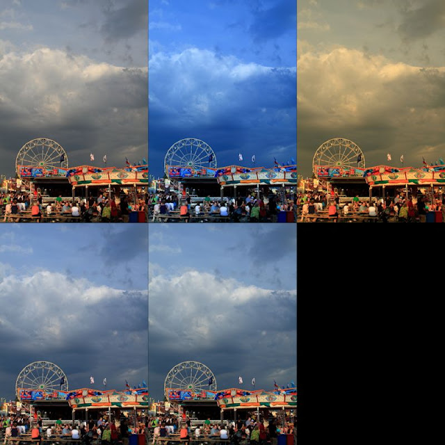
Most of today’s sensors seem biased toward the red. When you decrease the amount of red in the scene, you decrease your overall exposure. Over the course of editing photos and correcting color balance, you’ll start noting that decreasing the color temperature toward 4000K or lower a decrease in brightness generally occurs. This is especially true when using redder lights or in daylight shots. This can be clearly seen in the following series of images. All the settings are identical, except the color balance, which was set for to display this.

Hohenfels Volks: Color and Exposure
Top row L-R; no color balance, 3600K, 8700K Second row; click for the flag, click for the clouds. Notice the apparent changes in both exposure level and contrast.

Color balance also affects your exposure for black and white shots, even digital ones. You can see this in the shots below.

Hohenfels Volks: B&W Color exposure
Here we see the impact of color balance on black and white. The left is set for about 2700K and the right is 7000k.

By adjusting your color balance, you can correct your lighting to match what it was during your shooting. Doing this digitally without balancing your lighting through the proper application of color matching gels or matching your light sources can lead to issues that seem insurmountable, and may well be.

The best method to create proper color balance is to use a white target made for color balancing photographs and setting up a profile for that lighting situation. When you’re shooting a gathering for instance, set your custom white balance using the white target in the actual lighting conditions that you’ll be shooting in. This will enable you to have your white properly balanced, and enable batch white balancing. When shooting RAW this is the preferred method, as it can easily be changed should the results not be to your taste. Another method is to shoot a white balance shot as before, then only apply it where needed during RAW conversion. Of course, in situations like gatherings and events, I’ve found the best results to be obtained by shooting a white balance shot for each direction I’ll be photographing and applying them based on the shots. You usually get better results in mixed lighting this way.

When taking your white shots, make sure to frame the white card so that as much white is showing as possible. I find keeping some of the scene as reference helps when doing multiple white balance shots, so that I can remember which direction the shots were made. You can also use an 18% gray exposure target card, as long as there is no color in the card itself other than gray. Often times, the dyes used can lead to odd colorcasts. This is also true for white cards of lower quality. I used one once that showed up green on all the test shots I made. The actual shots would have been wasted if I had been shooting JPG and not RAW.

All this leads to this week’s exercise. Set your camera to monochrome and shoot a series of shots in different lighting. When you import the RAW files to your favorite converter, adjust your color temperature and see how it influences your exposure levels. Then try to apply several monochrome color filters and see the changes. Then set your picture style to one of the color modes and change your color temperature. You will see in all the cases, your exposure will change over different parts of the scene. Remember how you affect the scene, and when you’re out shooting apply that knowledge to your exposures. You’ll see things different and improve your work!

Time to get out and do some shooting, I hope you’ll be out today getting your shots in, too! Make some for us and share the wealth!

I’m looking forward to seeing your results and hearing from you. Let me know what you think and how you’re using your camera! Share your thoughts here or at the Hohenfels Volks Facebook page. Of course, commenting on both Facebook and here is always appreciated, too! Don't forget, we're on Google+, too!

Thursday, April 26, 2012

Hohenfels; Bursting!

Greetings, volks. Welcome to Hohenfels Volks, THE place for our place! Spring is upon us finally. Hohenfels is bursting to life with the colors and sounds of renewal. This is truly a great time to be out and about, making photos and capturing a fleeting moment of the glory that surrounds us.

Today I’m doing a short post; things have been busy and trying the last few weeks. We’re going to take a short look at capturing fireworks. This is by no means a full list of tips, but something to think about.

The first thing to consider is a tripod! You’re going to need something reasonably sturdy and level when the legs are extended. Another thing to consider is ease of operation, and adjustability.

The next thing that is a must have is a remote release. Without one of these, a steady tripod is more or less useless. This little item, reasonably priced at any photo shop, can make an image stable. Just the act of depressing the shutter release can cause some serious vibration. Another advantage of using a remote trigger or release is the ability to view the scene while you shoot. Just set your composition and focus, and then enjoy the show while shooting.

Make sure you use a lens that is short enough, yet long enough. Too short, and your shots lose the feeling that comes form small town fireworks, and too long you end up without any context.

Set your ISO to 200, or 400 depending on your intentions. Then set your aperture to f/8 and your shutter speed to B. Time your shots to the start of a volley and activate the shutter. Hold your release button for anywhere from 10 to 30 seconds to get a nice full burst and some detail from the area, then release. Over the course of a 20-minute show, you can get some really amazing photos.

One more thing, if your camera allows it, activate your mirror lock up feature. This will lower the vibration even more. Don’t forget to turn off you image stabilization or you’ll end with some blur.

Keep in mid your visualizing and composition, these can make a great shot into a real winner!

Don’t forget to post any of your images you’d like to see here at the Hohenfels Volks Facebook page. Of course, commenting on both Facebook and here is always appreciated, too! Don't forget, we're on Google+, too!

Friday, April 6, 2012

Golden Blue

Greetings, volks. Welcome to Hohenfels Volks, THE place for our place! I trust you’re ready for Easter, as we move into the holy weekend.

How are things going with shooting only 1 focal length? Have you worked through the limitations and found the strengths associated with your chosen lens or focal length? This weekend should provide many opportunities for working the exercise. Easter processions, children pushing carts to tell the time, family gatherings, and of course, the ubiquitous Easter fountain in every village. Work around your subject and see the angles, the lighting, and the lines. Enough on the exercise, though.

Today we’re going to introduce a couple concepts you may know about. The first is “golden hour” and the second is “blue hour.”

First up, the “golden Hour.” The golden hour is typically the first and last hour of sunlight in the day. It’s usually the hour after sunrise and before sunset. During this time, lighting is softer and more diffuse. The light also takes on a golden or warm hue and imparts warm tones to your overall image. It makes for some great landscape shots, and when applied to portraits makes for some magic images. It allows for slightly longer exposure times, and in the process adds detail to shadows and prevents blown highlights. Of course, that all depends on your exposure settings, but we know about that. For landscapes, it impacts color and saturation in desirable and magical ways. Artist were painting during this time hundreds of years ago. They knew the magic and its impact on their art, now you do, too.

The “blue hour” is the time between full dark and daylight. It generally refers to the period of twilight that is neither dark nor light, and is thought of in terms of the hour before sunrise and after sunset. The lighting is very soft and cool. It lends itself well to landscapes and cityscapes, but also to sea and waterscapes, where the light can compliment the water’s darker blues and blacks. It works great also with night lighting by signs, windows, and other warmer light sources. The blue hour comes on quick, nipping at the heels of sunset, or ushering in sunrise. Get to your chosen location early in the evening, shoot through sunset, and then be prepared for some incredible twilight shots. I encourage you to try some portraits during this time. Bring a couple flashes and click away for some dramatic results.

I hope this has given you something to consider the next you’re shooting our Hohenfels area in the evening or pursuing the perfect sunset photo. Remember to stick to the exercise over the weekend and look for next week’s on Monday. Enjoy the weekend and Happy Easter to all. God bless!

Don’t forget to post any of your images you’d like to see here at the Hohenfels Volks Facebook page. Of course, commenting on both Facebook and here is always appreciated, too! Don't forget, we're on Google+, too!

Tuesday, April 3, 2012

Color and Perception

Greetings, volks. Welcome to Hohenfels Volks, THE place for our place! How’s everyone faring with this week’s exercise? I trust you’re seeing things take shape.

Today we’re going to take another look at metering. From previous posts, we know that we can control our exposure by increasing or decreasing our exposure time or aperture to achieve the levels we want. For instance, making a white cloud white, while retaining its texture, we’d meter the cloud and add 2 to 3 stops of exposure. If we add 2 stops, we can further close the distance between our vision and what we shot.

Today, we’re going to look at how color and saturation work with exposure to give us a better rendering of our vision. Generally, we perceive saturation different than reality. In the most general of terms, saturation appears more thorough in an image when we darken it by some small amount and increase our contrast.

The reality reason for the apparent change in saturation is the actual change in chrominance. Chrominance relates to the levels of luminance present in each particular color. For instance, taking an RGB value of r=100 and increasing it to r=200 increases the chrominance, without changing the saturation. We perceive a difference only because of the resulting change in luminance. This is an extremely basic and simplified explanation, but helps to understand what we’re discussing next.

By knowing what we just discussed, we can change the viewer’s perception of the saturation in our scene, and therefore the mood we’re trying to convey. Without knowing the above and the basics of color theory, it becomes difficult to use color in our compositions as a tool of our message or mood.

By increasing or decreasing our exposure for a certain color’s luminance to create the color we visualized, we can change our message, theme, or mood some. We also change our perception of a color’s saturation, giving either a rich look or a washed out appearance. Try taking some shots of a strong color in a scene at various exposures and comparing the results. For a more noticeable impact, you can try a brighter color in a darker environment or vice versa. As you range through several exposures, you begin to see how our key and our brightness change. You’ll also notice a change in feeling as you view your images.

By throwing a bit of the color and saturation into your metering, you’ll be better equipped for this week’s exercise. Changing your vantage will change the luminance available to you, and require ways to get around the change in feeling that comes with it. Keeping your vision in your mind as you change vantage points, and knowing that exposing for a particular color or set of colors, you can put your original intent across.

I’m looking forward to seeing the results of this week from everyone, and hope the rest of this week treats you well!

Don’t forget to post any of your images you’d like to see here at the Hohenfels Volks Facebook page. Of course, commenting on both Facebook and here is always appreciated, too! Don't forget, we're on Google+, too!

Tuesday, March 13, 2012

Color Contrast in Monochrome

Greetings, volks. Welcome to Hohenfels Volks, THE place for our place!

Today we’re going to talk about using digital filters for black and white, and color contrast to bring our vision to our images. We’re going to walk through a few different colored filters in our RAW conversion software.

Referring to Canon’s Digital Photo Pro for our software portion, we see that the first thing is to set our picture style to monochrome. After doing that, you’ll notice that color tone and saturation sliders change to filter effects and toning effects.

Once we’re into monochrome picture style, set your white balance to color temperature and play with the slider a little. This will give you some idea of your sensor’s spectral response to color. For instance, raising your temperature from 5200 to 10000 may give a giant boost to your brightness, showing a larger response to red. Lowering it to 3000, seeing a boost would indicate a greater sensitivity to blue and green.

Now that you have some idea of its response to colors and temperature, we can understand how to work our monochrome images for maximum effect. Select the first filter choice as we drag our slider, yellow, and adjust your color temperature. Going either way with your temperature shows a slight shift in brightness throughout the range. As we get lower in temperature, we have less lightness, and more as we raise the temperature.

Selecting an orange filter shows a more pronounce version of the yellow filter’s response, due to an increased presence of red in the light being allowed through the filter, or in our case, allowed to impact the image by software. Moving on to red, we see great swings throughout the temperature range. At 2500, we see our greatest darkening and at 10000, we probably see something washed out and so high in contrast to be unusable.

Going to our last filter, green, we see almost no change as we shift through the temperature range. Since light is composed of all the colors, but most of the time less of the green, we see less impact. Green has a more pronounced effect in film photography than digital, though.

OK, now we’ve seen some pretty cool ways to improve on our vanilla black and white conversions. Let’s move to some interesting ways to use those filters. Select standard for your picture style. Selecting your RGB tab, you can choose between luminance, red, green, or blue. As we cycle through the colors and make adjustments, we end up with a pretty scary image. The color is ugly and unnatural. No that you’re someplace you think might work well with a colored filter, select saturation in the RGB tab and drag the slider to 0. Without saturation, there will be changes in lightness and brightness, but no real change.

Going back to your RAW tab, select monochrome, and choose your filter. Select color temperature. Once your color temperature is about where you want it, go back to the RGB tab and start playing with your color and lightness sliders. Notice how things change as you drag them around? Well, once you have your image about where you want it, you can either save it or finish it here. The reason for going into the color sliders goes back to our discussion on color theory. By adjusting our color curves, levels, and contrast, we can make some very nice black and white images with our initial RAW conversion.

Once you have your image about where you want it, you can save it and open in another editing program, like Paintshop Pro and split the image into CMYK or RGB layers and adjust it even further, or just play with your curves or layers creating a combination that suits your vision, message, and intent. Another nice option is to create a hand painted look or feel. We’ll talk about that in a future post.

I hope everyone is on the road to a great week and has plenty of opportunities to concretize your vision. Happy shooting and have a wonderful week, Hohenfels.

Don’t forget to post any of your images you’d like to see here at the Hohenfels Volks Facebook page. Of course, commenting on both Facebook and here is always appreciated, too! Don't forget, we're on Google+, too!

Friday, March 9, 2012

Ride Along: Golden Sky

Greetings, volks. Welcome to Hohenfels Volks, THE place for our place!

Today we’re going on another ride along. This one isn’t too far from home, so we’ll keep it short.

While exploring the backside of Hohenfels Sunday, I stumbled upon this scene and knew it was something I wanted to keep.

Hohenfels Volks: Golden Sky
ISO 400, f/22, 1/50, 35mm, Canon EOS 7D
The sun dipping slowly toward night's rest and renewal.

Going over the hill from Hohenfels proper toward Raitenbuch, you come across a small country lane meandering through the fields. Having been down this road before, I knew there were some nice scenics waiting to reward the one bringing them home. There is a tiny little chapel between 2 giant trees there, with some magnificent views of the hills around.

The shot was easy to visualize, I came up with several in fact. Composition was envisioned to include the colors all around as one the key elements. The sky was partly cloudy, with some nice golden glow from the sun hanging around the think veneer of sheeted clouds, and a nice blue in the areas without cloud cover.

I arrived moments before the color really started coming out. I took several shots, hoping to see something I could work with. I included the trees and the chapel in several, but liked this one for matching the closest to what I visualized.

I metered off the tree with the Gossen Sixtomat, at ISO 400. Giving the tree a –2-stop exposure from the meter would have washed out the sky and left the color flat and a bit comical. Metering the tree for –3 stops and the grass for about –2 stops from middle gray, meant I could shoot at f/22, which was part of getting the sun to streak in a nice little starburst. I was also able to shoot at 1/50, which limited the streaking to just a couple rays coming lightly over the hills in the distance through the clouds.

Getting it into Canon DPP, or the digital darkroom, added some magic. Canon has some “Picture Styles” for their application that come standard, allowing for the most common edits to color and contrast to be quickly applied. My first thought was Landscape, but that left the gold too vague and muddled. Having downloaded several other styles from Canon’s site, I settled on Autumn Hues for the picture style. This softened the contrast between the sun and the hills; it also made for some nice separation of the golds, oranges, and reds in the sky. I adjusted my levels, crushing them in some for clarity.

After that, I set the color temperature to about 6000K, which brought the color in line with the lighting hues. Increasing the contrast to +1 and the shadows to +2 added to the glow around the hills and tree, while allowing the levels to hold up throughout the image, including the separation in the distant hills. The last adjustment was to take saturation down –1 and sharpen.

The car coming up the road in the middle ground adds a nice little reference point for the viewer to pause. That was a lucky little bit of happenstance. I liked the lights as he was approaching and shot quickly to include his headlights. This photo captures what I visualized, and expresses the joy one gets when out looking for shots, especially when you find one that works for your vision. Shooting with a vision can make for some interesting stuff, knowing what tools you have at your disposal to make your vision a reality makes easier work of it!

Check out Canon’s site and download some of their picture styles. You’ll see some stuff that probably doesn’t appeal to you, at least I did, but you’ll also find something that does. I’m certain Nikon and other companies have something similar, if not, you can make your own in whatever app is your digital darkroom! Exposure and visualization start your image on its journey; your level controls and tools in software bring it home. Using them all together can make something that brings others to that same place with you!

Take care and enjoy your day!

Don’t forget to post any of your images you’d like to see here at the Hohenfels Volks Facebook page. Of course, commenting on both Facebook and here is always appreciated, too! Don't forget, we're on Google+, too!

Tuesday, December 20, 2011

Invasion of the Gnomes!

Greetings and welcome to Hohenfels Volks, THE place for our place. There are only so many ways to say, “It’s bloody cold,” so I’ll dispense with the description of Hohenfels weather and get right down to it!

Jennifer was once again the only participant for the theme. With Christmas break upon us, and some time off for me, I know I‘ll be participating more in the themes. Here is her magnificent entry.


Image copyright 2011 JennyO

In her words, “I love Gnome's at Christmas... The kind with their little noses peaking out? I love the quaint feel of Christmas past they have…”

Very interesting composition here, it shows some good boke and I love the color in the lights. Gnomes are really cool, and when they’re not scurrying around your lawn, make great subjects. The soft focus adds to the appeal, making this pic almost come to life with the wonder of Christmas and the season. The big gray hat with the red heart on it offsets that particular gnome, which seems to be Jennifer's favorite.

Thanks for sharing this pic; it works really well for the theme and for the season! It'll also be posted under our "Your Works" page.

On to this week’s theme. Something to keep in mind, the fruits of your labor do not have to be physical, nor do your labors. Time with the family can be both a labor and the reward depending on your presentation. As mentioned in the theme during the voting, hard work is its own reward. While many of us don’t think this way in today’s society, it’s a saying that still holds true. Break out the camera, visualize your rewards and how you’ll present them, and watch them appear.

Remember to cast your vote for next week’s theme, we don't want another tie. Don’t forget to get your pics posted at the Hohenfels Volks Facebook page. Of course, commenting on both Facebook and here is always appreciated, too!

Tuesday, December 13, 2011

Around Hohenfels: Christmas Time

Greetings and welcome to Hohenfels Volks, THE place for our place. Pack your camera for another trip Around Hohenfels.

Today we’re going to Nuernberg’s Christmas market, so get your camera ready!

The best way to get there for our purposes is via the train. You can get a train in Parsberg and it takes about 30-45 minutes to get there. The trip costs about 30 euros if you get the Bayern pass, which is good for round trip, up to 5 adults.


ISO 400, f/4.5, 1/50 second
Inside the old Handswerk area across from the Bahnhof. Using the lamps, leading lines take us into the tree.

As you exit the station, from underground, you are at the old walls and the Handswerk section. There are some great shots in this old area, especially at this time of year. Once you exit onto the main strip toward the market, you’ll be greeted by booths and vendors selling gluhwein, bratwurst, leibkuchen, and so on. The ½ meter feurwurst is hot and spicy, but has a nice taste and warms you up!


ISO 100, f/8, 1/4 second
Decorations on a bratwurst stall


ISO 400, f/5.6, 1/50 second
Brats of all types for sale.

As you proceed towards the actual “market proper,” you’ll encounter more booths selling everything from fruits to flowers, bratwurst to cocoa! What a walk, cold air, and a mug of your warm drink of choice. It feels like Christmas. Along the way, you're likely to see buskers dressed in holiday outfits.


ISO 100, f/8, 1/13 second
Santa and his dog take a break and pose for us.

Once you get into the market area, it’s crowded, people everywhere. Booths set up and selling all kinds of Christmas decorations, toys, food, and more gluhwein! Along the way you can buy a nice hot mug of real hot chocolate, the kind made with hot milk and real melted chocolate! Don’t dally with it, it starts skimming over, and unless you’re stirring or drinking it, gets pretty thick. If you have kids with you, it’s a real treat. They love it! Down one of the side ways is the kinder market, where rides of all types are available for the little shoppers. It’ll drain your pocket, and leave you no time for shopping if you don’t set a limit.


ISO 400, f/8, 1/32 second
Handmade decorations for sale. Putting the globes on one side, and balancing with the light makes a warm reminder of Christmases long ago, as well as a reminder of the light of Jesus entering our lives.

Back at the market, a trip through the booths and stands gives you some good choices for this year’s tree, both on it and under it! Don’t forget to take in the nativity scene and the towers erected for the celebrations, and keep an eye out for the Christmas angel making her rounds! It’s almost like a small town feeling here in the city. Don’t forget to visit the churches, as they are done up for the season, as well. Bring your flash and knowledge of the exposure triangle. Remember to make a small offering, it will be appreciated.

On your way back to the train, stop and get that cocoa or gluhwein, keep the cup, as the cost is included, Don’t forget to get that feurwurst to warm you up. Enjoy the train ride back to Parsberg and Hohenfels, while you review the great shots you got.

Back in Hohenfels now, you can work on planning and visualizing your shot for this week’s theme! It doesn’t have to be as deep as we discussed yesterday, just show a bit of your likes or dislikes, and make us see it, too. You’ll pull of something wonderful if you can make people feel what you want them to.

Remember to cast your vote for next week’s theme. Don’t forget to get your pics posted at the Hohenfels Volks Facebook page. Of course, commenting on both Facebook and here is always appreciated, too!

Thursday, November 17, 2011

Prevalent Art Styles in Our Area

Greetings, Hohenfels, welcome to Hohenfels Volks, THE place for our place. This lovely Thursday came in cold, remained cold, and leaves us shivering in it’s tightening embrace! Things are warming up spiritually, though, with the approach of the holidays, so look forward to the warmth and glow of family, friends, and cheer!

Today I thought we’d touch on some of the different art and architectural styles you’ll encounter during your journeys through our place. We’re only going to touch on a couple of styles and the basic characteristics. The reason we will discuss these is that as you explore cathedrals, palaces, churches, graveyards, and other parts of the area, you will encounter these quite a bit. It helps to know what you’re looking at when folks ask about your photos, so let’s run through a little. I’m not an art authority, so please let me know if I make any mistakes, so I can correct them.

Let’s start with Romanesque, which seems to have started around 1000 AD and ended about the 13th century. There was quite a bit of Byzantine influence, especially in the churches. The tops of columns were often carved with whole scenes. Statues of the Madonna were quite popular during this period. Most of the bright colors used in the art have faded, with the stained glass being the most colorful examples. To see this style, check out the Schottenkirche, St James’s in Regensburg.

Moving on, we run across the Gothic style or period. Gothic art was a medieval style reflecting the themes of the day. A large amount of Gothic art was religious in its nature. The architecture of the time relied heavily upon pointed arches, ribbed vaults, and the flying buttress. These allowed more emphasis of lines and light, and space in the structure. The labor and time to create these majestic Doms was immense! A trend in Gothic art was the integration of sculpture, stained glass, and architecture. Bamberg cathedral has the only life sized horse and rider statue in Europe since about 500AD, look for the "green man" below the horse's hoof. The Gothic period ran from about 1200 until about 1600. A great example of Gothic architecture is the Dom St Peter in Regensburg or the cathedral in Bamberg.

Next up, we find Baroque styles coming into importance. The baroque period ran from about 1600 until 1800. The general characteristics of baroque art were movement and energy. Strong contrasts of light and shadow, chiaroscuro, were very common in the arts of this time. Themes included scenes of ecstasies, martyrs, and other religious events. Artists tried to portray the emotions and feelings in the soul on their subjects. This time gave rise to the Dutch masters and others who worked with light in new ways, and continue to inspire us to this day! In Hohenfels, we have St Ulrich Church, a Baroque church built between 1716 and 1720. The Asam brothers did the frescoes inside.

Rococo Art is often called later Baroque. The Rococo style led to art that was more decorative and served no other real purpose than decoration. Bold colors were favored. Themes involved hobbies of the rich and the nobles, sensual activities, love, frivolity, and romantic intrigue. It was very ornate and playful, with elaborate details and craftsmanship. For some great examples of Rococo style, check out the Residenz in Munich, as well as the Residenz in Wurzburg.

Learning more about these styles can help us in more ways that one. Knowing them allows us to explain what we shot, but it also allows us to learn new ways to work our camera and art. Remember to share your pics and post your questions at the Hohenfels Volks Facebook page, and or by commenting here!

Thursday, November 10, 2011

Composition- Seeing in Color

Hello, Volks, welcome to Hohenfels Volks. Another week is almost over here in Hohenfels, and we’re onto another post!

Following up on yesterday’s post about color, today we’re going to talk about how color theory can work for you. Using complimentary and adjacent, or analogous, colors can really improve your compositions. The masters, including the painters and old time photographers knew how to get the most from the colors available to them.

Color theory is an extensive subject, and involves a lot more than we’re going to discuss. If you remember back in grade school, you learned there are 3 primary colors, red, yellow, and blue. They are primary because they cannot be made from combinations of other colors. Here’s a basic primary color wheel.


The 3 primary colors

The secondary colors, made from equal parts of 2 primary colors are orange, green, and purple. Here’s another chart showing the relationship between primaries.


The 3 primaries with the secondary colors

Colors opposite each other on the wheel are called complimentary colors. If you stare at one of the colors for some time, and then shift your view to solid white, the compliment, or opposite, of the stared at color will appear.

Beyond that, you have tertiary colors and other more complex blends and hues. Here is a 12-color wheel showing some of the basic ones.


12 colors, including primary, secondary, and tertiary.

Just as colors opposite each other are complimentary, colors next to each other are analogous, which means they are analogs of or for each other.

In normal human color vision, red focus beyond the focal plane, green directly on it, and blue focuses short of it. This is why red appears to advance and blue seems to recede. Another effect of normal human color vision is that the same color appears brighter and larger against a dark background than against a lighter one. Another interesting fact along that same line is that Da Vinci observed, "Colors appear what they are not, according to the ground that surrounds them." Handy stuff for the photographer!

With all that information, feeling overwhelmed can be a problem. So, to make this subject easier, we’re going to show a couple example of how to combine colors into a harmonious composition, and have them add to your image rather than distract from it.


Analogous color scheme. Using this scheme can create calm scenes and photos. Make sure you have enough color contrast, though, to keep your image interesting.


Complementary. Very vibrant and exciting images. Don't overdo it and you can get something really appealing.


This is called a split complementary scheme. This has a strong visual appeal like complementary colors, but with less risk of overdoing it.

Remember, there are other schemes as well. You could do a three color scheme using colors equally spaced through the wheel, which can create a dynamic image, especially when one is given a greater weight in the composition. A great way to get more information is to use Google "color theory." Another great source is Tiger Color. They also have some nifty software and such that will help you understand color.

Look for an assignment related to this post on Facebook in the next couple days. Hopefully we can get everyone posting a couple photos, and get more assignments going. Drop us a comment and let us know what you think of the idea.

Remember to share your pics and post your questions at the Hohenfels Volks Facebook page, and or by commenting here!

Wednesday, November 9, 2011

Elements of Composition- Color

Hello, Volks, welcome to Hohenfels Volks. I hope everyone is having a decent week. The weather on Monday and Tuesday was excellent getting out and shooting some pics weather. Even in this time of shorter days and less time to get the shot you want, you can still get one or two that will make you feel good.

Today we’re doing a quick post on one of the unexpected elements of composition. We’ve talked about chiaroscuro and shadow, and subject placement. There are general guidelines for most situations. Today we’re going to talk a little about using light and color to bring in your viewer.

As you can see in the photo below, there is a lot of shadow in the right side, set for zone 3 at best, which amounts to a lot of unused space. At least it would seem that way.


I shot this photo on a little side road about 15 to 20 KM from Hohenfels.
ISO 400, f/11, 1/40

By leaving so much in deep shadows, it really makes the light streaming in from the left pop out and creates almost a set of diagonal shafts crossing through into the road. It also amplifies the magnificent autumn colors of the trees and the shaft of light green grass. The blend of greens and oranges just makes it seem to jump out from the woods and the shadow.

Pick out a color in a scene and try to find one that either complements or contrasts your chosen color for an extra bit of eye drawing appeal. This even works in black and white, only instead of showing the colors, it creates tones and textures that will pull the viewer in. Remember color is a major part of your composition!

Keep your eyes open, walk around, and believe in your abilities. That will bring home some keepers and treasures, and isn’t there so much around Hohenfels that we can find to treasure? Remember to share your pics and post your questions at the Hohenfels Volks Facebook page, and or by commenting here!