Today’s post is a quick comment on what I’ve dubbed “the color crutch.” We’ve come to think of color as something that makes the image, that more and more saturation is the way to go to express our intended mood. It’s incredibly noticeable in HDR images, where everything is pushed beyond the need of the scene and intent.
A well-made image carries its intent through many elements, and sometimes the absence of elements can improve an image. Yet, somehow, we’ve adopted a bold color=bold image mentality. All too often it doesn’t, it just equals a garish rendition of an otherwise pleasing image.
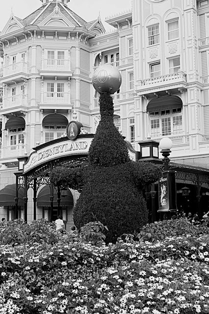
Moods, even joy, can be carried without color. The elements of composition, the light, the shadows, the contrast, and the subject matter can make even something plain into something buoyant when combined for the expressive image. An image that matches our intent and expresses a mood or feeling, with or without color, is a thing of beauty. The following image shows how color can be removed, and the mood amplified. While not one of the greats, it's a fitting example.

ISO 200, f/8, 1/125
Shrub sculpture near the entrance to Paris Disneyland.
This was shot in color on the 7D, colors were set in the channel mixer to match Kodak’s discontinued Plus-X film, the image was then converted to a negative, and the curves for Plus-X were applied via a Curves adjustment layer. The final step was adjusting levels to match the proper range that would be printed. The final image is light and expresses much of the joy that a visit to Disneyland instills, even in us old kids.
The use of light can carry much more of your expression and intent in most cases, than just over-doing the saturation. Overdone saturation, if that is your original intent and vision, is your expression. No one is saying it has no place. Color can amplify mood, it can create triggers within anyone, many linked by our common experiences. The issue arises when it’s done for no other reason than the thought that a weak image will be good if we amp it up. Photography is an art, and every individual uses their experiences, desires, and feelings to create something magic. Don’t let color be a crutch that hinders your magic, but don’t be afraid to use it, either!
I hope that everyone will manage to make their expressive shot, color or monochrome, and share it with us on our Hohenfels Volks Faceboook page.
Is there anything you’d like to see here? Do you have a question? Share your thoughts here or at the Hohenfels Volks Facebook page. Of course, commenting on both Facebook and here is always appreciated, too! Don't forget, we're on Google+, too!
