Showing posts with label curves. Show all posts

Monday, July 16, 2012

Shooting the Spires

Greetings, volks. Welcome to Hohenfels Volks, THE place for our place! Welcome to another Monday. I hope your week is off to a great start.

Yesterday I posted the following photo, along with a message that I would post more about it tonight.

Hohenfels Volks: Shooting the Spires
ISO 125, f/16, 1/125, 85mm.
This shot is straight from the camera. I applied some sharpening to retain detail during the resize, but no other edits were made. By placing the spires to the right, and using the clouds to create interest in otherwise negative space, mood is created and enhanced.

This photo was made in Regensburg on Saturday. Dachauplatz has a nice garage, located to be within a few minutes walk to just about anywhere in the old part of town. Parking on the roof and scanning the other roofs, this scene just begged to be photographed. The sky was stormy looking, and clouds appeared ominously ready to ruin our afternoon. I metered for the bright clouds and added about 2/3-stop exposure. This left the dark clouds about 1 and 1/3 stop below the meter reading on my 7D.

Composing to minimize intrusion of the garage and several other out of place structures, I made 2 shots about 1/3 stop apart. The mood of the image captured the light, sky, and feeling of that dreadful appearing scene.

After getting the image onto the computer, I decreased the exposure 1/2 stop, brought in the shadow levels to just right of the edge, the highlight levels a slight amount, set contrast to 3, and shadows to 2. I set the color temperature to 3500K, and adjusted the curves for maximum impact. Under the RGB tab, I reduced saturation to 0 and tweaked the curves again to create a balanced scene, resulting in the following B&W image. I applied maximum sharpening on both tabs, and felt pretty good about this image.

The rest of that afternoon was incredibly nice, the weather was on our side, we enjoyed some nice family time, and of course, some ice cream at Eis am Dom, in the Domplatz. Of course, no visit to Regensburg can be complete without a visit to Fotohaus Zacharias. I got to see their latest offerings in the old camera department and pick up some 120 film. They always have so much to choose from. I get lost dreaming about the cameras! I saw a couple old time large format cameras that were incredible. It’s definitely a place to spend a couple hours just looking!

Hohenfels Volks: Shooting the Spires, Monochrome
Here's the finished version. It looks old fashioned in monochrome, and the mood is enhanced without color to distract. Converting images can often be a very simple process when you shoot for a mood.

Well, that about wraps it up for today, but I’ll be back with some more photos from the trip and techniques to get that B&W image you visualized!

Did you get any exciting images this weekend? If so, feel free to share them on our Faceboook page. Is there anything you’d like to see here? Do you have a question? Share your thoughts here or at the Hohenfels Volks Facebook page. Of course, commenting on both Facebook and here is always appreciated, too! Don't forget, we're on Google+, too!

Thursday, June 21, 2012

On the Range...

Greetings, volks. Welcome to Hohenfels Volks, THE place for our place! Today’s weather turned out to be quite nice. There is a wide variety of things and places to shoot in our little part of Germany. Clouds and fields are just coming around to being incredibly photogenic.

Today we’re going to take a quick look at contrast and exposure. When we refer to contrast, we’re generally speaking about the range of values within an image or scene. From the brightest areas to the darkest is our range, and the contrast ratios can be quite high for a full range scene to rather low for a lower contrast image, such as a portrait.

As a general rule, higher contrast images tend to be more dramatic, while lower contrast images run toward the softer side. That’s the reason we call lower contrast “softer.” An image’s sharpness is also dependant upon contrast. When you decrease contrast, you can quickly decrease sharpness if your not careful.

Contrast can be varied by exposure. When an image runs toward high key, it loses contrast due the lower values being absent. The inverse is true in low-key images, though to a lesser extent. By adding shadow and decreasing brightness or overall exposure, contrast can apparently be increased. Decreasing exposure by 1/3 stop can be just the trick. The same can be said for color contrast, which is the range of tones in a single color within your image.

Drama can be added through darkening, and tranquility, or stillness, through lightening. Local contrast can be adjusted within a narrow range of tones, improving appearance, detail, and bringing interest to an area within the image. By using levels for general contrast adjustments, and curves for local effects, an interesting image can be created.

Combined with visualizing the desired outcome, or range of outcomes, limitless possibilities exist within each image. By exposing your brightest areas for M+2 and your darkest for M-3, a visual feast can be created from one shot, if done right. Visualize the effect of several adjustments and contrast ranges, and then set the shot so that each one can be accomplished using limited adjustments.

I hope this gives you something to think about and play with. Throw in some work with this week’s exercise, and you’ll be sure to get something that fills with that pride of accomplishment that comes from a shot well made.

Take care and enjoy the rest of the week!

Is there anything you’d like to see here? Do you have a question? Share your thoughts here or at the Hohenfels Volks Facebook page. Of course, commenting on both Facebook and here is always appreciated, too! Don't forget, we're on Google+, too!

Tuesday, May 1, 2012

Another Exercise...

Greetings, volks. Welcome to Hohenfels Volks, THE place for our place! Hohenfels, basking in the warmth and sun of spring, has really enjoyed having the annual German American Volksfest. I hope the Hohenfels Volks has, too, with all the opportunities to get and make some great shots!

In keeping with our last post, I thought I’d share a photo from Saturday’s fireworks, and then move on to another exercise.

Hohenfels Volks: Flaming Blossoms
f/22, ISO 125, 16 seconds, Bulb mode
Fireworks from the Volks fest

I shot from the parking area, including the windsock in the image, to create some context. Notice the fest tent in the lower left to give a sense of scale. I shot this at f/22 to minimize the impact of the Ferris wheel and to create some nice starbursts with the lighting along the bottom. The timing on this shot was quite lucky, as the combined effects create a flower like appearance of the fireworks. The white “dot” below and to the right of the larger burst was the only star visible at that time. I liked having it there, but could have cloned it out. Things like that are a matter of taste.

On to our exercise, we’re going to look at taming the relationship between highlights and shadows. One way to do this is through a combination of metering and exposure. Shoot scenes with a relatively high range of contrasts, but meter for the desired range. Should the highlights be the most important meter for them, and likewise for the shadows or midtones.

When shooting these shots, keep in mind controls you can use for bringing your images into line with your intention. For instance, a high contrast scene can be tamed slightly using an inverted S curves adjustment, and lowering the contrast. Remember, less is more, as applying too much of only one adjustment can leave the scene looking like, in the words of Ansel Adams, “chalk and charcoal.”

There are ways to increase contrast and lower it at the same time. We’ll look at some in a post later this week, but they include things like toning and intensification.

Hohenfels Volks: Simulated- Skies Over Fest
f/11, ISO 125, 1/60, metered for the highlights on the clouds and exposed at M+3
Stormy looking clouds over the fest. Edited for an old time semi-selenium toning and intensification.

Get out, get shooting, and enjoy the weather while it lasts!

Don’t forget to post any of your images you’d like to see here at the Hohenfels Volks Facebook page. Of course, commenting on both Facebook and here is always appreciated, too! Don't forget, we're on Google+, too!

Wednesday, February 29, 2012

Character...istic

Greetings, volks. Welcome to Hohenfels Volks, THE place for our place! I hope Hohenfels and our friends throughout the area are staying comfortable and warm.

Today we’re going to talk a little bit about the histogram and the characteristic curve portion. We’re going to see how every camera, film, and sensor has a different characteristic curve and how adjustments we make can change that. We’re also going to see those changes on the histogram.

First, we need to define what a histogram is. Simply stated, your histogram is a graphic representation of the range of levels within your image. The higher the graph, the more of that exposure level is present within your image. If you notice, with Canon’s DPP, it’s scaled from about –10 to +4. The starting and ending points vary between different models. The curve you see highlighted is what is generally referred to the characteristic curve, and is dependant on the camera model and sensor. This is analogous with a film’s characteristic curves, and once we see how our adjustments impact it, we can learn to judge our images and exposures.


The characteristic curve for my 7D in an unedited image


Here is the same image, after crushing levels some. Note the minor differences in the curves. Everything past the threshold of the toe will be pure black.

Next, we’re going to learn the basic terms when referring to the curve. At the bottom left, you can see the curve has tapered and become elongated. It loses its vertical travel and starts fading into a horizontal line at about –6. That area is referred to as the “toe,” and runs from –6 to about –2.5. At the upper right, something similar has happened, that area is referred to as the “shoulder,” and runs from about +1.5 to +4. The area in between is the straight-line portion. –6 on the curve is the “threshold” and at about +3 we hit “maximum density.”

The toe area represents the “density” in the negative shadow areas. The greater the density, the more detail can be brought out in your shadows. At maximum density, no further increase can be visually detected in the brightness at those levels. When we are at the threshold and maximum density, our shadows and highlights are clipped or blocked, and there is absolutely no detail in these areas. These equate to about zone 0 for your shadows and zone 10 for your highlights. These zones are slightly off some with digital due to restraints of monitors and printers. We look to get our images from blackest at zone 1 to 2 and whitest at about 8 to 9. This gives us our limitations within which our exposures must be made.

Using the example of my curve, we can see that zone 2 to zone 8, or –3 to +3 are capable of being exposed and retaining detail. Below 2 and above 8 we start to see clipping and blocking creep into the image. This equates to 3 stops under and 3 over middle gray, or what our meter is telling us to set our exposure for.

Understanding these things gives us the tools to adjust our images in a manner consistent with our vision and measurements. When we crush in our curves, as discussed in a prior post, we change our characteristic curve. As you can see from the image showing the levels we adjusted to, our toe and shoulder have gotten shorter. This changes our minimum maximum densities. In effect, it darkens our darks, and whitens our whites. A sort of photographic laundry soap! You’ll also notice that the straight-line portion becomes progressively more vertical. The more vertical this section is, the more contrast in your image.

Combining all these things, we see how easy it is to change our characteristic curve for our camera and sensor, which will change our image quality and exposure. We can easily use these tools in conjunction with our metering and proper exposure to bring our images into our range of visualization.

Film and even our sensors use these curves to determine the ISO or exposure value. That’s how true film speed was determined before the advent of digital. Sensitometry
was used in conjunction with testing different exposures to get the correct speed for setting cameras up. The densities were measured and settings read that allowed a film's ISO to be determined, and therefore exposed properly. Density today doesn’t need to be measured, but knowing how film density relates to your histogram and exposure can increase your ability to visualize and expose accurately.

The next time you’re working on your RAW images, watch what happens as you adjust your exposure and crush in your curves. When you see the characteristic curve change, you’ll know why and how better to read your original and your edits. Have fun playing with it, discovering what you can do, and making your vision concrete.

Enjoy the rest of your week.

Don’t forget to post any of your images you’d like to see here at the Hohenfels Volks Facebook page. Of course, commenting on both Facebook and here is always appreciated, too! Don't forget, we're on Google+, too!

Friday, February 24, 2012

Digital Density

Greetings, volks. Welcome to Hohenfels Volks, THE place for our place! Let’s start by welcoming a little sanity and quiet, as peace returns to Hohenfels and our surrounds!

The last couple weeks have been trying for everyone, I’m sure, but things are getting back on track.

I went out and shot some film today, and developed 2 rolls this evening. That got me thinking about something that we’ll discuss here today. Before we begin, I should explain that many of our recent references to Ansel Adams are because he was probably the most prolific educational writer on photography. He’s not the only great, but his vast amount of work and writings are the most widely read, studied, and approachable.

Today we’re talking about “Digital Density.” This has nothing to do with being behind the curve on technologies. I’m referring to something that hit me today while developing my film.

When old photographers spoke of their negatives, they spoke in the arcane language of photographers. A negative that was thin was dark in printing and so on. Too dense often leads to blocked, or clipped, highlights. Contrast was a product of your negative’s density. So was tonal range. The density was determined by the thickness of remaining silver, or emulsion, after development. Adams developed for a zone 8 density of 1.25-1.35 for his preferred diffusion enlargers. Density is a logarithmic number, and we’re not going into it here. Generally, zone 8 is where the brightest details can be discerned and identified. Zone 9 results only in very slight variations in tone and 10 is pure white. By exposing to keep the darkest shadow details in zone 3-4 and developing to keep highlight details in zone 8, he was able to make magnificent images.

Most of that is overly simplified, but it gives us a basis for the next part of this post.

First, let’s look at a basic representation of the zone system.
Hohenfels Volks: Zone System
The basic Zones chart

Now, we’re going to convert that to a negative.
Hohenfels Volks: Zone System in Negative
When converted to a negative, this is an approximation of the basic zone chart

You can see how things changed. Assuming a pure white light behind the negative strip, you can see that zone 1 is pure white, and so on up the scale. Below are the negative versions of a couple photos, one black and white, and the other color. Looking at them, you can see that the darker parts are actually the lighter areas when the image is returned to original.

Areas with no density, other than film base+fog, will have absolutely no detail, and tone. Areas that are pure black will have no detail and will be pure white. Knowing how the density affects photos, you can do a bit of editing on your image after converting it to negative. In Photoshop, this is done by inverting the image, or CTRL-I. In Lightroom, it’s the same. In Paintshop Pro, it’s under the Image Menu- negative image.

Here are 2 conversions of digital photos, taken with a Canon digital SLR, one in color and one black and white.
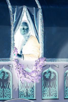
Hohenfels Volks: A Lady in Waiting
This is a color photo converted to negative. Look for the original in my works.

Hohenfels Volks: Developing for your vision
The photo we used in our last post about developing for your vision

Once you’ve done your conversion, you can clone out dust, with greater accuracy if you’re messy with the mouse. Another great thing about this feature is the ability to bring out detail in your highlights. Digital doesn’t deal too awfully well with blown highlights, but you can recover small amounts of detail by converting to a negative of your image. This is great for working with skies and snowy areas. It’s possible to recover some in the shadows, also.

The caveat is that there must be information there, or it will be less effective.

You can also increase your control over your tonal range by performing level and curve adjustments on a negative layer, then inverting it. When working on a color image, be aware, that subtle changes to exposure can be localized to perhaps a small portion by extraction that selection as a layer and converting it a negative. It allows you to expand the tonal range of any color, or the whole image, in ways that can be very impressive. You can also diminish some colorcasts! Colors are inverted in a negative, so keep that in mind, or you’ll end up all abstract and disappointed, unless that’s your vision! It’s almost like working with a large negative.

Using the tools taught to us by those who were taking photos when our folks were kids, we can learn to improve our digital art. Using your vision, seeing both the negative and the print, you can begin to get some awesome stuff going on. Give it a try and see how it works with your vision and your exposures. If it's something you're happy with, post the results, we'd all like to see!

Don’t forget to post any of your images you’d like to see here at the Hohenfels Volks Facebook page. Of course, commenting on both Facebook and here is always appreciated, too! Don't forget, we're on Google+, too!

Tuesday, October 4, 2011

Intro to Composition

Today we’re going to talk about COMPOSITION.

Simply put, COMPOSITION is bringing the image you’ve just visualized to life in a pleasing and attractive fashion. Pretty straight forward, isn’t it? Like many things related to photography, it goes deeper than that, simple- yes, easy - no.

Diving into the subject on a basic level, we’re going to cover some basics today.

First, there is subject and object placement to consider. Then there are color, exposure, DOF, weight, balance, and various other considerations.

The tips I’m outlining are not hard and fast rules! While often called rules, you can break them anytime. The trick is to know when and why to break them. That takes some time and practice.

The most commonly discussed is the “rule of thirds.” This rule states that your subject, or subjects, should be placed along an imaginary line dividing the image into thirds. For a more powerful composition, intersections of horizontal and vertical thirds are used. I’ve included a chart showing this and a sample using it below.


This is just a basic chart to show where things line up.


This is an example using a photo I recently took. Notice how the right line runs through the middle of her eye and the bottom right intersection is right about on the corner of her smile. Also, notice the diagonal lines formed by her eyes, smile, and head.

Another rule is the “Golden Spiral.” This one seems to have several names. This is placing your subject near one of the points of intersection in the thirds, and using a nautilus type spiral to lead the eye through the image to the subject. There is some mathematics behind this using the Fibonacci sequence and the “Golden Ratio” of 1.618 to 1. This can be more appealing than a simple rule of thirds, as this more natural. It just takes some practice and patience. I’ve included a link to a site that shows an applet demonstrating this and several others.

Java Adjuster A cool applet that shows the effects and use of the rules regarding composition.
Golden Section and the Rule of Thirds An informative sight covering more about using these rules.

Place your subjects and objects according to how you visualized their importance to the scene. A subject that is important to the overall composition can be placed on one the intersections, or in the center of your “Golden Spiral,” while objects of lower importance can be placed along either a vertical or horizontal third only. Giving each object or subject a weight or ranking based on how you visualize the scene can help in using, and breaking, the rules.

Another important element in COMPOSITION is lines. By having lines in your image, you can lead your viewer through your vision and tell a story in your work.

Diagonal lines add a dynamic and powerful element to an image. C and S shaped lines create a sense of grace and harmony. Vertical and horizontal lines are static. Including a graceful element, like a river, and ensuring that is either C or S shaped, gives the viewer a sense of calm and grace. Use your leading lines, and you will see a change in how you look at a scene and how you start to visualize your images.

Here's a link to a nice little page about COMPOSITION. It's short, simple, and very helpful! 10 Top Photography Composition Rules

Well enough for today. We’ll dive more into COMPOSITION in another post.

Try this out and let me know how it works for you! There are a large number of places that will help you feel more at ease with your COMPOSITIONS around Hohenfels! I’d love to know if it helps! If you have a question, post it to our Facebook account. Also post it here as a comment on the related post, I’ll review it and get back to you! If you have a photo you’d like to share, add it to our wall on Facebook, and I’ll get it posted here.