The last couple weeks have been trying for everyone, I’m sure, but things are getting back on track.
I went out and shot some film today, and developed 2 rolls this evening. That got me thinking about something that we’ll discuss here today. Before we begin, I should explain that many of our recent references to Ansel Adams are because he was probably the most prolific educational writer on photography. He’s not the only great, but his vast amount of work and writings are the most widely read, studied, and approachable.
Today we’re talking about “Digital Density.” This has nothing to do with being behind the curve on technologies. I’m referring to something that hit me today while developing my film.
When old photographers spoke of their negatives, they spoke in the arcane language of photographers. A negative that was thin was dark in printing and so on. Too dense often leads to blocked, or clipped, highlights. Contrast was a product of your negative’s density. So was tonal range. The density was determined by the thickness of remaining silver, or emulsion, after development. Adams developed for a zone 8 density of 1.25-1.35 for his preferred diffusion enlargers. Density is a logarithmic number, and we’re not going into it here. Generally, zone 8 is where the brightest details can be discerned and identified. Zone 9 results only in very slight variations in tone and 10 is pure white. By exposing to keep the darkest shadow details in zone 3-4 and developing to keep highlight details in zone 8, he was able to make magnificent images.
Most of that is overly simplified, but it gives us a basis for the next part of this post.
First, let’s look at a basic representation of the zone system.

The basic Zones chart
Now, we’re going to convert that to a negative.

When converted to a negative, this is an approximation of the basic zone chart
You can see how things changed. Assuming a pure white light behind the negative strip, you can see that zone 1 is pure white, and so on up the scale. Below are the negative versions of a couple photos, one black and white, and the other color. Looking at them, you can see that the darker parts are actually the lighter areas when the image is returned to original.
Areas with no density, other than film base+fog, will have absolutely no detail, and tone. Areas that are pure black will have no detail and will be pure white. Knowing how the density affects photos, you can do a bit of editing on your image after converting it to negative. In Photoshop, this is done by inverting the image, or CTRL-I. In Lightroom, it’s the same. In Paintshop Pro, it’s under the Image Menu- negative image.
Here are 2 conversions of digital photos, taken with a Canon digital SLR, one in color and one black and white.

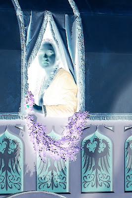
This is a color photo converted to negative. Look for the original in my works.

The photo we used in our last post about developing for your vision
Once you’ve done your conversion, you can clone out dust, with greater accuracy if you’re messy with the mouse. Another great thing about this feature is the ability to bring out detail in your highlights. Digital doesn’t deal too awfully well with blown highlights, but you can recover small amounts of detail by converting to a negative of your image. This is great for working with skies and snowy areas. It’s possible to recover some in the shadows, also.
The caveat is that there must be information there, or it will be less effective.
You can also increase your control over your tonal range by performing level and curve adjustments on a negative layer, then inverting it. When working on a color image, be aware, that subtle changes to exposure can be localized to perhaps a small portion by extraction that selection as a layer and converting it a negative. It allows you to expand the tonal range of any color, or the whole image, in ways that can be very impressive. You can also diminish some colorcasts! Colors are inverted in a negative, so keep that in mind, or you’ll end up all abstract and disappointed, unless that’s your vision! It’s almost like working with a large negative.
Using the tools taught to us by those who were taking photos when our folks were kids, we can learn to improve our digital art. Using your vision, seeing both the negative and the print, you can begin to get some awesome stuff going on. Give it a try and see how it works with your vision and your exposures. If it's something you're happy with, post the results, we'd all like to see!
Don’t forget to post any of your images you’d like to see here at the Hohenfels Volks Facebook page. Of course, commenting on both Facebook and here is always appreciated, too! Don't forget, we're on Google+, too!

No comments:
Post a Comment