Showing posts with label contrast. Show all posts

Monday, September 23, 2013

Improve Our Seeing

Greetings and welcome to Hohenfels Volks, THE place for our place! Hohenfels is getting ripe for photographic opportunities. Within the next couple weeks, the “autumnal fireworks” will really be in swing. Time to explore our areas and get your images made!

Today we’re going to provide a couple exercises to get you thinking about your photography and small ways to improve.

First up, we’re going to look at the use of tone and tonal variations to improve our shots. The exercise is simple enough. You’re going to need a couple lightly textured items to photograph. A couple differently colored towels or pillowcases will suffice. The object is to learn how our exposure impacts our tonal ranges, and how tones translate into an important element of our final image.

It’s best to use red, green, and blue items, but whatever you have at hand will work. Set up your item and meter it. In manual mode, set your exposure to give you –3 stops exposure and make a photo. Repeat for every full stop between –3 and +3 stops. You’ll have 7 photos. Do that for the other colors. Compare them in your image editing application, and see how the saturation, texture, and feel of each color changes with the different exposures and colors. Then take the same series of photos, but put your different items in the same frame. Finally, convert the last series to monochrome, and review one last time. After reviewing them all, you can see the difference in tones and moods. This is a big part of visualization, knowing how your camera’s rendition of color and light will present itself in the final image. It’s a simple exercise that does more than give you that knowledge; it also shows you what your camera can do. By knowing that there should be texture through all the shots, you can identify where your camera begins to lose that texture. Hey, since it’s autumn, you can combine the shots with more than all you colors into making something to hang on your wall by shooting something of the autumn around you.

Hohenfels Volks: Technicolor Pathways
ISO 100, f/15, 1/25
One of my older photos, taken just outside Hormansdorf. The track to the field was dappled and the tonal range of the colors brought to mind something from childhood, a reminder that God's beauty is everywhere. Notice how dark and light tones of the same color come into play here, creating contrast and enhancing the feeling of magic.

The next exercise is patterns. Learning to recognize patterns is something we all naturally do from an early age. But, patterns can be subtle or glaring. Stucco has a nice texture, and can have something of a pattern to it if you observe it long enough. Decorative tiles, clothing, and even bark will present something to create the feeling of a pattern if you open yourself to it.

The exercise is shooting 5-10 photos of patterns around you. This can be the tracks from a tractor in a just harvested field, the still tall rows of corn, your hounds-tooth pants, anything presenting a pattern. Corn on the cob present a nice pattern that can be presented and intensified by including the green of the husk and the golden caramel brown of the outer silk. They’re everywhere once you open up to them! It’s a great way to add interest to your photography, and bring you into a closer relationship with the scenes we take for granted every day. There is so much in God’s green Earth to see and feel, that an entire lifetime isn’t enough to experience it all!

I hope everyone will get out and make some photos, both for the exercises and to celebrate autumn’s beauty. There’s no time like now to get shooting! Figure out where and when, the rest will follow. Then, make your shot and share it with us on our Hohenfels Volks Facebook page. We’d love to see your work.

Is there anything you’d like to see here? Do you have a question? Share your thoughts here or at the Hohenfels Volks Facebook page. Of course, commenting on both Facebook and here is always appreciated, too! Don't forget, we're on Google+, too!

Tuesday, July 17, 2012

Converting Your Image

Greetings, volks. Welcome to Hohenfels Volks, THE place for our place! I hope everyone is faring well as press into the week.

Today we’re going to go over a simple, but interesting way to convert your photo to black and white.

As we all know, sometimes color can change the way an image feels. It can take a moody photo and make it seem wrong or out of place. It can distract from the subject and take away from the beauty of the light. There are many reasons for shooting, or converting to, black and white. For this post, we’re going to do something that takes our shot to a better place.

This is the image we’re working on. I’m using Corel’s Paintshop Pro Photo X4, but the concept is the same in Photoshop, Lightroom, or Gimp.

Hohenfels Volks: The Dom
ISO 6400, f/3.4, 1/15
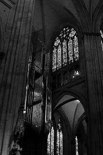
Looking into the Cathedral. The scene was beautiful, yet the image lacks some pop. We'll fix that!

I shot this photo inside the Dom in Regensburg. The beautiful Gothic architecture and art inside this cathedral seem best suited for black and white, and seem quite garish in color. The color temperature also becomes an issue when shooting at high ISOs, although I photographed this with the intent of making it black and white.

Once we’ve converted our image and opened it in our application of choice, we’re going to separate the image into red, green, and blue layers. There we’ll lighten and darken the different layers to our desired levels using curves and levels, and remove the noise. For this image, I slightly decreased the red and blue layers, while only dodging the green along the pipes of the organ. Once you’re content with your adjustments, combine the layers into a new image. For this shot, I slightly darkened the red layer, darkened the blue layer quite a bit, and dodged the pipes of the organ to increase the levels to offset the overall decrease in brightness. The finished combination now looks rather odd, and has some tinting/toning in it.

Hohenfels Volks: The Dom
This is our image after splitting the color channels and recombining them. Notice the green tint on the pipes.

Our next step is to split the image again, this time to hue, saturation, and lightness layers. You can discard the hue and saturation layers, as we will now use the lightness layer for our final canvas. For this image, I adjusted the levels, performed a minor curves adjustment, and increased sharpness. I chose to over-sharpen, using a radius of 1.00, as I would be softening the noisy area under the arch, and applying an edge preserving smooth filter.

Hohenfels Volks: The Dom
Almost finished, a few tweaks and we're there.

The finished result, while no masterpiece, is rewarding. It leaves you with a sense of place and scale that the color version tends to minimize. The chiaroscuro also seems quite well suited to the Gothic cathedral.

Hohenfels Volks: The Dom
And here we go. I think this really brings out the mood and scale of the Dom. Its incredible Gothic architecture and art are magnificent.

Well, that’s one way you can do it. This is by no means the only way. You can also adjust color channels without splitting the image, and then desaturate the image. There are as many ways to convert your image as there are folks playing around to figure out what works best for their photo. One of the biggest keys, though, is color contrast and levels. Getting that where you want it can lead to some very nice results!

Enjoy the rest of your week.

Please feel free to share your photos on our Faceboook page. Everyone here would love the chance to see your work! Is there anything you’d like to see here? Do you have a question? Share your thoughts here or at the Hohenfels Volks Facebook page. Of course, commenting on both Facebook and here is always appreciated, too! Don't forget, we're on Google+, too!

Thursday, June 21, 2012

On the Range...

Greetings, volks. Welcome to Hohenfels Volks, THE place for our place! Today’s weather turned out to be quite nice. There is a wide variety of things and places to shoot in our little part of Germany. Clouds and fields are just coming around to being incredibly photogenic.

Today we’re going to take a quick look at contrast and exposure. When we refer to contrast, we’re generally speaking about the range of values within an image or scene. From the brightest areas to the darkest is our range, and the contrast ratios can be quite high for a full range scene to rather low for a lower contrast image, such as a portrait.

As a general rule, higher contrast images tend to be more dramatic, while lower contrast images run toward the softer side. That’s the reason we call lower contrast “softer.” An image’s sharpness is also dependant upon contrast. When you decrease contrast, you can quickly decrease sharpness if your not careful.

Contrast can be varied by exposure. When an image runs toward high key, it loses contrast due the lower values being absent. The inverse is true in low-key images, though to a lesser extent. By adding shadow and decreasing brightness or overall exposure, contrast can apparently be increased. Decreasing exposure by 1/3 stop can be just the trick. The same can be said for color contrast, which is the range of tones in a single color within your image.

Drama can be added through darkening, and tranquility, or stillness, through lightening. Local contrast can be adjusted within a narrow range of tones, improving appearance, detail, and bringing interest to an area within the image. By using levels for general contrast adjustments, and curves for local effects, an interesting image can be created.

Combined with visualizing the desired outcome, or range of outcomes, limitless possibilities exist within each image. By exposing your brightest areas for M+2 and your darkest for M-3, a visual feast can be created from one shot, if done right. Visualize the effect of several adjustments and contrast ranges, and then set the shot so that each one can be accomplished using limited adjustments.

I hope this gives you something to think about and play with. Throw in some work with this week’s exercise, and you’ll be sure to get something that fills with that pride of accomplishment that comes from a shot well made.

Take care and enjoy the rest of the week!

Is there anything you’d like to see here? Do you have a question? Share your thoughts here or at the Hohenfels Volks Facebook page. Of course, commenting on both Facebook and here is always appreciated, too! Don't forget, we're on Google+, too!
Friday, May 4, 2012

Tech Talk: Rating Your Sensor

Greetings, volks. Welcome to Hohenfels Volks, THE place for our place! WOW! The annual Hohenfels Volksfest was a great time and the weather was perfect. Now the clouds are puffing up some, and that makes for great outdoor photos that include the sky!

Today we’re going to introduce rating and EI.

Your camera has a range of ISOs you can choose from, most likely running from ISO100 to ISO3200 in third stop increments. Camera and film manufacturers used the International Standards Organization methods to set the speed, or ISO, of your sensor or film. They generally are set to favor overexposure, as underexposure is harder to correct. Therefore, in test conditions ISO 100 performs at ISO 80-100 to get you exposed at the general target for the contrast and exposure standards set by the organization. This used to be referred to as a film’s “box speed.” For digital work, I’ve come to think of it as “nominal.” Therefore, when I say I shot it at ISO 125, that’s what I was set and exposed for.

The ISO recognized that most scenes deviated from test conditions, as did developing or processing. A film may be rated at ISO 100, when developed in a certain developer for a specific time, but not for any other combination. Film shooters would “rate” their film at different speeds for their methods, including exposure and development controls. For instance, some would shoot FP4+, which is ISO125 in Ilford’s ID11 developer, rated at EI80 developed in Kodak D-76 for their preferred method of exposing and developing a standard shot.

EI, or “exposure index,” is what you rate your film at for your methods, and usually refers to speed rating assigned that’s different from the film's actual speed. Generally, when you shoot with your digital SLR, you shoot maybe at ISO 100, and edit it in your manufacturer’s provided application and get decent results. You are shooting and making your shot at nominal speed, or box speed with film.

You may find that in high contrast scenes at nominal speed, you are getting shadows that are clipped to black and whites that are blown and have no detail. In that case, it’s time to change your EI, or rate your speed different. To do this correctly, you should test your camera, and we’re going to cover the procedures to do that for YOUR best results. Since this test is based on your equipment, metering, and editing, someone else will get different results using the same equipment. This test is based on your style and methods, which others may not follow. Keep that in mind when “rating” your gear, you can recommend your “rating” to others with the same camera, they will most likely appreciate the information, but each “rating” is subjective, and will work best in your hands.

This testing becomes especially important when shooting at extremes of lighting. In very low light, like that in most old buildings, noise is a real concern when trying to increase your image brightness during editing, and in bright daylight lit landscapes skies and clouds can become just blotches of white without any detail.

The procedures for setting your EI involved a gray card, meter, and your camera. You should be set up for this in light conditions that match your intended shooting conditions to effectively use this method.

Step 1, set up your gray card in lighting that matches your shooting conditions. Step 2, set your desired ISO reading on your camera, and select RAW mode. Step 3; set your camera to f/8 or f/11 and AV mode. Step 4, meter your gray card, use spot metering and fill as much of the frame as possible with the gray card. Note the shutter speed. Step 4, set your camera to manual mode, and enter the shutter speed metered in step3, which should give you an 18% gray image. Step 5: compose your test shot. You can pull back some, including other elements. I have a test screen that includes black and white pieces and collapses nicely into a camera bag, and prefer to use that to check contrast ranges while doing this test. Step 6, take the following series of shots- at the metered reading obtained previously, -1/3 stop, -2/3 stop, -1 stop, +1/3 stop, +2/3 stop, and +1 stop. Step 7, load the images onto your computer. Then open your image editing application. Step 8, Open each image in turn, and find the one that is MOST CLOSELY identical to the gray card in exposure for your set up. Make sure to perform absolutely no adjustments to the images, as we are looking for the most closely identical image. Take note of the settings used for this shot. Step 9, this is your EI for that type of scene with that ISO selected. For example if –1/3 stop produced the best rendition for ISO100, then your EI would be 125 or EI125. You will effectively be rating your ISO100 shots at 125, and removing 1/3 stop on all your shots in those conditions. To accomplish this, when shooting at ISO100 simply remove 1/3 stop exposure, either by increasing your shutter speed 1/3 stop or closing down your aperture 1/3 stop.

Rating your sensor or speed before shooting can save a lot of time editing and the heartbreak of a shot that doesn’t live up to your expectations. It’s not perfect, and varies based up taste, style, and personal preference, but it will bring you closer to achieving your vision. It’s definitely something to try in conjunction with this week’s exercise on contrast and contrast control. Combine it with M+ and M- exposure placement for even better results. By exposing properly, you can keep your contrast in the desired range, and make it easier to achieve your vision in your final processing stage.

For those interested in more information about film speed, Wikipedia has a great article. It includes formulae and details about how box speed and nominal are attained.

I’m looking forward to seeing your results and hearing from you. Let me know what you think and how you’re using your camera! Share your thoughts here or at the Hohenfels Volks Facebook page. Of course, commenting on both Facebook and here is always appreciated, too! Don't forget, we're on Google+, too!

Tuesday, May 1, 2012

Another Exercise...

Greetings, volks. Welcome to Hohenfels Volks, THE place for our place! Hohenfels, basking in the warmth and sun of spring, has really enjoyed having the annual German American Volksfest. I hope the Hohenfels Volks has, too, with all the opportunities to get and make some great shots!

In keeping with our last post, I thought I’d share a photo from Saturday’s fireworks, and then move on to another exercise.

Hohenfels Volks: Flaming Blossoms
f/22, ISO 125, 16 seconds, Bulb mode
Fireworks from the Volks fest

I shot from the parking area, including the windsock in the image, to create some context. Notice the fest tent in the lower left to give a sense of scale. I shot this at f/22 to minimize the impact of the Ferris wheel and to create some nice starbursts with the lighting along the bottom. The timing on this shot was quite lucky, as the combined effects create a flower like appearance of the fireworks. The white “dot” below and to the right of the larger burst was the only star visible at that time. I liked having it there, but could have cloned it out. Things like that are a matter of taste.

On to our exercise, we’re going to look at taming the relationship between highlights and shadows. One way to do this is through a combination of metering and exposure. Shoot scenes with a relatively high range of contrasts, but meter for the desired range. Should the highlights be the most important meter for them, and likewise for the shadows or midtones.

When shooting these shots, keep in mind controls you can use for bringing your images into line with your intention. For instance, a high contrast scene can be tamed slightly using an inverted S curves adjustment, and lowering the contrast. Remember, less is more, as applying too much of only one adjustment can leave the scene looking like, in the words of Ansel Adams, “chalk and charcoal.”

There are ways to increase contrast and lower it at the same time. We’ll look at some in a post later this week, but they include things like toning and intensification.

Hohenfels Volks: Simulated- Skies Over Fest
f/11, ISO 125, 1/60, metered for the highlights on the clouds and exposed at M+3
Stormy looking clouds over the fest. Edited for an old time semi-selenium toning and intensification.

Get out, get shooting, and enjoy the weather while it lasts!

Don’t forget to post any of your images you’d like to see here at the Hohenfels Volks Facebook page. Of course, commenting on both Facebook and here is always appreciated, too! Don't forget, we're on Google+, too!

Tuesday, April 10, 2012

Ride Along Shot: High...

Greetings, volks. Welcome to Hohenfels Volks, THE place for our place! Welcoming Tuesday, Hohenfels finds a nice day breaking out and greeting us back.

Let’s visit Regensburg for another ride along shot. This time we’re going to look at a shot taken on film in the old part of town.

Here’s the image.
Hohenfels Volks: High Key Shopping
ISO 100 Agfa APX100, f/8, 1/50, 50mm
A shop window in Regensburg's old town.

This was taken outside one of the many little shops lining the square, and not far from the Dom, or cathedral. I was immediately attracted to the material, old boxes, wreaths, and some cool roses. Throw in the bottles and glassware in the window, and it really seemed like a “must have” shot.

Metering from the white portion in the bottom right window gave too little exposure, so I shot at M+3 and developed for N. This left white zone to about M+3 and leaves a nice tonal range. This also gives us a nice high key image, with a very suitable contrast, and detail in the brightest parts. The reflections in the windows could have been removed with a CP filter, but I would lose the high key effect of the light reflecting around the scene.

The meter gave me f/16 at 1/100. I think this was shot on Agfa APX100 film. I shot with a 50mm f/1.8 prime, as I did the entire day. The final exposure was f/8 and 1/50, with an ISO of 100. I didn’t want to go slower, as the old cameras had no IS, and any wider would have left the DOF inadequate to express what I had envisioned. The sun was out, it was mid-day, and the weather had warmed up a little that day. It was still snowing back in Hohenfels, which was a bit surprising as I got off the train.

After scanning the negative, editing was most certainly required. The sharpness was quite nearly gone, the contrast had come down, and the whites were nearly blown. By applying curves in an inverse S and adjusting the levels to bring down the shadows, and raise the midtones and highlights, I was nearly complete. The next step was to reduce noise and apply an unsharp mask at about 3px radius, 90 strength, and 2 clipping.

The final image grew on me. At first, being satisfied with the image, it was ok. After editing and revisiting the image several times, I realize it had become something I really liked. It showed that the system of metering for the highlights when you plan an image to be presented digitally, can lead to some really nice results.

By exposing on the plus side, it brought out some detail in the shadows, allowing just enough to bring the eye to them in the middle of the brights. Our eyes are generally drawn to the brightest part of a scene first, which is why we often keep our subject 1/3 to 1 stop brighter that the surrounding. In cases like this, it sets our darks apart and brings focus to the play between shadow and light.

I hope I haven’t bored you too much! Enjoy the rest of a lovely evening, maybe using this time to get some blue or golden hour shots in. Take care and keep shooting.

Don’t forget to post any of your images you’d like to see here at the Hohenfels Volks Facebook page. Of course, commenting on both Facebook and here is always appreciated, too! Don't forget, we're on Google+, too!

Tuesday, March 13, 2012

Color Contrast in Monochrome

Greetings, volks. Welcome to Hohenfels Volks, THE place for our place!

Today we’re going to talk about using digital filters for black and white, and color contrast to bring our vision to our images. We’re going to walk through a few different colored filters in our RAW conversion software.

Referring to Canon’s Digital Photo Pro for our software portion, we see that the first thing is to set our picture style to monochrome. After doing that, you’ll notice that color tone and saturation sliders change to filter effects and toning effects.

Once we’re into monochrome picture style, set your white balance to color temperature and play with the slider a little. This will give you some idea of your sensor’s spectral response to color. For instance, raising your temperature from 5200 to 10000 may give a giant boost to your brightness, showing a larger response to red. Lowering it to 3000, seeing a boost would indicate a greater sensitivity to blue and green.

Now that you have some idea of its response to colors and temperature, we can understand how to work our monochrome images for maximum effect. Select the first filter choice as we drag our slider, yellow, and adjust your color temperature. Going either way with your temperature shows a slight shift in brightness throughout the range. As we get lower in temperature, we have less lightness, and more as we raise the temperature.

Selecting an orange filter shows a more pronounce version of the yellow filter’s response, due to an increased presence of red in the light being allowed through the filter, or in our case, allowed to impact the image by software. Moving on to red, we see great swings throughout the temperature range. At 2500, we see our greatest darkening and at 10000, we probably see something washed out and so high in contrast to be unusable.

Going to our last filter, green, we see almost no change as we shift through the temperature range. Since light is composed of all the colors, but most of the time less of the green, we see less impact. Green has a more pronounced effect in film photography than digital, though.

OK, now we’ve seen some pretty cool ways to improve on our vanilla black and white conversions. Let’s move to some interesting ways to use those filters. Select standard for your picture style. Selecting your RGB tab, you can choose between luminance, red, green, or blue. As we cycle through the colors and make adjustments, we end up with a pretty scary image. The color is ugly and unnatural. No that you’re someplace you think might work well with a colored filter, select saturation in the RGB tab and drag the slider to 0. Without saturation, there will be changes in lightness and brightness, but no real change.

Going back to your RAW tab, select monochrome, and choose your filter. Select color temperature. Once your color temperature is about where you want it, go back to the RGB tab and start playing with your color and lightness sliders. Notice how things change as you drag them around? Well, once you have your image about where you want it, you can either save it or finish it here. The reason for going into the color sliders goes back to our discussion on color theory. By adjusting our color curves, levels, and contrast, we can make some very nice black and white images with our initial RAW conversion.

Once you have your image about where you want it, you can save it and open in another editing program, like Paintshop Pro and split the image into CMYK or RGB layers and adjust it even further, or just play with your curves or layers creating a combination that suits your vision, message, and intent. Another nice option is to create a hand painted look or feel. We’ll talk about that in a future post.

I hope everyone is on the road to a great week and has plenty of opportunities to concretize your vision. Happy shooting and have a wonderful week, Hohenfels.

Don’t forget to post any of your images you’d like to see here at the Hohenfels Volks Facebook page. Of course, commenting on both Facebook and here is always appreciated, too! Don't forget, we're on Google+, too!

Friday, March 9, 2012

Ride Along: Golden Sky

Greetings, volks. Welcome to Hohenfels Volks, THE place for our place!

Today we’re going on another ride along. This one isn’t too far from home, so we’ll keep it short.

While exploring the backside of Hohenfels Sunday, I stumbled upon this scene and knew it was something I wanted to keep.

Hohenfels Volks: Golden Sky
ISO 400, f/22, 1/50, 35mm, Canon EOS 7D
The sun dipping slowly toward night's rest and renewal.

Going over the hill from Hohenfels proper toward Raitenbuch, you come across a small country lane meandering through the fields. Having been down this road before, I knew there were some nice scenics waiting to reward the one bringing them home. There is a tiny little chapel between 2 giant trees there, with some magnificent views of the hills around.

The shot was easy to visualize, I came up with several in fact. Composition was envisioned to include the colors all around as one the key elements. The sky was partly cloudy, with some nice golden glow from the sun hanging around the think veneer of sheeted clouds, and a nice blue in the areas without cloud cover.

I arrived moments before the color really started coming out. I took several shots, hoping to see something I could work with. I included the trees and the chapel in several, but liked this one for matching the closest to what I visualized.

I metered off the tree with the Gossen Sixtomat, at ISO 400. Giving the tree a –2-stop exposure from the meter would have washed out the sky and left the color flat and a bit comical. Metering the tree for –3 stops and the grass for about –2 stops from middle gray, meant I could shoot at f/22, which was part of getting the sun to streak in a nice little starburst. I was also able to shoot at 1/50, which limited the streaking to just a couple rays coming lightly over the hills in the distance through the clouds.

Getting it into Canon DPP, or the digital darkroom, added some magic. Canon has some “Picture Styles” for their application that come standard, allowing for the most common edits to color and contrast to be quickly applied. My first thought was Landscape, but that left the gold too vague and muddled. Having downloaded several other styles from Canon’s site, I settled on Autumn Hues for the picture style. This softened the contrast between the sun and the hills; it also made for some nice separation of the golds, oranges, and reds in the sky. I adjusted my levels, crushing them in some for clarity.

After that, I set the color temperature to about 6000K, which brought the color in line with the lighting hues. Increasing the contrast to +1 and the shadows to +2 added to the glow around the hills and tree, while allowing the levels to hold up throughout the image, including the separation in the distant hills. The last adjustment was to take saturation down –1 and sharpen.

The car coming up the road in the middle ground adds a nice little reference point for the viewer to pause. That was a lucky little bit of happenstance. I liked the lights as he was approaching and shot quickly to include his headlights. This photo captures what I visualized, and expresses the joy one gets when out looking for shots, especially when you find one that works for your vision. Shooting with a vision can make for some interesting stuff, knowing what tools you have at your disposal to make your vision a reality makes easier work of it!

Check out Canon’s site and download some of their picture styles. You’ll see some stuff that probably doesn’t appeal to you, at least I did, but you’ll also find something that does. I’m certain Nikon and other companies have something similar, if not, you can make your own in whatever app is your digital darkroom! Exposure and visualization start your image on its journey; your level controls and tools in software bring it home. Using them all together can make something that brings others to that same place with you!

Take care and enjoy your day!

Don’t forget to post any of your images you’d like to see here at the Hohenfels Volks Facebook page. Of course, commenting on both Facebook and here is always appreciated, too! Don't forget, we're on Google+, too!

Wednesday, February 29, 2012

Character...istic

Greetings, volks. Welcome to Hohenfels Volks, THE place for our place! I hope Hohenfels and our friends throughout the area are staying comfortable and warm.

Today we’re going to talk a little bit about the histogram and the characteristic curve portion. We’re going to see how every camera, film, and sensor has a different characteristic curve and how adjustments we make can change that. We’re also going to see those changes on the histogram.

First, we need to define what a histogram is. Simply stated, your histogram is a graphic representation of the range of levels within your image. The higher the graph, the more of that exposure level is present within your image. If you notice, with Canon’s DPP, it’s scaled from about –10 to +4. The starting and ending points vary between different models. The curve you see highlighted is what is generally referred to the characteristic curve, and is dependant on the camera model and sensor. This is analogous with a film’s characteristic curves, and once we see how our adjustments impact it, we can learn to judge our images and exposures.


The characteristic curve for my 7D in an unedited image


Here is the same image, after crushing levels some. Note the minor differences in the curves. Everything past the threshold of the toe will be pure black.

Next, we’re going to learn the basic terms when referring to the curve. At the bottom left, you can see the curve has tapered and become elongated. It loses its vertical travel and starts fading into a horizontal line at about –6. That area is referred to as the “toe,” and runs from –6 to about –2.5. At the upper right, something similar has happened, that area is referred to as the “shoulder,” and runs from about +1.5 to +4. The area in between is the straight-line portion. –6 on the curve is the “threshold” and at about +3 we hit “maximum density.”

The toe area represents the “density” in the negative shadow areas. The greater the density, the more detail can be brought out in your shadows. At maximum density, no further increase can be visually detected in the brightness at those levels. When we are at the threshold and maximum density, our shadows and highlights are clipped or blocked, and there is absolutely no detail in these areas. These equate to about zone 0 for your shadows and zone 10 for your highlights. These zones are slightly off some with digital due to restraints of monitors and printers. We look to get our images from blackest at zone 1 to 2 and whitest at about 8 to 9. This gives us our limitations within which our exposures must be made.

Using the example of my curve, we can see that zone 2 to zone 8, or –3 to +3 are capable of being exposed and retaining detail. Below 2 and above 8 we start to see clipping and blocking creep into the image. This equates to 3 stops under and 3 over middle gray, or what our meter is telling us to set our exposure for.

Understanding these things gives us the tools to adjust our images in a manner consistent with our vision and measurements. When we crush in our curves, as discussed in a prior post, we change our characteristic curve. As you can see from the image showing the levels we adjusted to, our toe and shoulder have gotten shorter. This changes our minimum maximum densities. In effect, it darkens our darks, and whitens our whites. A sort of photographic laundry soap! You’ll also notice that the straight-line portion becomes progressively more vertical. The more vertical this section is, the more contrast in your image.

Combining all these things, we see how easy it is to change our characteristic curve for our camera and sensor, which will change our image quality and exposure. We can easily use these tools in conjunction with our metering and proper exposure to bring our images into our range of visualization.

Film and even our sensors use these curves to determine the ISO or exposure value. That’s how true film speed was determined before the advent of digital. Sensitometry
was used in conjunction with testing different exposures to get the correct speed for setting cameras up. The densities were measured and settings read that allowed a film's ISO to be determined, and therefore exposed properly. Density today doesn’t need to be measured, but knowing how film density relates to your histogram and exposure can increase your ability to visualize and expose accurately.

The next time you’re working on your RAW images, watch what happens as you adjust your exposure and crush in your curves. When you see the characteristic curve change, you’ll know why and how better to read your original and your edits. Have fun playing with it, discovering what you can do, and making your vision concrete.

Enjoy the rest of your week.

Don’t forget to post any of your images you’d like to see here at the Hohenfels Volks Facebook page. Of course, commenting on both Facebook and here is always appreciated, too! Don't forget, we're on Google+, too!

Friday, February 24, 2012

Digital Density

Greetings, volks. Welcome to Hohenfels Volks, THE place for our place! Let’s start by welcoming a little sanity and quiet, as peace returns to Hohenfels and our surrounds!

The last couple weeks have been trying for everyone, I’m sure, but things are getting back on track.

I went out and shot some film today, and developed 2 rolls this evening. That got me thinking about something that we’ll discuss here today. Before we begin, I should explain that many of our recent references to Ansel Adams are because he was probably the most prolific educational writer on photography. He’s not the only great, but his vast amount of work and writings are the most widely read, studied, and approachable.

Today we’re talking about “Digital Density.” This has nothing to do with being behind the curve on technologies. I’m referring to something that hit me today while developing my film.

When old photographers spoke of their negatives, they spoke in the arcane language of photographers. A negative that was thin was dark in printing and so on. Too dense often leads to blocked, or clipped, highlights. Contrast was a product of your negative’s density. So was tonal range. The density was determined by the thickness of remaining silver, or emulsion, after development. Adams developed for a zone 8 density of 1.25-1.35 for his preferred diffusion enlargers. Density is a logarithmic number, and we’re not going into it here. Generally, zone 8 is where the brightest details can be discerned and identified. Zone 9 results only in very slight variations in tone and 10 is pure white. By exposing to keep the darkest shadow details in zone 3-4 and developing to keep highlight details in zone 8, he was able to make magnificent images.

Most of that is overly simplified, but it gives us a basis for the next part of this post.

First, let’s look at a basic representation of the zone system.
Hohenfels Volks: Zone System
The basic Zones chart

Now, we’re going to convert that to a negative.
Hohenfels Volks: Zone System in Negative
When converted to a negative, this is an approximation of the basic zone chart

You can see how things changed. Assuming a pure white light behind the negative strip, you can see that zone 1 is pure white, and so on up the scale. Below are the negative versions of a couple photos, one black and white, and the other color. Looking at them, you can see that the darker parts are actually the lighter areas when the image is returned to original.

Areas with no density, other than film base+fog, will have absolutely no detail, and tone. Areas that are pure black will have no detail and will be pure white. Knowing how the density affects photos, you can do a bit of editing on your image after converting it to negative. In Photoshop, this is done by inverting the image, or CTRL-I. In Lightroom, it’s the same. In Paintshop Pro, it’s under the Image Menu- negative image.

Here are 2 conversions of digital photos, taken with a Canon digital SLR, one in color and one black and white.
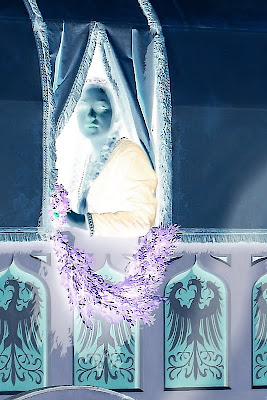
Hohenfels Volks: A Lady in Waiting
This is a color photo converted to negative. Look for the original in my works.

Hohenfels Volks: Developing for your vision
The photo we used in our last post about developing for your vision

Once you’ve done your conversion, you can clone out dust, with greater accuracy if you’re messy with the mouse. Another great thing about this feature is the ability to bring out detail in your highlights. Digital doesn’t deal too awfully well with blown highlights, but you can recover small amounts of detail by converting to a negative of your image. This is great for working with skies and snowy areas. It’s possible to recover some in the shadows, also.

The caveat is that there must be information there, or it will be less effective.

You can also increase your control over your tonal range by performing level and curve adjustments on a negative layer, then inverting it. When working on a color image, be aware, that subtle changes to exposure can be localized to perhaps a small portion by extraction that selection as a layer and converting it a negative. It allows you to expand the tonal range of any color, or the whole image, in ways that can be very impressive. You can also diminish some colorcasts! Colors are inverted in a negative, so keep that in mind, or you’ll end up all abstract and disappointed, unless that’s your vision! It’s almost like working with a large negative.

Using the tools taught to us by those who were taking photos when our folks were kids, we can learn to improve our digital art. Using your vision, seeing both the negative and the print, you can begin to get some awesome stuff going on. Give it a try and see how it works with your vision and your exposures. If it's something you're happy with, post the results, we'd all like to see!

Don’t forget to post any of your images you’d like to see here at the Hohenfels Volks Facebook page. Of course, commenting on both Facebook and here is always appreciated, too! Don't forget, we're on Google+, too!

Tuesday, February 21, 2012

Developing for Your Vision

Greetings, volks. Welcome to Hohenfels Volks, THE place for our place! Welcome to another delayed post.

Lots of things going on have delayed posting for several days, yet again! So here we go, continuing our last post about exposing for your vision.

We posted a photo that we referred to as N development, or normal. That going to be our starting point. Going back to our RAW conversion, we’re going to change that some. Since I use Canon’s Digital Photo Pro that came with my camera, I’ll refer to that.

Our first step is to adjust the slider for exposure. I took it down to -.33 stop. That added some depth to the sky and brighter areas, allowing for some slight texture and tonality. Then I set the white balance to color temperature, at 4200. You’ll see why I did that later.

After that, I crushed in the levels some, the method is shown below. That increases contrast and allows you to bring your levels at the extreme end in some. It gives deeper shadows and highlights. Some of this will be offset, while allowing the levels to be set in our next step.

Hohenfels Volks: Crushing levels
Looking at the arrows, you can see how the levels are crushed in using your sliding limits. This adds clarity, contrast, and depth to an image.

Bringing the contrast up to 2, and the highlights to –2, allowed for some slight increase in highlight detail along the snowy roof of the church and in the snow on the fields. Bringing the shadows up to +2, added depth to the forest and some detail to the church tower and tonality to the almost black barn. It also allowed the shadows to move higher along the exposure scale, increasing the open feeling of the spaces and the shadows from the buildings.

After setting my monochrome filter to red, which darkens greens and blues, the snow appeared brighter without fading or washing out, while adding some shadows back to the open parts of the further hill and forest. Adjusting the color temperature down to about 3900 cleared things up a little.

After rotating the image to a more suitable angle, due to my camera not being level while I shot, I was ready to sharpen, convert, and save. Below is the finished image.

Hohenfels Volks: N-.3 village outside Hohenfels
ISO 400, f/16, 1/500, 115mm
Our finished shot of this charming village.

Here is the photo in color with almost the same settings, with the biggest change coming from the color temperature. Outdoor shadows, and snow, usually have more blue light, so bumping up the color temperature allowed for white snow, blacker shadows, and still retained the color on the far hills.

Hohenfels Volks: N-.3 village outside Hohenfels
ISO 400, f/16, 1/500, 115mm
Our color shot of this charming village.

Some small edits in RAW can save tons of time fixing photos. They also allow us to create our vision, not just re-create what we saw. Using some dodging and burning tools and sharpening brushes, as well as the other tools, in editing applications can further that vision to a concrete expression of what our mind saw and wanted to show.

I hope to see some of your vision soon! Start sharing your work and showing us how you saw something, not what you saw. Making great photos is a great way to spend some time, and get in touch with the world around you! I hope you have a wonderful week and enjoy the weather we have right now!

Don’t forget to post any of your images you’d like to see here at the Hohenfels Volks Facebook page. Of course, commenting on both Facebook and here is always appreciated, too! Don't forget, we're on Google+, too!

Friday, February 17, 2012

Exposing for Your Vision

Greetings, volks. Welcome to Hohenfels Volks, THE place for our place! Welcome to another delayed post.

Lots of things going on have delayed posting for several days. So today, we’re going to get back to basics a little. We’re going to look at several concepts of exposure and how to use our settings to get our photo as close as possible to our vision in camera. Our next post will deal with bringing that image into our application and bringing to what we envisioned.

First, as you know, exposure is a combination of things, ISO, shutter speed, aperture, and light. You can read more about it here, in our intro to photography. Changing any one of these things will change your exposure. Usually when we’re shooting travel, landscape, and other photos, light cannot be changed for various reasons, so we’ll stick with the basics of the exposure triangle, and metering for our intent and vision.

The first thing to decide is what shooting mode we’ll use. If you’re shooting AV, set your f/stop accordingly. Then we need to know what we’re metering from. Knowing that what we meter gives us a flat neutral 18% gray reading, we know that we’ll be shooting that as our mid tone. Using spot metering in your camera gives you about 7 degrees of coverage, which allows us to meter several areas of our scene. Once we’ve decided what our subject will be and what level we want it placed at, we meter from that. Should we want our subject to be 2 stops under middle gray, we take our meter reading and set our camera 2 stops below that. For instance, your meter tells you that at ISO 200, f/8, your shutter speed should be 1/50, then set your shutter speed to 1/200. That’s 2 stops down from your meter. Remember, that lower values are accordingly decreased, as are brighter values. It’s often useful to take a shot at 1 stop and 1 at 2 stops, or even going by third stops, to get your image values where you want them. It may not look perfect, but when it’s as close as you can get it, it’s time to work your settings through various combinations, adjusting your aperture for DOF effects and your shutter for exposure and creative effects.

It’s often useful to take your readings from several points, your deepest shadow value where detail is to be retained, and your brightest highlight where detail and textures need retention. Going back to f/8 at ISO 200, we find that the lowest value with texture and detail is 3 stops down from middle gray and that may be too dark for your vision. We can make up for some of that in our software, but shadows pushed into higher exposures, introduce noise. That’s why we meter for our vision and not for an average. If we know the darkest part we need to keep detail in, we can build up from there. The same is true of highlights, only building down from there.

Give it a try, shoot RAW, and save your files. When you open them, unedited in your conversion program, that will be called N, or Normal development. We’ll refer to that in our next post.

Hohenfels Volks: Country village at N development
ISO 400, f/16, 1/500, 115mm
A country village along the way, near Hohenfels. This is processed for normal, or N, development in RAW conversion.It's not bad, but can use some help!

Take your favorite shot, metered for your intent. It can be a test shot, in color or monochrome. The point here is learning to use your vision, the light, and your camera to make something you like. After you feel comfortable with metering that way and get some shots that you like, try it on your next shoot. Then we can learn how to get that look you visualized and worked so hard to come up with. It may not be an exact replica of the scene, but it should be what you wanted to see and show us all!

Don’t forget to post any of your images you’d like to see here at the Hohenfels Volks Facebook page. Of course, commenting on both Facebook and here is always appreciated, too! Don't forget, we're on Google+, too!

Tuesday, January 31, 2012

A Quick shot

Greetings, volks. Welcome to Hohenfels Volks, THE place for our place! Today is going to be short and sweet.

Today I was reading a post at DIY Photography about someone shooting a photo through their old MF viewfinder. They had a great pic, so I thought I’d try it out.

When I got home, I set up some of my old timers and started to work on getting an image I could live with. After a lot of trial and error, I ended up with the image you see below. I like the dark tones and the way the image in the viewfinder of this WWII era TLR pop out of the dark without the distraction of color or too much brightness.

Hohenfels Volks: A Shot in the Dark
ISO 800, f/4, 1/60, 47mm
A shot in the dark. Low light and a wide aperture draw your eye to the image on the TLR's ground glass.

I posted this image to show you how inspiration can be found anywhere. Keep your eyes and mind open, and BOOM, you get the thought that launches your photography session for at least a day or 2.

Here’s hoping that some great inspiration comes your way! It’ll help with this week’s theme! Get clicking and posting. Have a great week!

Don’t forget to post any of your images you’d like to see here at the Hohenfels Volks Facebook page. Of course, commenting on both Facebook and here is always appreciated, too!

Monday, January 30, 2012

Ride Along Shot- The Snowy Track

Greetings, volks. Welcome to Hohenfels Volks, THE place for our place! A sunny Monday greeted us with a chilling embrace. –15 is no way to start the day!

The winner of this week’s poll is The Fortress (For the Superman Fans). Sounds silly, doesn’t it? Well let’s outline it for you!

In the Superman movies, Superman had a place where he could go to be alone and recharge. It was called the Fortress of Solitude. You guessed it; our theme for the week is Solitude, with a kick. Your shots should show the positive aspects of solitude, not loneliness or a single thing, but something positive, in solitude. It could be someone enjoying a moment alone, or someone escaping the world, any image showing something positive about solitude. Maybe your image will even contain more than one person, but will show solitude in a positive light. Remember; get your images for last week in tonight! We’ll feature them here.

Now on to our Ride Along Shot.

Hohenfels Volks: Snowy road through the woods
ISO 400, f/16, 1/500, 50mm
Tracks in the Snow, winter has hit Hohenfels!

While out and about, I noticed an old road. After approaching the road, I saw some tire tracks, as well as tracks from animals. Rather than isolate one or the other, I chose to highlight the road and have both sets of tracks in the shot. While the tire tracks feature more strongly and lead the eye through the frame, seeing the signs of animals, possibly a fox and a rabbit, adds a little dimension to the shot.

Given the time of day, I had to use a fast shutter speed and tight aperture to keep the snow in the range of zone 6-7. That allowed some texture and detail in the snow, and allows darker trees and surrounds that provide nice depth and contrast.

Having the tire tracks curving up through the frame, the eye, as mentioned, is led through the image, but it also creates some tension that brings it to life. Where are the tracks leading? Who was here? Where’d they come from? Several questions can be raised that add that little bit of drama, while preserving the serenity of the scene. Keeping the tracks from being dead center allows them to become the leading line, and add some grace and sweep to the shot.

I thought black and white was the only way to go with this scene. Color distracts from the snow and tracks, and it makes the image somewhat less appealing. Keeping the classic monochrome allows the tones to wander from nearly blown highlights to some slightly clipped shadows and increases the range of the image. I shot this set to monochrome and added a red filter. Putting a red filter on black and white darkens blues and greens, while brightening reds and oranges. This can add some crispness to your shots. Shooting at f/16 allows for both limiting the light, and increasing the DOF.

Remember that when making your photo, visualizing it is the key to getting your image. Take the time to view the scene, absorb what you're seeing, and find the light that allows you to make that magic with your camera. Sometimes, you stumble upon something, sometimes, you have to take what you find and make it work. Ansel Adams said “Sometimes I arrive just when God's ready to have someone click the shutter.” This seems to have been one of those times for me! Find someplace and keep going back, get to know it during all kinds of conditions. You’ll start seeing all sorts of images you can make with it, and one day, you’ll find the one you’ve been seeing.

Well, that’s it for today. Keep seeing the light and your shots before you take them. Keep shooting, and remember this week’s theme on solitude. I hope your week is a great one!

Don’t forget to post any of your images you’d like to see here at the Hohenfels Volks Facebook page. Of course, commenting on both Facebook and here is always appreciated, too! Don't forget our new Hohenfels Volks Google+, too.

Friday, January 27, 2012

Rice? Sand? Nope, It's Film!

Greetings, volks. Welcome to Hohenfels Volks, THE place for our place! Well, so much for no snow here in Hohenfels.

As promised last night, here’s our post on editing your digital images for the film look. We’re going to be using GIMP with some script-fu plug-ins. Even though we’re assuming you use and have GIMP there are 2 things before we begin; 1- these concepts apply to Photoshop and Paint Shop as well, but may be called something else, and 2- choose an image you think would look good as a film shot, and let’s get ready.

hohenfels Volks: Starting out, in B&W
ISO 125, f/4.5, 1/60, 53mm
We're going to start with this image. You can see the settings above. It was shot monochrome on the Canon EOS 7D, with a red filter applied and some very minor crushing of levels.

First, open GIMP. When it’s finished loading, select Open from the File menu. Navigate to your image and click Open. Once your image loads, right click on the layers palette and select Duplicate Layer. This is the layer we will be using as our background, which allows us to perform our edits without actually touching the pixels on the original image. Right click on your background and select Delete, leaving only the duplicate layer.

Right click on the duplicate layer and select New Layer. In the dialog box, Name your layer grain and select Transparency, then click OK. Make sure brush color is set for 50% gray, although darker shades will increase contrast and lighter shades will decrease it. I generally choose a darker shade to get an older style feel to the image, but the choice is up to your style and taste. Choose your Flood Fill tool, AKA Bucket Tool, and click inside the image area with your grain layer selected. You should see nothing but your selected color now. In the Mode drop down select Overlay. You can see your image now, although it will have some contrast changes.

Click on your filters menu. Select Noise, and then select Hurl. In the dialog box that appears, click the New Seed button, Then adjust your Randomization slide for about 10-15% and your repeat for 1-5. Then click OK. Your image now looks slightly contrasty and noisy, and quite unappealing. From the menu bar select Colors, then Hue-Saturation and decrease your lightness slightly and your saturation all the way down. Things are looking better, but it still needs some work. Go back to your filters menu and select Blur. From there, click Gaussian Blur. Set your radius to about 1-1.5 and click OK. The noise now looks like the grain on film, but we’re not done yet.

Next, select your background. Click on Script Fu in your menu and go to Sharpness. Select Sharper and finally click on High Pass Sharpen. Select your desired level of sharpening and click OK. You now have a new layer that is the sharpening level and looks like the lines from your original. Click the Eye Button to turn off your background.

Go back to the Colors menu and select Brightness-Contrast. I usually bring the brightness down, around 30 for most B&W photos, and increase the contrast to about 25, then click OK. Click the eye on your background layer again, turning it back on. You should be about right. The grain, contrast, and sharpness should be about what you’d expect from a general use film like ISO 200-400. If it’s too grainy, blur your noise layer in .25 pixel steps until it looks good. If your contrast is too high or low, adjust the brightness or transparency of your grain and sharpened layers.

And here's the final product. Although at this size, the grain isn't quite as prominent as it would be zoomed in, you can see the difference and the impact adding grain can have.

hohenfels Volks: finished grain in BW
This is more film like, although not quite as contrasty as pushing a little more could make it. Higher contrast can make for some nice old time photos that bring people back in time.

It isn’t perfect, but with some practice, patience, and trial and error, you can get something that looks like real film. Photoshop has plug-ins to do, as does GIMP, but the results are more natural when done manually. One important thing to remember is to make sure you remove all saturation from your grain layer. If you don’t, you’ll end up with colored noise that has no resemblance to film grain.

I hope you're working on your shots for the theme! Have a great weekend and shoot that trophy photo you've always wanted!

Don’t forget to post any of your images you’d like to see here at the Hohenfels Volks Facebook page. Of course, commenting on both Facebook and here is always appreciated, too!

Monday, January 9, 2012

Blurry Lines...

Welcome back to Hohenfels Volks, THE place for our place! Another rainy and cold Hohenfels Monday brings shivering into the new week and a new theme.

Our new theme for the week is “Blurring the Lines (Not in Polite Society!).” It won with 2 votes. So onward we ride toward a description.

For centuries, societies have been stratified. You had the upper class, the middle class, the untouchables, the eta, and numerous ways to keep societies organized. Today is not much different. Only instead of class per se, we have things like employer and employee, service persons and the served, leaders and followers. The list is limited only by your vision.

The purpose of this week’s theme is to show interactions between the “classes” or groups. It could be a waiter serving a meal, a shoeshine in progress, or simply a store clerk ringing up a customer. It could be something that shows the transition from one level to another, previously unattainable. Create an image perhaps showing a graduation or promotion, or someone preparing to begin their day at work. We all transition several times a day from server to served, from leader to follower, etc.

No longer are we limited to one layer of society and that, in itself, could be an image. Hence, we have the blurring the lines part. Here’s the kicker, sharpest focus or concentration should be on the interaction or transition, not the people involved. This highlight could come from high contrast lighting or sharpness, perhaps from compositional elements like color, or even a shallow DOF. Explain the contrast without words, using just your image. Remember, there are also many societies within our society. Gender roles, marital roles, workplace roles, the options are as limitless as your ability to see how the roles and layers within a society can be crossed or transitioned.

Don’t forget to get your images for last week’s theme in tonight. I didn’t do one, as I was too busy trying out some old cameras and trying out my skills. I won’t have any results until all the film is developed next week! I’ll be shooting something this week for the theme, though; as I’m back on schedule and hopefully time will be slightly more available.

Don’t forget to post any of your images you’d like to see here at the Hohenfels Volks Facebook page and to get your vote in for next week’s theme. Of course, commenting on both Facebook and here is always appreciated, too!

Tuesday, November 29, 2011

Tech Talking

Greetings, Hohenfels, welcome to Hohenfels Volks, THE place for our place. Here’s hoping your week is off to a good start and Tuesday didn’t turn in to Monday part 2.

Today we’re going to introduce the concept of “Dynamic Range.” If you remember our introduction to the Zone System, there are 11 zones, 0-10. Ansel Adams considered this the full range, zones 1-9 were the dynamic range, and 2-8 the textural range. Zone 2 is the lowest value that retains discernable texture, and zone 8 is the highest value retaining usable texture, and in both cases the values where detail is preserved and recorded.

When we speak of dynamic range today, this still in some ways holds true. Metering from a gray card, it’s how many stops of exposure above and below middle gray that are usable. For instance, the EOS 7D has about 8 stops. Its range consists of 5 stops below gray before clipping to black or solid noise, and about 3 stops above middle before blowing to white. This means it runs from about zone 1 to zone 8, maybe a little higher. Each camera’s range is different; so don’t use one camera’s range to guess another’s. "Dynamic Range" determines the amount of contrast an image can have and how sharply that gets applied. It also can effect how you change the sides on your exposure triangle, based on your intention.

When you know your camera’s range, you can adjust your exposures appropriately. If you wish to increase middle gray, zone 5, to zone 6, you have to know your limits before the higher zones blow out. Taking 5 to 6 brings zone 7 to 8, and anything starting at or above 8 will be blown to solid, textureless white.

A camera’s range often times is limited by the size of the photocells or photosites. These are the individual receptors on the camera sensor. A larger frame sensor will usually have larger photocells, allowing more light to be received and detail retained. There are millions per most of today’s sensors.

Another way to expand your “Dynamic Range” is to always shoot RAW, as your camera records more information. You can add up to a stop and a half shooting RAW. Shooting automatically and in JPEG mode can cost you that latitude in your exposure. Keep that in mind when shooting in very bright or low light conditions.

Well, that about wraps up our discussion. Try to keep that in mind when you’re out capturing the beauty of Hohenfels, our area, and your holidays. The results will amaze you.

On to other things, I’d like to remind all of you to get your votes in and get working on your photos for this week’s theme, “Morning Moments.” I can’t wait to see what you amaze me with!

Shoot for the love, of photography, your subjects, and your art, it really will show! Get shooting and start posting at the Hohenfels Volks Facebook page. Of course, commenting here is always welcome, too!

Tuesday, November 22, 2011

Reading List: The Negative

Greetings, Hohenfels, welcome to Hohenfels Volks, THE place for our place. Shorter days and lots of fog made our visibility very limited this Tuesday. Cold, foggy, and wet, together they combine to make for some serious winter like weather. It looks like Hohenfels can expect snow before too awfully long!

This post will introduce the book “The Negative.” This is a piece of advice for those who desire more knowledge about photographic techniques and methods. Ansel Adams wrote The Negative in the 1940s as part of his series on photography. It was part 2 of a 3 book series. In its final version, written by Adams in 1981 and still published today, it provides an incredible amount of guidance to the photographer and would be photographer. It also helps the photographer understand exposure in more detail, breaks down controlling exposure and contrast, and introduces concepts and theories that will advance even the beginner along the path toward better photos.

The chapters include Visualization, Exposure, The Zone System, as well as chapters on natural light, artificial light, and filters. I find the chapters on exposure and the zone system to be the best material on the subjects. One of the main reasons is that Ansel Adams explains exposure in extreme detail, while making it understandable to anyone remotely interested. The other reason is he co-created the zone system. No one else could have brought it within the grasp of so many people.

Even though he wrote this book for users of film, Adams himself envisioned a sort of digital photography. When you take into account that photography remains writing with light, and that the concepts are the same, you can see the use of studying this handy book. Some of the terms used may no longer be common, like candles/square foot, but the information remains within grasp. For example, in the previous example of foot candles or candles per square foot, a lux meter will give you a measurement in lux, which can be converted to c/f2 by dividing the lux reading by 10. Knowing this, you can use a reflected light lux meter, do the math, and use the exposure formula in chapter 3 of this wonderful book to get your exposure correct. A concept introduced is that every ISO has a native aperture. That native aperture is the square root of the ISO. For example, ISO 200 has a native aperture of approximately f/14. ISO 125 has one of f/11; ISO 400 is f/20, and so on. Keep that in mind, as in an upcoming post we talk about the exposure formula.

Another great feature of this book is the inclusion of some of Adams’s amazing photography to emphasize a point or introduce a concept. If you only get it for the pictures, it’s worth the price. You can get it for as little as $12.00 new!

On to something else. Are you visualizing your shot for this week’s theme? Are you thinking about how to get something great, just the right DOF, and how to get the angle? I’ve had a couple cool ideas. I can’t wait to see what you come up with!

Well, Volks, here’s hoping your week stays short and interesting.

Remember to share your pics and post your questions at the Hohenfels Volks Facebook page, and or by commenting here!

Thursday, November 10, 2011

Composition- Seeing in Color

Hello, Volks, welcome to Hohenfels Volks. Another week is almost over here in Hohenfels, and we’re onto another post!

Following up on yesterday’s post about color, today we’re going to talk about how color theory can work for you. Using complimentary and adjacent, or analogous, colors can really improve your compositions. The masters, including the painters and old time photographers knew how to get the most from the colors available to them.

Color theory is an extensive subject, and involves a lot more than we’re going to discuss. If you remember back in grade school, you learned there are 3 primary colors, red, yellow, and blue. They are primary because they cannot be made from combinations of other colors. Here’s a basic primary color wheel.


The 3 primary colors

The secondary colors, made from equal parts of 2 primary colors are orange, green, and purple. Here’s another chart showing the relationship between primaries.


The 3 primaries with the secondary colors

Colors opposite each other on the wheel are called complimentary colors. If you stare at one of the colors for some time, and then shift your view to solid white, the compliment, or opposite, of the stared at color will appear.

Beyond that, you have tertiary colors and other more complex blends and hues. Here is a 12-color wheel showing some of the basic ones.


12 colors, including primary, secondary, and tertiary.

Just as colors opposite each other are complimentary, colors next to each other are analogous, which means they are analogs of or for each other.

In normal human color vision, red focus beyond the focal plane, green directly on it, and blue focuses short of it. This is why red appears to advance and blue seems to recede. Another effect of normal human color vision is that the same color appears brighter and larger against a dark background than against a lighter one. Another interesting fact along that same line is that Da Vinci observed, "Colors appear what they are not, according to the ground that surrounds them." Handy stuff for the photographer!

With all that information, feeling overwhelmed can be a problem. So, to make this subject easier, we’re going to show a couple example of how to combine colors into a harmonious composition, and have them add to your image rather than distract from it.


Analogous color scheme. Using this scheme can create calm scenes and photos. Make sure you have enough color contrast, though, to keep your image interesting.


Complementary. Very vibrant and exciting images. Don't overdo it and you can get something really appealing.


This is called a split complementary scheme. This has a strong visual appeal like complementary colors, but with less risk of overdoing it.

Remember, there are other schemes as well. You could do a three color scheme using colors equally spaced through the wheel, which can create a dynamic image, especially when one is given a greater weight in the composition. A great way to get more information is to use Google "color theory." Another great source is Tiger Color. They also have some nifty software and such that will help you understand color.

Look for an assignment related to this post on Facebook in the next couple days. Hopefully we can get everyone posting a couple photos, and get more assignments going. Drop us a comment and let us know what you think of the idea.

Remember to share your pics and post your questions at the Hohenfels Volks Facebook page, and or by commenting here!

Wednesday, November 9, 2011

Elements of Composition- Color

Hello, Volks, welcome to Hohenfels Volks. I hope everyone is having a decent week. The weather on Monday and Tuesday was excellent getting out and shooting some pics weather. Even in this time of shorter days and less time to get the shot you want, you can still get one or two that will make you feel good.

Today we’re doing a quick post on one of the unexpected elements of composition. We’ve talked about chiaroscuro and shadow, and subject placement. There are general guidelines for most situations. Today we’re going to talk a little about using light and color to bring in your viewer.

As you can see in the photo below, there is a lot of shadow in the right side, set for zone 3 at best, which amounts to a lot of unused space. At least it would seem that way.


I shot this photo on a little side road about 15 to 20 KM from Hohenfels.
ISO 400, f/11, 1/40

By leaving so much in deep shadows, it really makes the light streaming in from the left pop out and creates almost a set of diagonal shafts crossing through into the road. It also amplifies the magnificent autumn colors of the trees and the shaft of light green grass. The blend of greens and oranges just makes it seem to jump out from the woods and the shadow.

Pick out a color in a scene and try to find one that either complements or contrasts your chosen color for an extra bit of eye drawing appeal. This even works in black and white, only instead of showing the colors, it creates tones and textures that will pull the viewer in. Remember color is a major part of your composition!

Keep your eyes open, walk around, and believe in your abilities. That will bring home some keepers and treasures, and isn’t there so much around Hohenfels that we can find to treasure? Remember to share your pics and post your questions at the Hohenfels Volks Facebook page, and or by commenting here!