Today we’re going to go over a simple, but interesting way to convert your photo to black and white.
As we all know, sometimes color can change the way an image feels. It can take a moody photo and make it seem wrong or out of place. It can distract from the subject and take away from the beauty of the light. There are many reasons for shooting, or converting to, black and white. For this post, we’re going to do something that takes our shot to a better place.
This is the image we’re working on. I’m using Corel’s Paintshop Pro Photo X4, but the concept is the same in Photoshop, Lightroom, or Gimp.

ISO 6400, f/3.4, 1/15
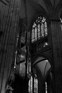
Looking into the Cathedral. The scene was beautiful, yet the image lacks some pop. We'll fix that!
I shot this photo inside the Dom in Regensburg. The beautiful Gothic architecture and art inside this cathedral seem best suited for black and white, and seem quite garish in color. The color temperature also becomes an issue when shooting at high ISOs, although I photographed this with the intent of making it black and white.
Once we’ve converted our image and opened it in our application of choice, we’re going to separate the image into red, green, and blue layers. There we’ll lighten and darken the different layers to our desired levels using curves and levels, and remove the noise. For this image, I slightly decreased the red and blue layers, while only dodging the green along the pipes of the organ. Once you’re content with your adjustments, combine the layers into a new image. For this shot, I slightly darkened the red layer, darkened the blue layer quite a bit, and dodged the pipes of the organ to increase the levels to offset the overall decrease in brightness. The finished combination now looks rather odd, and has some tinting/toning in it.

This is our image after splitting the color channels and recombining them. Notice the green tint on the pipes.
Our next step is to split the image again, this time to hue, saturation, and lightness layers. You can discard the hue and saturation layers, as we will now use the lightness layer for our final canvas. For this image, I adjusted the levels, performed a minor curves adjustment, and increased sharpness. I chose to over-sharpen, using a radius of 1.00, as I would be softening the noisy area under the arch, and applying an edge preserving smooth filter.

Almost finished, a few tweaks and we're there.
The finished result, while no masterpiece, is rewarding. It leaves you with a sense of place and scale that the color version tends to minimize. The chiaroscuro also seems quite well suited to the Gothic cathedral.

And here we go. I think this really brings out the mood and scale of the Dom. Its incredible Gothic architecture and art are magnificent.
Well, that’s one way you can do it. This is by no means the only way. You can also adjust color channels without splitting the image, and then desaturate the image. There are as many ways to convert your image as there are folks playing around to figure out what works best for their photo. One of the biggest keys, though, is color contrast and levels. Getting that where you want it can lead to some very nice results!
Enjoy the rest of your week.
Please feel free to share your photos on our Faceboook page. Everyone here would love the chance to see your work! Is there anything you’d like to see here? Do you have a question? Share your thoughts here or at the Hohenfels Volks Facebook page. Of course, commenting on both Facebook and here is always appreciated, too! Don't forget, we're on Google+, too!

No comments:
Post a Comment