Greetings, volks. Welcome to Hohenfels Volks, THE place for our place!
Today we’re going to talk about using digital filters for black and white, and color contrast to bring our vision to our images. We’re going to walk through a few different colored filters in our RAW conversion software.
Referring to Canon’s Digital Photo Pro for our software portion, we see that the first thing is to set our picture style to monochrome. After doing that, you’ll notice that color tone and saturation sliders change to filter effects and toning effects.
Once we’re into monochrome picture style, set your white balance to color temperature and play with the slider a little. This will give you some idea of your sensor’s spectral response to color. For instance, raising your temperature from 5200 to 10000 may give a giant boost to your brightness, showing a larger response to red. Lowering it to 3000, seeing a boost would indicate a greater sensitivity to blue and green.
Now that you have some idea of its response to colors and temperature, we can understand how to work our monochrome images for maximum effect. Select the first filter choice as we drag our slider, yellow, and adjust your color temperature. Going either way with your temperature shows a slight shift in brightness throughout the range. As we get lower in temperature, we have less lightness, and more as we raise the temperature.
Selecting an orange filter shows a more pronounce version of the yellow filter’s response, due to an increased presence of red in the light being allowed through the filter, or in our case, allowed to impact the image by software. Moving on to red, we see great swings throughout the temperature range. At 2500, we see our greatest darkening and at 10000, we probably see something washed out and so high in contrast to be unusable.
Going to our last filter, green, we see almost no change as we shift through the temperature range. Since light is composed of all the colors, but most of the time less of the green, we see less impact. Green has a more pronounced effect in film photography than digital, though.
OK, now we’ve seen some pretty cool ways to improve on our vanilla black and white conversions. Let’s move to some interesting ways to use those filters. Select standard for your picture style. Selecting your RGB tab, you can choose between luminance, red, green, or blue. As we cycle through the colors and make adjustments, we end up with a pretty scary image. The color is ugly and unnatural. No that you’re someplace you think might work well with a colored filter, select saturation in the RGB tab and drag the slider to 0. Without saturation, there will be changes in lightness and brightness, but no real change.
Going back to your RAW tab, select monochrome, and choose your filter. Select color temperature. Once your color temperature is about where you want it, go back to the RGB tab and start playing with your color and lightness sliders. Notice how things change as you drag them around? Well, once you have your image about where you want it, you can either save it or finish it here. The reason for going into the color sliders goes back to our discussion on color theory. By adjusting our color curves, levels, and contrast, we can make some very nice black and white images with our initial RAW conversion.
Once you have your image about where you want it, you can save it and open in another editing program, like Paintshop Pro and split the image into CMYK or RGB layers and adjust it even further, or just play with your curves or layers creating a combination that suits your vision, message, and intent. Another nice option is to create a hand painted look or feel. We’ll talk about that in a future post.
I hope everyone is on the road to a great week and has plenty of opportunities to concretize your vision. Happy shooting and have a wonderful week, Hohenfels.
Don’t forget to post any of your images you’d like to see here at the Hohenfels Volks Facebook page. Of course, commenting on both Facebook and here is always appreciated, too! Don't forget, we're on Google+, too!

Tuesday, March 13, 2012

Friday, March 9, 2012
Ride Along: Golden Sky
Greetings, volks. Welcome to Hohenfels Volks, THE place for our place!
Today we’re going on another ride along. This one isn’t too far from home, so we’ll keep it short.
While exploring the backside of Hohenfels Sunday, I stumbled upon this scene and knew it was something I wanted to keep.

ISO 400, f/22, 1/50, 35mm, Canon EOS 7D
The sun dipping slowly toward night's rest and renewal.
Going over the hill from Hohenfels proper toward Raitenbuch, you come across a small country lane meandering through the fields. Having been down this road before, I knew there were some nice scenics waiting to reward the one bringing them home. There is a tiny little chapel between 2 giant trees there, with some magnificent views of the hills around.
The shot was easy to visualize, I came up with several in fact. Composition was envisioned to include the colors all around as one the key elements. The sky was partly cloudy, with some nice golden glow from the sun hanging around the think veneer of sheeted clouds, and a nice blue in the areas without cloud cover.
I arrived moments before the color really started coming out. I took several shots, hoping to see something I could work with. I included the trees and the chapel in several, but liked this one for matching the closest to what I visualized.
I metered off the tree with the Gossen Sixtomat, at ISO 400. Giving the tree a –2-stop exposure from the meter would have washed out the sky and left the color flat and a bit comical. Metering the tree for –3 stops and the grass for about –2 stops from middle gray, meant I could shoot at f/22, which was part of getting the sun to streak in a nice little starburst. I was also able to shoot at 1/50, which limited the streaking to just a couple rays coming lightly over the hills in the distance through the clouds.
Getting it into Canon DPP, or the digital darkroom, added some magic. Canon has some “Picture Styles” for their application that come standard, allowing for the most common edits to color and contrast to be quickly applied. My first thought was Landscape, but that left the gold too vague and muddled. Having downloaded several other styles from Canon’s site, I settled on Autumn Hues for the picture style. This softened the contrast between the sun and the hills; it also made for some nice separation of the golds, oranges, and reds in the sky. I adjusted my levels, crushing them in some for clarity.
After that, I set the color temperature to about 6000K, which brought the color in line with the lighting hues. Increasing the contrast to +1 and the shadows to +2 added to the glow around the hills and tree, while allowing the levels to hold up throughout the image, including the separation in the distant hills. The last adjustment was to take saturation down –1 and sharpen.
The car coming up the road in the middle ground adds a nice little reference point for the viewer to pause. That was a lucky little bit of happenstance. I liked the lights as he was approaching and shot quickly to include his headlights. This photo captures what I visualized, and expresses the joy one gets when out looking for shots, especially when you find one that works for your vision. Shooting with a vision can make for some interesting stuff, knowing what tools you have at your disposal to make your vision a reality makes easier work of it!
Check out Canon’s site and download some of their picture styles. You’ll see some stuff that probably doesn’t appeal to you, at least I did, but you’ll also find something that does. I’m certain Nikon and other companies have something similar, if not, you can make your own in whatever app is your digital darkroom! Exposure and visualization start your image on its journey; your level controls and tools in software bring it home. Using them all together can make something that brings others to that same place with you!
Take care and enjoy your day!
Don’t forget to post any of your images you’d like to see here at the Hohenfels Volks Facebook page. Of course, commenting on both Facebook and here is always appreciated, too! Don't forget, we're on Google+, too!
Today we’re going on another ride along. This one isn’t too far from home, so we’ll keep it short.
While exploring the backside of Hohenfels Sunday, I stumbled upon this scene and knew it was something I wanted to keep.
ISO 400, f/22, 1/50, 35mm, Canon EOS 7D
The sun dipping slowly toward night's rest and renewal.
Going over the hill from Hohenfels proper toward Raitenbuch, you come across a small country lane meandering through the fields. Having been down this road before, I knew there were some nice scenics waiting to reward the one bringing them home. There is a tiny little chapel between 2 giant trees there, with some magnificent views of the hills around.
The shot was easy to visualize, I came up with several in fact. Composition was envisioned to include the colors all around as one the key elements. The sky was partly cloudy, with some nice golden glow from the sun hanging around the think veneer of sheeted clouds, and a nice blue in the areas without cloud cover.
I arrived moments before the color really started coming out. I took several shots, hoping to see something I could work with. I included the trees and the chapel in several, but liked this one for matching the closest to what I visualized.
I metered off the tree with the Gossen Sixtomat, at ISO 400. Giving the tree a –2-stop exposure from the meter would have washed out the sky and left the color flat and a bit comical. Metering the tree for –3 stops and the grass for about –2 stops from middle gray, meant I could shoot at f/22, which was part of getting the sun to streak in a nice little starburst. I was also able to shoot at 1/50, which limited the streaking to just a couple rays coming lightly over the hills in the distance through the clouds.
Getting it into Canon DPP, or the digital darkroom, added some magic. Canon has some “Picture Styles” for their application that come standard, allowing for the most common edits to color and contrast to be quickly applied. My first thought was Landscape, but that left the gold too vague and muddled. Having downloaded several other styles from Canon’s site, I settled on Autumn Hues for the picture style. This softened the contrast between the sun and the hills; it also made for some nice separation of the golds, oranges, and reds in the sky. I adjusted my levels, crushing them in some for clarity.
After that, I set the color temperature to about 6000K, which brought the color in line with the lighting hues. Increasing the contrast to +1 and the shadows to +2 added to the glow around the hills and tree, while allowing the levels to hold up throughout the image, including the separation in the distant hills. The last adjustment was to take saturation down –1 and sharpen.
The car coming up the road in the middle ground adds a nice little reference point for the viewer to pause. That was a lucky little bit of happenstance. I liked the lights as he was approaching and shot quickly to include his headlights. This photo captures what I visualized, and expresses the joy one gets when out looking for shots, especially when you find one that works for your vision. Shooting with a vision can make for some interesting stuff, knowing what tools you have at your disposal to make your vision a reality makes easier work of it!
Check out Canon’s site and download some of their picture styles. You’ll see some stuff that probably doesn’t appeal to you, at least I did, but you’ll also find something that does. I’m certain Nikon and other companies have something similar, if not, you can make your own in whatever app is your digital darkroom! Exposure and visualization start your image on its journey; your level controls and tools in software bring it home. Using them all together can make something that brings others to that same place with you!
Take care and enjoy your day!
Don’t forget to post any of your images you’d like to see here at the Hohenfels Volks Facebook page. Of course, commenting on both Facebook and here is always appreciated, too! Don't forget, we're on Google+, too!
Wednesday, March 7, 2012
Ride Along Shot- Braustuberl
Greetings, volks. Welcome to Hohenfels Volks, THE place for our place! Another beautiful day left us feeling nice here in Hohenfels.
Today we’re packing up some film and going shooting in Parsberg. That means it’s time for another Ride Along shot.
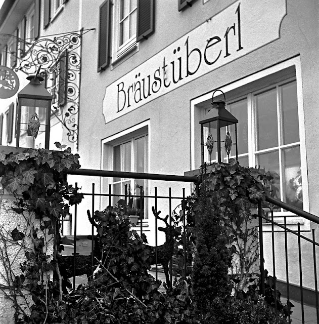
ISO 400, f/8, 1/50, Zeiss Ikon Ikoflex I, 75mm lens
Ivy at the Braustuberl in Parsberg
I used a mid ‘40s Zeiss Ikon Ikoflex I TLR, with Ilford’s 120 HP5+ film. This film is ISO 400, but can be pushed to 1600, giving it wide exposure latitude. The medium format 120 film combined with the camera’s 1X1 aspect ratio produces biggish 6cmX6cm negatives, which allows for nice print sizes.
I was in Parsberg picking up some film, developer, and color prints from our day trip to Bamberg with some wonderful friends. I made sure to have my camera and look for shots that might make nice prints. The combination of ivy and the rest of the scene set me thinking about how to compose a photo using the elements I desired.
The first step was to visualize what I wanted to see in the final image. I knew I wanted the “Braustuberl” sign and both lanterns. I also wanted to make the ivy a nice part of the scene. How did I want to convey the image? What parts needed detail and how much detail led to the process of putting together the final composition.
Knowing that I wanted detail in the lanterns, enough to show the shadows cast by the lantern tops, meant that they had to be placed about 3 stops down from middle gray. The leaves needed more luminance, so had to be placed about 2 stops down. Remember, when dealing with your shadows, 2 stops down will give you variations in tone, but no texture, and 3 will give you texture and an inkling of nice detail.
Metering off the ivy from about 1 foot away, gave me f/16 at 1/5 second. Metering off the walkway in the lower right for middle gray gave me f/16 at 1/125. Metering from the lanterns gave me ½ at f/16. The final shot was f/8 at 1/50 second. This moved everything up 1 stop above where I wanted it to allow for experimenting with compensating development.
Developing was done for N+1/3 in pre-depleted Tetenal Ultrafin 1+30. The times were 30 seconds of initial inversion agitation, with 4-minute stand cycles followed by 15 seconds inversion agitation. Total developing time was 20 minutes followed by the usual washing, fixing, and a German Jet dry to prevent spots. The film was hung up to dry for about 4 hours before cutting and scanned the next day.
The developing and exposure method allows the developer to deplete rapidly at the highlights, limiting the action there, while allowing more action on the shadow details. It lowers contrast and can give shadows a luminosity that makes them stand out more than just being black.
After scanning, I brought in the levels some, adjusted the curves for a tiny inverted S, and applied sharpening. It was scanned at 4800 DPI and resized to 800x800 at 300 DPI for the web, it won’t print nicely at all at that resolution, but I have the negative and the original file for that. The beauty of the scanning and editing on the computer is that it allows us to revisit our original and edit it multiple ways and times until we are satisfied with the match.
The meter I used was an old Gossen Sixtomat from the 1960s. This meter has a 30-degree field of view, so I had to get close and cup the sides to get the correct reading for the areas that were being measured. The digital camera would have made it easier with its 7-degree field in spot mode. I probably could have gotten the shot in half the time, but doing the old fashioned way was actually quite nice and reinforced what I’ve been learning.
Well, that’s it for this ride. I hope everyone has a great week and gets some photo time!
Don’t forget to post any of your images you’d like to see here at the Hohenfels Volks Facebook page. Of course, commenting on both Facebook and here is always appreciated, too! Don't forget, we're on Google+, too!
Today we’re packing up some film and going shooting in Parsberg. That means it’s time for another Ride Along shot.
ISO 400, f/8, 1/50, Zeiss Ikon Ikoflex I, 75mm lens
Ivy at the Braustuberl in Parsberg
I used a mid ‘40s Zeiss Ikon Ikoflex I TLR, with Ilford’s 120 HP5+ film. This film is ISO 400, but can be pushed to 1600, giving it wide exposure latitude. The medium format 120 film combined with the camera’s 1X1 aspect ratio produces biggish 6cmX6cm negatives, which allows for nice print sizes.
I was in Parsberg picking up some film, developer, and color prints from our day trip to Bamberg with some wonderful friends. I made sure to have my camera and look for shots that might make nice prints. The combination of ivy and the rest of the scene set me thinking about how to compose a photo using the elements I desired.
The first step was to visualize what I wanted to see in the final image. I knew I wanted the “Braustuberl” sign and both lanterns. I also wanted to make the ivy a nice part of the scene. How did I want to convey the image? What parts needed detail and how much detail led to the process of putting together the final composition.
Knowing that I wanted detail in the lanterns, enough to show the shadows cast by the lantern tops, meant that they had to be placed about 3 stops down from middle gray. The leaves needed more luminance, so had to be placed about 2 stops down. Remember, when dealing with your shadows, 2 stops down will give you variations in tone, but no texture, and 3 will give you texture and an inkling of nice detail.
Metering off the ivy from about 1 foot away, gave me f/16 at 1/5 second. Metering off the walkway in the lower right for middle gray gave me f/16 at 1/125. Metering from the lanterns gave me ½ at f/16. The final shot was f/8 at 1/50 second. This moved everything up 1 stop above where I wanted it to allow for experimenting with compensating development.
Developing was done for N+1/3 in pre-depleted Tetenal Ultrafin 1+30. The times were 30 seconds of initial inversion agitation, with 4-minute stand cycles followed by 15 seconds inversion agitation. Total developing time was 20 minutes followed by the usual washing, fixing, and a German Jet dry to prevent spots. The film was hung up to dry for about 4 hours before cutting and scanned the next day.
The developing and exposure method allows the developer to deplete rapidly at the highlights, limiting the action there, while allowing more action on the shadow details. It lowers contrast and can give shadows a luminosity that makes them stand out more than just being black.
After scanning, I brought in the levels some, adjusted the curves for a tiny inverted S, and applied sharpening. It was scanned at 4800 DPI and resized to 800x800 at 300 DPI for the web, it won’t print nicely at all at that resolution, but I have the negative and the original file for that. The beauty of the scanning and editing on the computer is that it allows us to revisit our original and edit it multiple ways and times until we are satisfied with the match.
The meter I used was an old Gossen Sixtomat from the 1960s. This meter has a 30-degree field of view, so I had to get close and cup the sides to get the correct reading for the areas that were being measured. The digital camera would have made it easier with its 7-degree field in spot mode. I probably could have gotten the shot in half the time, but doing the old fashioned way was actually quite nice and reinforced what I’ve been learning.
Well, that’s it for this ride. I hope everyone has a great week and gets some photo time!
Don’t forget to post any of your images you’d like to see here at the Hohenfels Volks Facebook page. Of course, commenting on both Facebook and here is always appreciated, too! Don't forget, we're on Google+, too!
Tuesday, March 6, 2012
Inspiration and Quotes
Greetings, volks. Welcome to Hohenfels Volks, THE place for our place! A lovely afternoon spent taking photos made for an end of day ritual worth participating in.
Today we’re going to post some photography quotes followed by a quick thought from Hohenfels Volks. I hope you’ll find something to inspire you here!
Beauty can be seen in all things, seeing and composing the beauty is what separates the snapshot from the photograph. – Matt Hardy
Remembering the inherent beauty in things can help change how you view a scene and aid in your visualization!
Nothing happens when you sit at home. I always make it a point to carry a camera with me at all times…I just shoot at what interests me at that moment. – Elliott Erwitt
There are always photographic opportunities, the train station, the drive home, and even the quick dash out for milk. Maybe it’s a sunset or some interesting clouds, visualize, meter, and shoot it!
There is nothing worse than a brilliant image of a fuzzy concept. Ansel Adams
Remember, your photos should have some coherence in the composition. It takes a good photo and makes it great!
In photography, there is a reality so subtle that it becomes more real than reality. Alfred Stieglitz
The object of taking a photo doesn’t always include a literal rendering of the scene, but a rendering of what you intended!
Food for thought is something we all need form time to time. Keeping our inspiration and thinking fed nourishes ideas and creativity. Feed yours today; see how creative you can be.
I’m hoping to post another ride along shot tomorrow, so stay tuned for that one!
Don’t forget to post any of your images you’d like to see here at the Hohenfels Volks Facebook page. Of course, commenting on both Facebook and here is always appreciated, too! Don't forget, we're on Google+, too!
Today we’re going to post some photography quotes followed by a quick thought from Hohenfels Volks. I hope you’ll find something to inspire you here!
Beauty can be seen in all things, seeing and composing the beauty is what separates the snapshot from the photograph. – Matt Hardy
Remembering the inherent beauty in things can help change how you view a scene and aid in your visualization!
Nothing happens when you sit at home. I always make it a point to carry a camera with me at all times…I just shoot at what interests me at that moment. – Elliott Erwitt
There are always photographic opportunities, the train station, the drive home, and even the quick dash out for milk. Maybe it’s a sunset or some interesting clouds, visualize, meter, and shoot it!
There is nothing worse than a brilliant image of a fuzzy concept. Ansel Adams
Remember, your photos should have some coherence in the composition. It takes a good photo and makes it great!
In photography, there is a reality so subtle that it becomes more real than reality. Alfred Stieglitz
The object of taking a photo doesn’t always include a literal rendering of the scene, but a rendering of what you intended!
Food for thought is something we all need form time to time. Keeping our inspiration and thinking fed nourishes ideas and creativity. Feed yours today; see how creative you can be.
I’m hoping to post another ride along shot tomorrow, so stay tuned for that one!
Don’t forget to post any of your images you’d like to see here at the Hohenfels Volks Facebook page. Of course, commenting on both Facebook and here is always appreciated, too! Don't forget, we're on Google+, too!
Monday, March 5, 2012
Components of Composition: Remembering Our Vision
Greetings, volks. Welcome to Hohenfels Volks, THE place for our place! What a day, all set to be decent, then, WHAM, a huge snowfall!
I hope everyone is doing well. Today we’re going to discuss visualization and envisioning your image. We’re going to deal less with the technical side, and more with our art as an art.
Most people when asked about visualization think about seeing things in their minds. They often associate it with seeing reality. Remember, we can be craftsmen and capture everything purely as it is, or was, and we can be artists. Most of the time we shoot what we see and think would look nice. We don’t really give a lot of thought to our image and the little things like levels, luminosity, luminance, and other small factors.
Thinking about those factors can be technical and very limiting unless you learn to think of them as tools. Starting with your metering, these little factors can be the biggest tools to getter photos that we envisioned.
We all need to slow down sometimes. What better way than doing something we love, our cameras ready and fingers itching to capture something. Stop and look at your scene, what’s it saying? What are you seeing and what are you feeling? How can you create a scene using what you have that will evoke what you wish to convey?
Close your eyes see where you can use your light to bring out a detail, to pluck out something reminiscent of your feeling. Perhaps you wish to convey the wrap around luminous quality of the light, try shooting your spot metered area for 1 stop higher and editing for a slightly lower contrast. Make sure your shadows and highlights will be supported and not blocked or clipped. How about the radiant charm of a sweet little girl running around that party you’re attending? Shoot her at metered + 2 stops, and develop down your levels and mid-tones, while lowering your contrast a small amount. She’ll glow with your vision, in just the way you thought she did!
Here’s a photo to give you an idea. I visualized the sun setting at a very high level and the chapel seeming alive with a lower contrast lighting, which would allow the shadows of the window to remain mysterious. With the chapel part at about metered –1 and the trees at –2, the sun was at about metered +6. Stopping down to the chapel, metered and set at –1 brought the sky down and gave it some detail. By shooting at f/22 the sun becomes part of the image with the flare and star-bursting. During RAW conversion, the levels were crushed in some, the shadows were given +2 and the highlights given –1. With contrast set to –1, the result seems to bring the chapel to life, while keeping the mystery. The trees, with their scattered branches, add to the mystery.

ISO 400, f/22, 1/50, 24mm
Sunset at the Chapel.
Stopping for a moment to think about your intention and visualizing the final image goes a long way toward making it a reality. Take the time to think through your settings, exposure, and edits and your image will come to life.
Here’s wishing you a great Hohenfels week!
Don’t forget to post any of your images you’d like to see here at the Hohenfels Volks Facebook page. Of course, commenting on both Facebook and here is always appreciated, too! Don't forget, we're on Google+, too!
I hope everyone is doing well. Today we’re going to discuss visualization and envisioning your image. We’re going to deal less with the technical side, and more with our art as an art.
Most people when asked about visualization think about seeing things in their minds. They often associate it with seeing reality. Remember, we can be craftsmen and capture everything purely as it is, or was, and we can be artists. Most of the time we shoot what we see and think would look nice. We don’t really give a lot of thought to our image and the little things like levels, luminosity, luminance, and other small factors.
Thinking about those factors can be technical and very limiting unless you learn to think of them as tools. Starting with your metering, these little factors can be the biggest tools to getter photos that we envisioned.
We all need to slow down sometimes. What better way than doing something we love, our cameras ready and fingers itching to capture something. Stop and look at your scene, what’s it saying? What are you seeing and what are you feeling? How can you create a scene using what you have that will evoke what you wish to convey?
Close your eyes see where you can use your light to bring out a detail, to pluck out something reminiscent of your feeling. Perhaps you wish to convey the wrap around luminous quality of the light, try shooting your spot metered area for 1 stop higher and editing for a slightly lower contrast. Make sure your shadows and highlights will be supported and not blocked or clipped. How about the radiant charm of a sweet little girl running around that party you’re attending? Shoot her at metered + 2 stops, and develop down your levels and mid-tones, while lowering your contrast a small amount. She’ll glow with your vision, in just the way you thought she did!
Here’s a photo to give you an idea. I visualized the sun setting at a very high level and the chapel seeming alive with a lower contrast lighting, which would allow the shadows of the window to remain mysterious. With the chapel part at about metered –1 and the trees at –2, the sun was at about metered +6. Stopping down to the chapel, metered and set at –1 brought the sky down and gave it some detail. By shooting at f/22 the sun becomes part of the image with the flare and star-bursting. During RAW conversion, the levels were crushed in some, the shadows were given +2 and the highlights given –1. With contrast set to –1, the result seems to bring the chapel to life, while keeping the mystery. The trees, with their scattered branches, add to the mystery.
ISO 400, f/22, 1/50, 24mm
Sunset at the Chapel.
Stopping for a moment to think about your intention and visualizing the final image goes a long way toward making it a reality. Take the time to think through your settings, exposure, and edits and your image will come to life.
Here’s wishing you a great Hohenfels week!
Don’t forget to post any of your images you’d like to see here at the Hohenfels Volks Facebook page. Of course, commenting on both Facebook and here is always appreciated, too! Don't forget, we're on Google+, too!
Subscribe to:
Posts (Atom)