Wednesday, February 29, 2012

Character...istic

Greetings, volks. Welcome to Hohenfels Volks, THE place for our place! I hope Hohenfels and our friends throughout the area are staying comfortable and warm.

Today we’re going to talk a little bit about the histogram and the characteristic curve portion. We’re going to see how every camera, film, and sensor has a different characteristic curve and how adjustments we make can change that. We’re also going to see those changes on the histogram.

First, we need to define what a histogram is. Simply stated, your histogram is a graphic representation of the range of levels within your image. The higher the graph, the more of that exposure level is present within your image. If you notice, with Canon’s DPP, it’s scaled from about –10 to +4. The starting and ending points vary between different models. The curve you see highlighted is what is generally referred to the characteristic curve, and is dependant on the camera model and sensor. This is analogous with a film’s characteristic curves, and once we see how our adjustments impact it, we can learn to judge our images and exposures.


The characteristic curve for my 7D in an unedited image


Here is the same image, after crushing levels some. Note the minor differences in the curves. Everything past the threshold of the toe will be pure black.

Next, we’re going to learn the basic terms when referring to the curve. At the bottom left, you can see the curve has tapered and become elongated. It loses its vertical travel and starts fading into a horizontal line at about –6. That area is referred to as the “toe,” and runs from –6 to about –2.5. At the upper right, something similar has happened, that area is referred to as the “shoulder,” and runs from about +1.5 to +4. The area in between is the straight-line portion. –6 on the curve is the “threshold” and at about +3 we hit “maximum density.”

The toe area represents the “density” in the negative shadow areas. The greater the density, the more detail can be brought out in your shadows. At maximum density, no further increase can be visually detected in the brightness at those levels. When we are at the threshold and maximum density, our shadows and highlights are clipped or blocked, and there is absolutely no detail in these areas. These equate to about zone 0 for your shadows and zone 10 for your highlights. These zones are slightly off some with digital due to restraints of monitors and printers. We look to get our images from blackest at zone 1 to 2 and whitest at about 8 to 9. This gives us our limitations within which our exposures must be made.

Using the example of my curve, we can see that zone 2 to zone 8, or –3 to +3 are capable of being exposed and retaining detail. Below 2 and above 8 we start to see clipping and blocking creep into the image. This equates to 3 stops under and 3 over middle gray, or what our meter is telling us to set our exposure for.

Understanding these things gives us the tools to adjust our images in a manner consistent with our vision and measurements. When we crush in our curves, as discussed in a prior post, we change our characteristic curve. As you can see from the image showing the levels we adjusted to, our toe and shoulder have gotten shorter. This changes our minimum maximum densities. In effect, it darkens our darks, and whitens our whites. A sort of photographic laundry soap! You’ll also notice that the straight-line portion becomes progressively more vertical. The more vertical this section is, the more contrast in your image.

Combining all these things, we see how easy it is to change our characteristic curve for our camera and sensor, which will change our image quality and exposure. We can easily use these tools in conjunction with our metering and proper exposure to bring our images into our range of visualization.

Film and even our sensors use these curves to determine the ISO or exposure value. That’s how true film speed was determined before the advent of digital. Sensitometry
was used in conjunction with testing different exposures to get the correct speed for setting cameras up. The densities were measured and settings read that allowed a film's ISO to be determined, and therefore exposed properly. Density today doesn’t need to be measured, but knowing how film density relates to your histogram and exposure can increase your ability to visualize and expose accurately.

The next time you’re working on your RAW images, watch what happens as you adjust your exposure and crush in your curves. When you see the characteristic curve change, you’ll know why and how better to read your original and your edits. Have fun playing with it, discovering what you can do, and making your vision concrete.

Enjoy the rest of your week.

Don’t forget to post any of your images you’d like to see here at the Hohenfels Volks Facebook page. Of course, commenting on both Facebook and here is always appreciated, too! Don't forget, we're on Google+, too!

Tuesday, February 28, 2012

Hohenfels Cloudy

Greetings, volks. Welcome to Hohenfels Volks, THE place for our place! After a chilly day and busy day, Hohenfels is best served with a cup of HOT chocolaty cocoa!

Today’s lighting was nice for some outdoor environmental portraits. The sky can be a great light source if used properly.

Cloudy overcast skies give us nice soft light that wraps around our subjects. Being so soft allows the light to smooth and flatter the folks you’re photographing. It works best if we can keep the sky out of the scene, like shooting against a nice background or in an office through a large open window. Soft light is what makes a portrait nice and can be used for awesome effect.

When we don’t have the luxury of cloudy weather, open shade works about as well, depending on reflections and such. When shooting near the edge of a wooded area like a park, it can give the same soft effect. Using reflectors and other light sources allows us to make it more or less dramatic according to our vision.

Don’t forget, though, that cloudy and overcast can also be your friend when shooting cityscapes and nature shots, and can add some nice smooth highlights to close up flower shots. This last one is especially true right after a rain. I’ve found that taking shots of features near old buildings in cloudy weather can smooth out your light and help hold the exposure for your metered areas to bring out the details. A little bit of golden tone to the cloudy light can really add some warmth to those details, as well.

Try getting out during these end of winter and early spring blah days. Look for the soft light, look for something that inspires your vision and encourages a shot or 2, and take the shot! You’ll enjoy reviewing your results over a cup of cocoa.

Don’t forget to post any of your images you’d like to see here at the Hohenfels Volks Facebook page. Of course, commenting on both Facebook and here is always appreciated, too! Don't forget, we're on Google+, too!

Monday, February 27, 2012

Placing and Falling

Greetings, volks. Welcome to Hohenfels Volks, THE place for our place! Lovely weather is starting to work its way around to us again. Slowly, but it’s coming!

Today we’re going to talk about metering and level placements. First things first, though, you need to know your camera and how to set metering types.

We need to start with our visualization and an assessment of the scene we’re trying to bring to life. Where are the most important details, where do we want to keep detail, and where can we sacrifice some detail to get our image to match our vision?

Once we’ve done our initial assessment, we need to place our camera’s metering mode to spot mode. In spot mode, we’re going to meter several places in AV mode, with our aperture set to the key stop for our ISO. Remember, your key stop is the square root of your ISO. To keep things simple, we can go to ISO 125, f/11, and be set. Having 2 sides of the triangle will help us get our exposure the way we want.

Start by metering the darkest part of the scene. Meter the brightest part of the scene, and move through to the middle levels. Take note of what these shutter speeds are. Find the darkest part in which you want to retain full detail and texture and meter off it. Take note of that setting, perhaps you’re showing 1/60 in your most important dark area, and read your brightest area where you want full detail.

Deciding upon which is more important, based on your vision, highlights or shadows, you need to set your exposure. If you decide the shadows are the most important, then you’d set your exposure 2 stop down. If you metered your darkest detail area at 1/60 at f/11 for ISO 125, you’ll want to shoot 2 stops down. You could go 1/125 at f/16 for maximum DOF, or 1/500 at f/8. Alternatively, you could go 1/250 at f/11, which would be 2 stops down. That will place your shadow details 2 stops below middle gray, or about 18% reflectance. This is about zone 3 in the zone system.

This concept is known as place and fall. By deciding the most important part of your image, you are deciding where you want it exposed. As mentioned in the example above, we’re placing our shadows which we find important into zone 3, letting the other values fall where their new levels will be. The same works in reverse for highlights. By moving our desired highlights up 3 stops, we’re placing them at about zone 8. This gives us a range of exposures in our image that should be about what we visualized.

By placing our levels where we want them, we can minimize our editing time, which means more time shooting! It also gives us a starting place for our previous post on developing for our vision. Try shooting a few scenes in monochrome this way, and then try it in color. You’ll see a change in your image and the way you see and approach a scene and photographing it. You’ll also notice that you have a more vibrant color and tonal range than before.

Exposure is the base of all we do in photography. Even printing an image was traditionally done by exposing the paper to light. Most high quality printing by large firms is still exposure using lasers. Learning the triangle and how to manipulate it, in ways beyond the conventional can make for incredible images. Your vision is the starting point to making it happen!

Here’s hoping you find the right light, the right scene, and have your camera by your side to capture it!

Don’t forget to post any of your images you’d like to see here at the Hohenfels Volks Facebook page. Of course, commenting on both Facebook and here is always appreciated, too! Don't forget, we're on Google+, too!
Friday, February 24, 2012

Digital Density

Greetings, volks. Welcome to Hohenfels Volks, THE place for our place! Let’s start by welcoming a little sanity and quiet, as peace returns to Hohenfels and our surrounds!

The last couple weeks have been trying for everyone, I’m sure, but things are getting back on track.

I went out and shot some film today, and developed 2 rolls this evening. That got me thinking about something that we’ll discuss here today. Before we begin, I should explain that many of our recent references to Ansel Adams are because he was probably the most prolific educational writer on photography. He’s not the only great, but his vast amount of work and writings are the most widely read, studied, and approachable.

Today we’re talking about “Digital Density.” This has nothing to do with being behind the curve on technologies. I’m referring to something that hit me today while developing my film.

When old photographers spoke of their negatives, they spoke in the arcane language of photographers. A negative that was thin was dark in printing and so on. Too dense often leads to blocked, or clipped, highlights. Contrast was a product of your negative’s density. So was tonal range. The density was determined by the thickness of remaining silver, or emulsion, after development. Adams developed for a zone 8 density of 1.25-1.35 for his preferred diffusion enlargers. Density is a logarithmic number, and we’re not going into it here. Generally, zone 8 is where the brightest details can be discerned and identified. Zone 9 results only in very slight variations in tone and 10 is pure white. By exposing to keep the darkest shadow details in zone 3-4 and developing to keep highlight details in zone 8, he was able to make magnificent images.

Most of that is overly simplified, but it gives us a basis for the next part of this post.

First, let’s look at a basic representation of the zone system.
Hohenfels Volks: Zone System
The basic Zones chart

Now, we’re going to convert that to a negative.
Hohenfels Volks: Zone System in Negative
When converted to a negative, this is an approximation of the basic zone chart

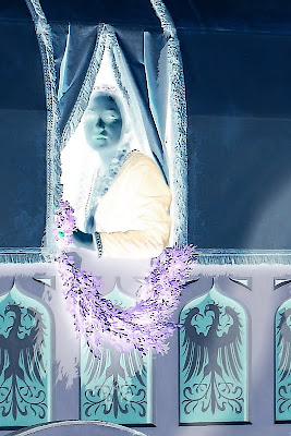
You can see how things changed. Assuming a pure white light behind the negative strip, you can see that zone 1 is pure white, and so on up the scale. Below are the negative versions of a couple photos, one black and white, and the other color. Looking at them, you can see that the darker parts are actually the lighter areas when the image is returned to original.

Areas with no density, other than film base+fog, will have absolutely no detail, and tone. Areas that are pure black will have no detail and will be pure white. Knowing how the density affects photos, you can do a bit of editing on your image after converting it to negative. In Photoshop, this is done by inverting the image, or CTRL-I. In Lightroom, it’s the same. In Paintshop Pro, it’s under the Image Menu- negative image.

Here are 2 conversions of digital photos, taken with a Canon digital SLR, one in color and one black and white.
Hohenfels Volks: A Lady in Waiting
This is a color photo converted to negative. Look for the original in my works.

Hohenfels Volks: Developing for your vision
The photo we used in our last post about developing for your vision

Once you’ve done your conversion, you can clone out dust, with greater accuracy if you’re messy with the mouse. Another great thing about this feature is the ability to bring out detail in your highlights. Digital doesn’t deal too awfully well with blown highlights, but you can recover small amounts of detail by converting to a negative of your image. This is great for working with skies and snowy areas. It’s possible to recover some in the shadows, also.

The caveat is that there must be information there, or it will be less effective.

You can also increase your control over your tonal range by performing level and curve adjustments on a negative layer, then inverting it. When working on a color image, be aware, that subtle changes to exposure can be localized to perhaps a small portion by extraction that selection as a layer and converting it a negative. It allows you to expand the tonal range of any color, or the whole image, in ways that can be very impressive. You can also diminish some colorcasts! Colors are inverted in a negative, so keep that in mind, or you’ll end up all abstract and disappointed, unless that’s your vision! It’s almost like working with a large negative.

Using the tools taught to us by those who were taking photos when our folks were kids, we can learn to improve our digital art. Using your vision, seeing both the negative and the print, you can begin to get some awesome stuff going on. Give it a try and see how it works with your vision and your exposures. If it's something you're happy with, post the results, we'd all like to see!

Don’t forget to post any of your images you’d like to see here at the Hohenfels Volks Facebook page. Of course, commenting on both Facebook and here is always appreciated, too! Don't forget, we're on Google+, too!

Tuesday, February 21, 2012

Developing for Your Vision

Greetings, volks. Welcome to Hohenfels Volks, THE place for our place! Welcome to another delayed post.

Lots of things going on have delayed posting for several days, yet again! So here we go, continuing our last post about exposing for your vision.

We posted a photo that we referred to as N development, or normal. That going to be our starting point. Going back to our RAW conversion, we’re going to change that some. Since I use Canon’s Digital Photo Pro that came with my camera, I’ll refer to that.

Our first step is to adjust the slider for exposure. I took it down to -.33 stop. That added some depth to the sky and brighter areas, allowing for some slight texture and tonality. Then I set the white balance to color temperature, at 4200. You’ll see why I did that later.

After that, I crushed in the levels some, the method is shown below. That increases contrast and allows you to bring your levels at the extreme end in some. It gives deeper shadows and highlights. Some of this will be offset, while allowing the levels to be set in our next step.

Hohenfels Volks: Crushing levels
Looking at the arrows, you can see how the levels are crushed in using your sliding limits. This adds clarity, contrast, and depth to an image.

Bringing the contrast up to 2, and the highlights to –2, allowed for some slight increase in highlight detail along the snowy roof of the church and in the snow on the fields. Bringing the shadows up to +2, added depth to the forest and some detail to the church tower and tonality to the almost black barn. It also allowed the shadows to move higher along the exposure scale, increasing the open feeling of the spaces and the shadows from the buildings.

After setting my monochrome filter to red, which darkens greens and blues, the snow appeared brighter without fading or washing out, while adding some shadows back to the open parts of the further hill and forest. Adjusting the color temperature down to about 3900 cleared things up a little.

After rotating the image to a more suitable angle, due to my camera not being level while I shot, I was ready to sharpen, convert, and save. Below is the finished image.

Hohenfels Volks: N-.3 village outside Hohenfels
ISO 400, f/16, 1/500, 115mm
Our finished shot of this charming village.

Here is the photo in color with almost the same settings, with the biggest change coming from the color temperature. Outdoor shadows, and snow, usually have more blue light, so bumping up the color temperature allowed for white snow, blacker shadows, and still retained the color on the far hills.

Hohenfels Volks: N-.3 village outside Hohenfels
ISO 400, f/16, 1/500, 115mm
Our color shot of this charming village.

Some small edits in RAW can save tons of time fixing photos. They also allow us to create our vision, not just re-create what we saw. Using some dodging and burning tools and sharpening brushes, as well as the other tools, in editing applications can further that vision to a concrete expression of what our mind saw and wanted to show.

I hope to see some of your vision soon! Start sharing your work and showing us how you saw something, not what you saw. Making great photos is a great way to spend some time, and get in touch with the world around you! I hope you have a wonderful week and enjoy the weather we have right now!

Don’t forget to post any of your images you’d like to see here at the Hohenfels Volks Facebook page. Of course, commenting on both Facebook and here is always appreciated, too! Don't forget, we're on Google+, too!