Saturday, December 31, 2011

Out With the Old

Hohenfels Volks Happy New Year

Here's wishing everyone out the a bright and beautiful 2012. May God bless you with the best there is, with joy, love, and peace throughout the new year and beyond!

Thanks for allowing us to be part of your adventure in photography!

Friday, December 30, 2011

Tips of the Trade- More Exposing?

Greetings and welcome to Hohenfels Volks, THE place for our place. Tomorrow is the last day 2011, is everyone in Hohenfels ready for the New Year?

Today we’re going to do a short post on long exposures. By that, I don’t mean what you might be thinking… Actually, we’ll be talking about exposures made over an extended period, usually longer than 1 or 2 seconds. Most of you already know this stuff, but a little refresher is always nice. With longer nights upon us, and lovely seasonal decorations and lighting, long exposures can be a real shot maker during this time of year. To create starbursts, for instance, longer exposure means longer rays.

Chances are you already know that long exposures absolutely REQUIRE the use of a tripod. Notice the capitalization of REQUIRE. If you don’t have a tripod, and your exposure is short enough, a monopod will work, but it’s a tradeoff. 30 seconds on a monopod probably won’t get the shot you want. The best option is a slightly heavy tripod, one that has the fewest leg extensions. More leg extensions mean thinner legs and less support. When you can get way with it, don’t extend your legs, and if you have to, start with the top ones, which are thicker until you get the height you need. Try to use a tripod with a center element that doesn’t crank up, but if you do, keep it down where possible to add support.

Don’t use your finger to release your shutter. Get a good shutter release with a long enough cable for your purpose, or go wireless. Turn off your IS, if your lens has it. IS can cause blurring as the elements move looking for motion to offset. If your camera is capable, turn on mirror lock up. Even the motion of the mirror can cause subtle blurring. Compose your image, lock your mirror, and then activate your shutter. If your camera has a delay, activate it to get that extra pause to allow shake to diminish. Carry a good flashlight or other light source, as you’ll likely be working in the dark. Your kids or spouse can be helpful if you’re shooting inside to turn on the lights for focusing, then turning them off when you’re ready to start the shot.

Now I’ll give you a few ideas for using this information.

Has anyone shot star trails? This “simple” long exposure can create some interesting images. Find a strong center of interest and the North Star, Put the North Star at the center of interest and compose your image appropriately. Then expose for about 10 minutes, it will seem as if the stars are rotating around your subject. To do this, you should be in bulb mode and your remote release should have a lock function, as most cameras limit at about 30 seconds. Set your f/stop at about f/16 and your time to B. Longer times equal longer trails, shorter times equal generally brighter trails. Don’t do this during a full moon, as it works best on a moonless night.

How about light painting? Using an exposure time as above, you can use lights, flashes, and other sources to paint your scene with some good light, or create some really interesting effect. Try it with a candle or flashlight for something cool. Candles can create the illusion of fire rings and the like, check it out.

Try making a nighttime scene into a daytime shot. During the fool moon, long enough exposures can create the illusion of daylight. A nice feature of nighttime scenes is the slow shutter allows for nice effects with fog or moving water.

Of course, long exposures can be used to set a mood or allow dark areas to expose better, too. You’re only limited by your creativity! I hope you’ll post some of yours at the Facebook page and share them with us.

Enjoy the rest of your evening, and remember to cast your vote for next week’s theme. We have 2 votes now, and it’s a tie. Get yours in to have a say! Don’t forget to get your pics posted at the Hohenfels Volks Facebook page. Of course, commenting on both Facebook and here is always appreciated, too!

Thursday, December 29, 2011

Tech Talk- Print Resolution

Greetings and welcome to Hohenfels Volks, THE place for our place. Hohenfels was greeted with clear skies, which soon disappeared, as usual. However, Thursday brings us a new post, one that will get you thinking and warm things up.

Today we’re going to talk about printing and preparing your image for printing. It’s a technical issue, but we’re going to concentrate on the simplest way to get your images print shop perfect, or ready for web display. Break out your files and let’s get kicking.

First things, being by their nature, first; we’re going to assume that even though you know math, you don’t like to do too much when working on your pics. Of course, I’m basing that on a notion I pulled out of thin air, so forgive me if I’m wrong. You’re going to have to do some math, but we’ll keep it simple here.

The first question we need to address is how are we presenting our images.

For web based viewing, simple jpegs for your blog or Facebook, an image 800 on the long side should be sufficient. That’s going to take up a little less than half of a monitor running 1920x1080 in landscape mode, and or a little over ¾ when the image in portrait mode. Of course, monitors with smaller resolutions will be filled to a greater extent, based on their resolution. 72 dpi for web presentation or e-mail is sufficient and will allow most monitors or browsers to present the image as desired. Using greater dimensions or a greater than 72 dpi resolutions creates larger files and slower downloads, so if you do desire larger, keep that in mind. If you try to print an 800x600 image at 72 dpi, you can get a print size of 11.11x8.33 inches. For reasons you’ll soon see, that’s unacceptable. For e-mail, generally follow the same guidelines, unless you are e-mailing it for printing.

For print presentation, things get a little trickier. Time to get your calculator out; we’re going to do some simple math. Print resolution will generally be determined by size and viewing distance, which is a function of size. First, let’s say this now- billboard images look good at 5-10 dpi, mostly because we’re so far away and can’t make out the dots. If you want a great print that you can view from a foot away, you need 300 dpi. Let’s assume that the normal person puts an 8x10 on his wall, he probably doesn’t view it from more than 2 feet away. To get a good print at 8x10, with a viewing distance of 2 feet 180 dpi is more than adequate, with 150 dpi being acceptable to most people with normal vision. Here’s the math. To get the right file resolution, multiply the desired dpi by the desired length of that side. Then do the same for the other side. So 8x10 at 180 dpi gives us 1440 by 1800 at 180 dpi in your software.

Now, here’s another catch. When viewing in an album, whether your image is 4x6 or 8x10, print at 300 dpi, as the viewing distance will likely be about 1 foot, and not much more than 2 feet. That way the folks who move in closer than that won’t see the dots formed by the printer’s ink spray.

Another guideline is the viewing distance should be 1.5 to 2 times the diagonal of the print. For a 20x30 inch print, with a viewing distance of 54 inches 64 dpi is sufficient, although 100 is better. That allows for wiggle room. I’ve had prints made 20x30, printed at 103 dpi, and viewed them at 1-2 feet and been amazed by what a good printer can do. I use Mpix or MpixPro, others like Nations Photo Lab or Shutterfly.

For those who are interested, here is a good link to a print calculator that will help you in determining what size and resolution to go with. It's also a decent resource for more information about print resolution. B&H has a great chart by camera megapixels and print size that should be a good guideline, and save you having to enter numbers!

After you do your sizing, then apply sharpening. That way the sharpening is appropriate for your print. Next time in Tech Talk we’ll look at sharpening and how to apply it, and what those terms used when referring to sharpening mean.

Let’s hope we get everyone voting and taking their pics for this week’s theme, Knock Knock.

Enjoy the rest of your evening, and remember to cast your vote for next week’s theme. Don’t forget to get your pics posted at the Hohenfels Volks Facebook page. Of course, commenting on both Facebook and here is always appreciated, too!

Wednesday, December 28, 2011

All Work...

Greetings and welcome to Hohenfels Volks, THE place for our place. Wednesday finds us entering the downhill side of another week here in Hohenfels! I trust everyone is getting ready to ring in the New Year in an exciting and safe way!

Today we’re posting the entries in our theme for last week, Fruits of Your Labor. There were 2 entries this time around, Jennifer’s and mine. Let’s start with Jennifer’s entry.

Hohenfels Volks The Fruits of Jen's Labor
Copyright 2011 JennyO
Another great shot by Jennifer!

She described it in her own words, “Hi there, my submission is more of a layers project, the fruits of my workouts at the gym and my need to stay inspired”

My first thought was “rewarding your labor with more labor?” and I actually left that as a comment. Then I realized that after a long day, exercise is a bit of a reward, as it helps you unwind. I also realized that by working so hard, she was actually showing us the reward of her workouts, a fit and healthy lifestyle, and body. Kudos on that. The motivating quotes actually are very cool, but for the time being, I’m going to discount them, as we are talking about her photo.

I really like the idea of this image. Using the light from the window helps sculpt the form shown here and create a flowing silhouette without being a silhouette. Having lighting come in behind her allows for nice details and color to be brought out. Using the window as a light source, close up like this creates a nice bright light that wraps her body, and displays a nice fall off due to its softness. Large light sources are soft light sources! By shooting from a lower position, she creates a powerful subject, giving a bit of the dynamic to her shot! Chest height camera shots for a portrait make nice full body and 3/4 portraits, when shot from lower and looking up, it adds power and strength to your subject. A great pic using great light, with the quotes thrown in, it serves to remind us that hard work truly can be its own reward.

Next up is mine.

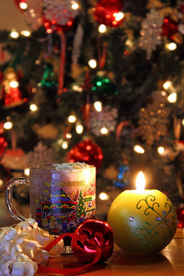
Hohenfels Volks A Quiet Evening
ISO 100, f/5.6, 2 seconds, 55mm
A Quiet Evening With the Princess

I chose to use a quiet Christmas scene to illustrate the reward I get from a quiet evening with my daughter, Jasmine. Of course, it’s rarely a quiet evening, but it’s almost always rewarding. Sharing her homework, eating our dinner, and enjoying either games or stories together makes the day’s labor worth the effort and more.

The cocoa had whipped topping on it, which had to be replenished to keep some form, as it melted throughout the 15 minutes of shooting for this shot. Smoothing the light with a small bounce brought out the colors in the mug, highlighted the cocoa bubbles, and added a nice bit of depth to the candle. A plus was the layering in the cocoa, from dark to white! For a similar setup, check out our last Ride Along. By allowing the light to fully hit the tree, we got some nice reflections and color from the bulbs and the tree, creating a Christmas feel, which is what spending time with the princess can be like!

Well, that’s it for tonight. For more on lighting glass, check out LIGHT—SCIENCE & MAGIC, from our last Reading List post. Also, check out Jennifer’s blog, it’s in our links to the right. She makes some great pics that deserve a look. I hope we’ll get some more pics posted in our next theme round up. Let’s get everyone voting and taking their pics for this week’s theme, Knock Knock.

Enjoy the rest of your evening, and remember to cast your vote for next week’s theme. Don’t forget to get your pics posted at the Hohenfels Volks Facebook page. Of course, commenting on both Facebook and here is always appreciated, too!

Tuesday, December 27, 2011

Elements of Composition: Negative Space

Greetings and welcome to Hohenfels Volks, THE place for our place. As we begin another workweek here in Hohenfels, let’s take a moment to reflect on what we’re working for. I extended the deadline for submitting to last week’s theme due to the holiday. I hope everyone gets submitting.

Today we’re going to talk about NEGATIVE SPACE. There’s a lot of ground to cover, it’s a wide topic, and there are a variety of views on the subject. We’re just going to touch on some of it today, with more about it another time. Of course, if you really want to, you can Google it for loads of information.

NEGATIVE SPACE is basically the area around the subject of your photo. NEGATIVE SPACE is used in all forms of art, from photography and painting to music and gardening. They even use it when designing logos and trademarks.

When we make photos we place our subject, generally following guidelines, where we feel it will create visual appeal. This subject becomes our positive space, for want of a better descriptor in today’s context. The remaining areas are your NEGATIVE SPACE used to balance the positive space, or to add context to an image. It's generally used in conjunction with other "rules" of composition, like the rule of thirds.

In the minimalist approach, NEGATIVE SPACE often refers to space that carries minimal detail, yet allows the image to work. Much like the photo below. Notice how the background is blown almost totally white or light shades of gray. Another side of this approach is not just monotone, but lacking detail. When most folks see NEGATIVE SPACE, they tend to think that any detail detracts, so like to blur it out. Bokeh comes from this, and makes for great images. You can use blur for effects, for subjects in and of itself, or to add context.

Hohenfels Volks Jasmine in Hohenfels
ISO 320, f/5.6, 1/60, 85mm
Notice the white NEGATIVE SPACE around the princess.

Another great use of NEGATIVE SPACE is to carry minor detail and add to the context of the image. In my Christmas shot, you can see the NEGATIVE SPACE is the background. It’s just a Christmas tree, but too little information creates a blurry mess, and too much creates a distraction. By selecting my f/stop and focus to allow enough detail to show up, it shows a time, Christmas, and creates a sense of being at home. Due to decorations on the tree, and their size, blurring beyond this becomes a distraction, as does greater DOF. You see now how NEGATIVE SPACE can convey time, place, and themes. Using snow-capped mountains would have felt like a ski lodge, a Christmas market would have left one with the feeling on being Nurnberg.

Hohenfels Volks Merry Christmas, Hohenfels
ISO 100, f/5.6, 2 seconds, 55mm
Merry Christmas, Hohenfels!

In both the images above, NEGATIVE SPACE has been used to create a composition that makes the image work. Don’t overlook the importance of your NEGATIVE SPACE when visualizing and composing your shots. Think about your intent and how to use NEGATIVE SPACE to aid your subject in fulfilling your intent. By knowing how to use NEGATIVE SPACE and how it affects your image, you can use it to carry some information or use it outline your subject creating an interesting image. If you use it to create a silhouette, remember the silhouette is generally your subject, not NEGATIVE SPACE.

Enjoy the rest of your evening, and remember to cast your vote for next week’s theme. Don’t forget to get your pics posted at the Hohenfels Volks Facebook page. Of course, commenting on both Facebook and here is always appreciated, too!